Ok, I know I've been in a cartoony mood lately, but Im working on my Resistance 2 cover so I'll get out of these little cartoony things. I think I may have to update the back of the box, becasue Im not as pleased with it as I am with the front.
Anyway, credit to numerobetically for screenshot borders and gamehiker image gallery for artwork, oh yeah and ADFD for temp.
Oh yes, I almost forgot this is my box for the mini cmpetition, except i dont know who im up against... >__O
Better than your previous one, like venom said, add a dropshadow and change the text to something less curly. If your gonna make the text twisted, make it center aligned.
This is nice. The dark text does not work, every thing else is so bright and vibrant. You should try and add more depth to the text with a good outline. A list of features can be a good addition. The copyright text has camouflaged in with the background which is bad.
Update! If you ask me I think it looks pretty ok now! E_G I made the text red, even though a couple words aren't visible and I tried to make the copyright text visible at the bottom.
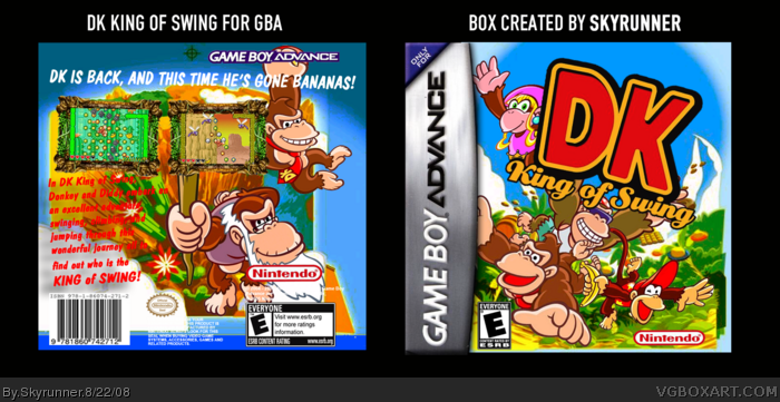
 DK: King Of Swing Box Cover Comments
Ok, I know I've been in a cartoony mood lately, but Im working on my Resistance 2 cover so I'll get out of these little cartoony things. I think I may have to update the back of the box, becasue Im not as pleased with it as I am with the front.
Anyway, credit to numerobetically for screenshot borders and gamehiker image gallery for artwork, oh yeah and ADFD for temp.
Oh yes, I almost forgot this is my box for the mini cmpetition, except i dont know who im up against... >__O
Ok, Im up against rasenagan boi lol
Edited at 1 decade ago
[ Reply ]
#1, your up against ragesn....Hunter the Hedgehog's new name. Ya him. For the box, mind if I fave it?
Edited at 1 decade ago
[ Reply ]
The front seems nice, but the back is pretty bleh. Also, you spelt Bananas wrong.
[ Reply ]
#3 so the back is bananas? (lame :p) How should I fix it up?
Lestat and GRP thanks for the faves.
Edited at 1 decade ago
[ Reply ]
Add a dropshadow to the text so it stands out.
[ Reply ]
Update! I hope it's a little better.
Oh, I can try.
Updated again, version 3 added. I just made a high dropshadow, cuz the others made it look blurry.
Max, thanks for the fav.
Edited at 1 decade ago
[ Reply ]
Better than your previous one, like venom said, add a dropshadow and change the text to something less curly. If your gonna make the text twisted, make it center aligned.
[ Reply ]
I added a drop shadow to the text, but if you think I should again, than I will.
[ Reply ]
This is nice. The dark text does not work, every thing else is so bright and vibrant. You should try and add more depth to the text with a good outline. A list of features can be a good addition. The copyright text has camouflaged in with the background which is bad.
[ Reply ]
#9 Thanks, will update tonight :)
[ Reply ]
Update! If you ask me I think it looks pretty ok now! E_G I made the text red, even though a couple words aren't visible and I tried to make the copyright text visible at the bottom.
[ Reply ]