![]() »
»
[ Box updated on September 20th, 2008 ] [ original ]
 Prince of Persia: The Two Thrones Box Cover Comments
Comment on Altair's Prince of Persia: The Two Thrones Box Art / Cover.
![]() »
»
[ Box updated on September 20th, 2008 ] [ original ]
Comment on Altair's Prince of Persia: The Two Thrones Box Art / Cover.
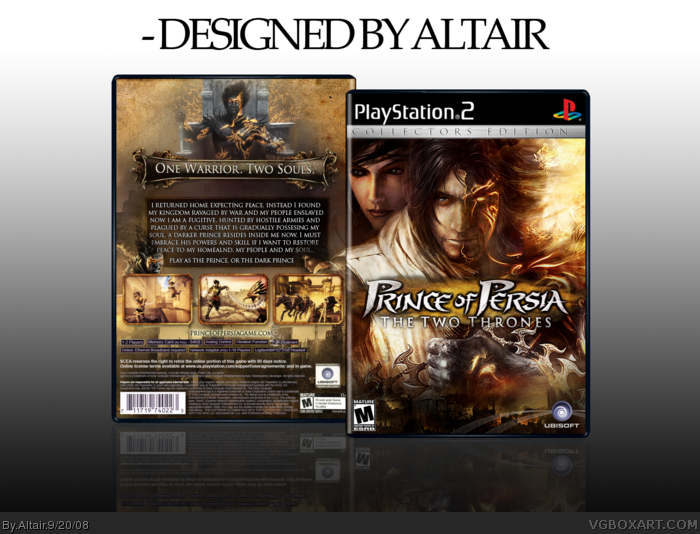
This took a while.
Credit to Steven for the logo, Karma for some wallpapers. Sens for the collectors edition tag, and some one for the template, not sure whose it is?
Thanks.
[ Reply ]
Great box, I love the back. 5/5
[ Reply ]
you're amazing at what you do
[ Reply ]
Okay there's something funky at the bottom of the temp on the back, the back ESRB should be larger, I'm not a fan of the blank spaces on either side of the top on the back, there should be a period after "enslaved" and "now," the text that says "Play as the Prince or the Dark Prince" should be smaller than the description text, and the Ubisoft logo on the front should be in the right hand corner.
Other than that, it's awesome and you have my fave :)
BTW I don't think anyone knows whose template that is...
[ Reply ]
Amazing job.
[ Reply ]
Thanks 2-5.
And Numero, I dont see any major flaws that you pointed out, and I think as it is a CE the Ubi logo is fine in the middle. Thanks
[ Reply ]
I likes it
[ Reply ]
Looks real good mate. Only thing that kinda not perfect is the blending of some of the images... like the title on the front has a slight black edge.. and there's a straight line down the right of hero's hair, etc. Apart from that.. nice work.
[ Reply ]
Thanks MARKER and Dan, your favs means a lot.
@Dersnap. I thought since it was a Collecters Edition the more subtle Ubi logo was justified.
And check your PM's.
Edited at 1 decade ago
[ Reply ]
Pretty damn awesome ;)
[ Reply ]
#4, I agree. I also think that you should lose the reflection on the Ubisoft logo and add the Ubisoft text under the swirl.
Can you send me the logo? Steven's my home boy so he wouldn't mind. ;]
Edited at 1 decade ago
[ Reply ]
Mate, this is great!
[ Reply ]
Thanks for all the favs and comments guys!
[ Reply ]
This is very nice. The back specs stuff is a little off with the colour, but it's ok. Like before, I think the Ubisoft logo would be better if it had the words and was centered on the box, or put on the left.
Either way, I think it's worth a fav.
[ Reply ]
Wonderful job here. Keep up the great work! ;)
[ Reply ]
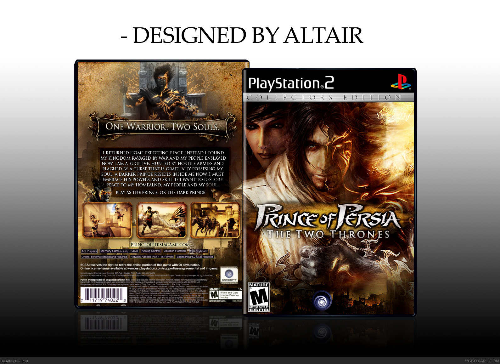
*Update*
I know its been a while but the mistakes on this were annoying me. I fixed up all the errors to meet your suggestions. Hope it looks better now!
[ Reply ]
This has got to be the best Prince of Persia box I've seen. This deserves HOF.
The only problem I see is that it looks like there is two ESRB ratings on the front.
Edited at 1 decade ago
[ Reply ]
Fixed. And thanks.
Edited at 1 decade ago
[ Reply ]
OH MY LORDY.
[ Reply ]
Well its about time^^ Second kiwi to get a HOF? :D
[ Reply ]
Thanks for the HoF guys. #20, Yup! :D
[ Reply ]
About Time!
[ Reply ]
awesome
fav
but the reflection on the front isn't matching
esrb shrinks lol.
[ Reply ]
Wow.... beautiful.
[ Reply ]