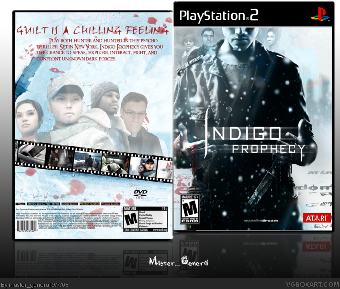
The back looks a teeny bit too plain, but I'm cool with that and it looks pretty awesome, although it doesn't do much to separate itself from other boxes for this game
I will fav this!!! Love it. I find it disappointing that Indigo Prophecy wasn't more popular because of it's rating. But anyway, the boxart's colors are prettilicious. =)
 Indigo Prophecy Box Cover Comments
Well, after working on this for a week, i finally have it done
Logo:Jangojoewells
[ Reply ]
Looks good but I suggest just making the text bigger and putting it under the header/tagline
[ Reply ]
#2, i was about to do that, but it looked horrible, but thanks anyway
[ Reply ]
Back = too plain.
[ Reply ]
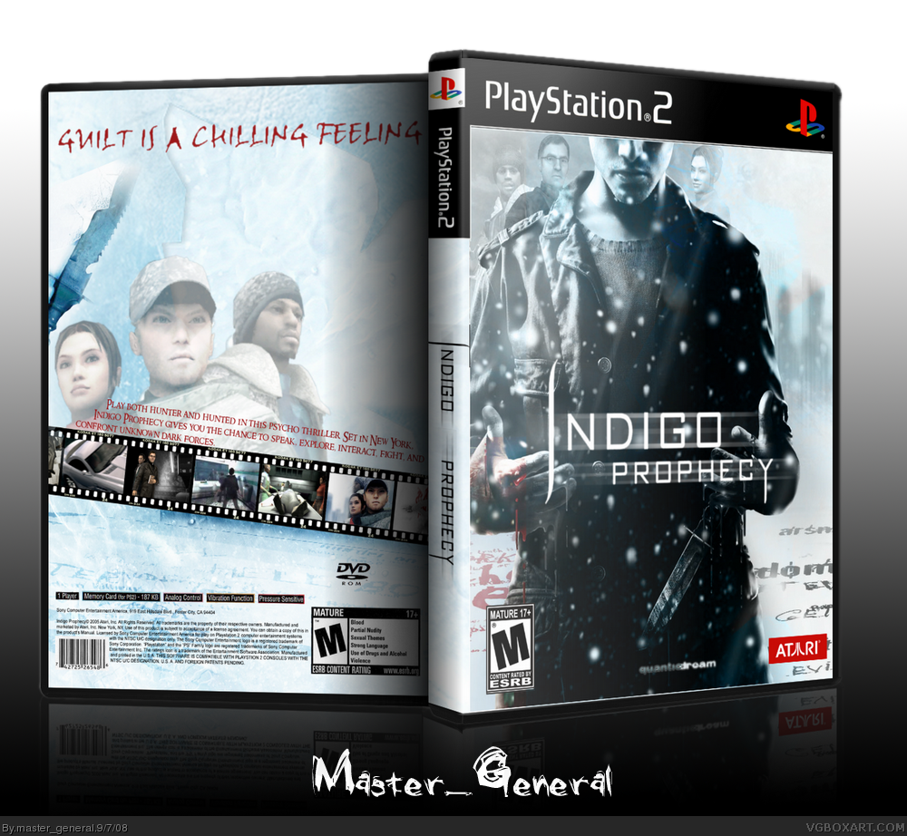
The front looks great, the back could use some sprucing up though.
[ Reply ]
#4, Agreed the front looks really nice and has a great feel to it.
[ Reply ]
allright, doing these now
[ Reply ]
There we go!!!
Update is done
[ Reply ]
I think the back looks to plain. I dunno what to suggest, as i've never heard of this game.
[ Reply ]
The back looks a teeny bit too plain, but I'm cool with that and it looks pretty awesome, although it doesn't do much to separate itself from other boxes for this game
[ Reply ]
#9 It's Fahrenheit in the UK
[ Reply ]
#11, Why is that, i knew that, but why -___-
[ Reply ]
#12 Because the NTSC version is crap, has all the bits censored.
The PAL version is the real version of the game, as stated by the developers, thats why they called it Fahrenheit.
[ Reply ]
I will fav this!!! Love it. I find it disappointing that Indigo Prophecy wasn't more popular because of it's rating. But anyway, the boxart's colors are prettilicious. =)
[ Reply ]