For round one of the OctFest against Drakxxx. It was a minimalism round, but yeah. :P
Credz - Techne/Soundwave (I think) for the template. Ross for the original and Soundwave for the info edit.
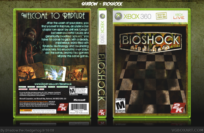
The shadow is very creepy, and the checker board texture hints towards the motifs and architecture throughout the game very effectively.
It's damn good man, and possibly the most innovative BioShock box on the site.
#15, Thanks Chibi =D
I'm really starting to hate this monitor, the it looks uber washed out because of brightness (apparently my monitor's really bright), but I take it the colors look fine to you guys?
 BioShock Box Cover Comments
For round one of the OctFest against Drakxxx. It was a minimalism round, but yeah. :P
Credz - Techne/Soundwave (I think) for the template. Ross for the original and Soundwave for the info edit.
[ Reply ]
Great box man, what font are u using for the back?
[ Reply ]
That is just amazing. Your best box.
[ Reply ]
#3, Thanks sky, and to all the people that faved.
#2, I think it's this: link
[ Reply ]
The shadow is very creepy, and the checker board texture hints towards the motifs and architecture throughout the game very effectively.
It's damn good man, and possibly the most innovative BioShock box on the site.
[ Reply ]
#5, Definitely not, thanks though. I didn't think one idea would draw so many others ^^
Edited at 1 decade ago
[ Reply ]
#6 Hah, I dunno man, I see that same rusty ol' big daddy an awful lot around here. They all start to run together.
[ Reply ]
Is Very niiiiice!
[ Reply ]
this is really cool
[ Reply ]
what #5 said, fav!
[ Reply ]
Edited at 1 decade ago
[ Reply ]
Front-2.5/5 its too plane for me
Back-5/5 Awsome
overall 4.5/5
Edit whoops triple post
Edited at 1 decade ago
[ Reply ]
Awesome
[ Reply ]
Thanks guys (not a bump)
#12, it's was for the minimalism round so yeah...
[ Reply ]
Wow, this is really neat and creative! ^^ I just LOVE the front. Great job! :D
[ Reply ]
#15, Thanks Chibi =D
I'm really starting to hate this monitor, the it looks uber washed out because of brightness (apparently my monitor's really bright), but I take it the colors look fine to you guys?
[ Reply ]
#16 No color or saturation issues in my opinion.
[ Reply ]
Veranice, love the use of brown here.
[ Reply ]
#18, Thanks lk :)
[ Reply ]