The mario on the front is from 64 while the rest is from GCN. I sugest to look for a better render. On the back, text could use an outline or drop shadow, and mario and yoshi are floating on the back. But i love what you did with the tennis balls tube, and how make the front so you get my fav. But fix those stuff and it will be better IMO :D
The front is great (even if im not too keen on the characters going over the template) but the back could use a better structure and design in my opinion. The ESRB on the front is also too small 4/5
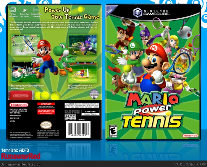
 Mario Power Tennis Box Cover Comments
My newest box, Mario Power Tennis. Enjoy!
Special thanks to GlowBlue for critiquing!
[ Reply ]
DAMN IT! I was going to start making a box for this...:p +fav
[ Reply ]
Good but none of your best :(
The mario on the front is from 64 while the rest is from GCN. I sugest to look for a better render. On the back, text could use an outline or drop shadow, and mario and yoshi are floating on the back. But i love what you did with the tennis balls tube, and how make the front so you get my fav. But fix those stuff and it will be better IMO :D
[ Reply ]
its preaty kool
[ Reply ]
Mmm <3
[ Reply ]
I like it. The back really looks like a Gamecube game.
[ Reply ]
Very nice! I really like it! +fav
[ Reply ]
The front is great (even if im not too keen on the characters going over the template) but the back could use a better structure and design in my opinion. The ESRB on the front is also too small 4/5
[ Reply ]
Impressive.
[ Reply ]
This is awesome! People are seriously knit-picking the size of the ESRB logo? C'mon. As a whole, this box is great! Nice job!
[ Reply ]
I agree, this is a really nice design, and I love the green turf as a background! And the tube of Nintendo tennis balls is an excellent touch.
Edited at 1 decade ago
[ Reply ]
love this box great job
[ Reply ]
awesome, great job
[ Reply ]
Reminds me of Star's lol. IS good but amzingZOMGZgreat
[ Reply ]