I wanted to do this box for ages, so i downloaded the fansite-kit and went ahead.
This is my spin on the original box, without looking at it once during the design [ how odd is that?]
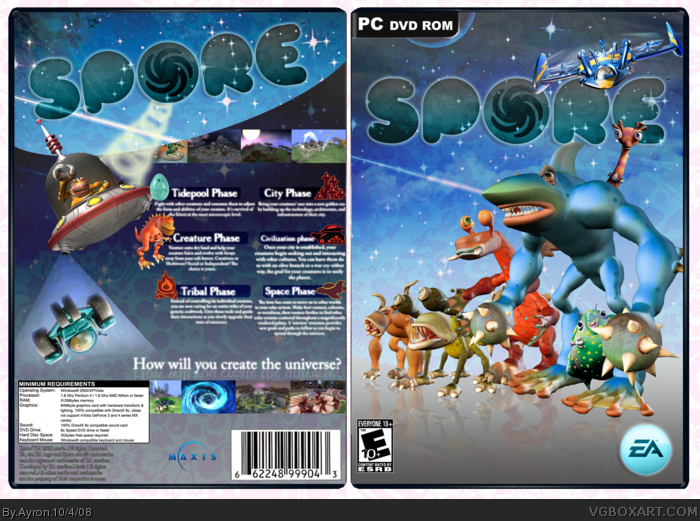
Ayron, I love you as much as one straight man can love another... but... I'm not feeling the back on this one. :( The cutout on the spaceship is painfully jaggy and I think the overall plainness of the gradient is a bit boring. It doesn't seem to fit the bubbly, colourful theme of the game. Still, the cover is simply awesome, so you get a FAV from me!
I get where you're coming from, but I'm afraid I'm just not feeling it. Like Jay said, it's a colourful game, all about creation and interaction, and this isn't showing much. The grey would probably look better as a different colour, or you could find a different theme altogether. Apart from the concept, there are a bunch of minor mistakes---the reflections on the characters don't line up, the text doesn't really fit, the screens go past the specs box, the spaceship is choppy, etc. If it was just one, I wouldn't pick on it, but so many really distract.
My suggestion would be to go back to drawing board and work on fixing it, I'm sure it'll be better after ;)
It looks plain over minimalistic and makes the game feel rather, as others have said...grey. It just seems unfinished. It's good but it needs some ways to go. Maybe change the lighting and go for a more turquoise feel.
I like this a lot, especially have you have the monsters lined up like they're on one specific side of a battle about the start. I'm going to have to agree with the comments about the back though man, something about it doesn't pop. I'm thinking it may be the gradient, and possibly the blue text in the blue boxes. Perhaps white text in blue boxes or vice versa would snap it up a bit?
I do like the back layout though, and the front is awesome in my opinion, so fav regardless!
 Spore Box Cover Comments
o.my.gawsh.
Spore.yeah.spore.
I wanted to do this box for ages, so i downloaded the fansite-kit and went ahead.
This is my spin on the original box, without looking at it once during the design [ how odd is that?]
I present to you: SPORE!!!! xD
-credit to ADFD for template ;)
comments/criticism/feedback ,as usual, highly appreciated.
-Ayron
[ Reply ]
Love the box mate!!
+fav
[ Reply ]
Just to plain for me. This game is supposed to be a very massive, colorful game. That blue to gray gradient just doesnt fit.
[ Reply ]
Ayron, I love you as much as one straight man can love another... but... I'm not feeling the back on this one. :( The cutout on the spaceship is painfully jaggy and I think the overall plainness of the gradient is a bit boring. It doesn't seem to fit the bubbly, colourful theme of the game. Still, the cover is simply awesome, so you get a FAV from me!
[ Reply ]
Lol, the cut on the spaceship is not my work, it's Ea's work for not fixing it. BLAME THEM! ;)
Any way to improve it,suggestions,anything?
[ Reply ]
I get where you're coming from, but I'm afraid I'm just not feeling it. Like Jay said, it's a colourful game, all about creation and interaction, and this isn't showing much. The grey would probably look better as a different colour, or you could find a different theme altogether. Apart from the concept, there are a bunch of minor mistakes---the reflections on the characters don't line up, the text doesn't really fit, the screens go past the specs box, the spaceship is choppy, etc. If it was just one, I wouldn't pick on it, but so many really distract.
My suggestion would be to go back to drawing board and work on fixing it, I'm sure it'll be better after ;)
[ Reply ]
It looks plain over minimalistic and makes the game feel rather, as others have said...grey. It just seems unfinished. It's good but it needs some ways to go. Maybe change the lighting and go for a more turquoise feel.
[ Reply ]
#6, Jay lol. No one has every called me that online, only people in real life.
[ Reply ]
I dont like the gray :/
[ Reply ]
#8, It's a habit, my best friend's name is Jason, and I call him that. I you're fine with it, then I hope you don't mind me calling you that.
[ Reply ]
Oh how I love the giant muscular man shark hand spike man
for that I fav
Edited at 1 decade ago
[ Reply ]
well, it isn't that great, sorry but i would have expected more from you. sorry if i'm being harsh, i just calls em as i sees em.
[ Reply ]
I like this a lot, especially have you have the monsters lined up like they're on one specific side of a battle about the start. I'm going to have to agree with the comments about the back though man, something about it doesn't pop. I'm thinking it may be the gradient, and possibly the blue text in the blue boxes. Perhaps white text in blue boxes or vice versa would snap it up a bit?
I do like the back layout though, and the front is awesome in my opinion, so fav regardless!
Edited at 1 decade ago
[ Reply ]
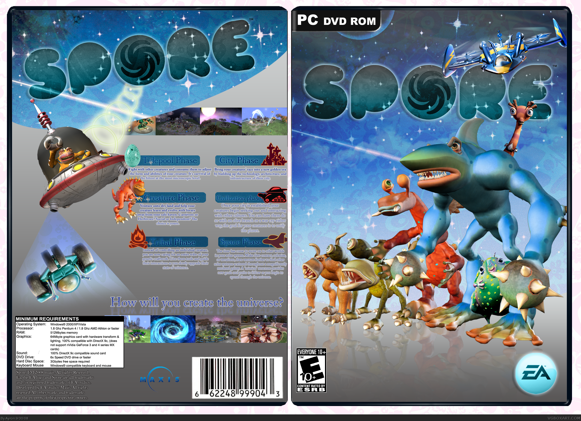
There you go everyone-- i've updated all i COULD update with the time and tools i had.
I sure hope this is better. ;)
[ Reply ]
Ooo. I like.
[ Reply ]
I like it a lot better Ayron.
You really made the back pop out with the update. Awesome job sir.
[ Reply ]
Thanks #15-16 =D!
[ Reply ]
Holy shit!! O.O Nice update!!
[ Reply ]
Better ;)
[ Reply ]
gray=bad
[ Reply ]