[ Buy Street Fight... at Amazon ] By Rezliv 5 on October 2nd, 2008 No Printable Available [ Box updated on October 3rd, 2008 ] [ original ] Street Fighter IV Box Cover Comments Comment on Rezliv's Street Fighter IV Box Art / Cover. Cancel Reply Rezliv 5 [ 1 decade ago ] My latest work done in an hour or so... I found the background on fightersgeneration.com everything else google well the temp I got from the forums but forgot from who... so if you know this is your temp please tell me and you shall be credited. oh... btw... I don't think I'll do a back... I still can't do one well hehe [ Reply ] Dbone2you 1 [ 1 decade ago ] it looks great to me, the only flaw is the esrb logo looks a little fat but other than that it's great. 5/5 [ Reply ] GrahamZ 40 [ 1 decade ago ] its good but i really dont like the logo much is that offical logo ? [ Reply ] mtirkmane 5 [ 1 decade ago ] #3, yes, but the coloring is altered. Nice box. [ Reply ] Rezliv 5 [ 1 decade ago ] it's the original logo, only that I ltered it to look more like the art style of the game [ Reply ] jangojoewells 28 [ 1 decade ago ] nice [ Reply ] E_G 39 [ 1 decade ago ] It is nice, you can tell the logo is a bit choppy in full size and I reckon you can use a better one. [ Reply ] Rezliv 5 [ 1 decade ago ] I forgot to actually look at it in full size... I'll see waht I can do [ Reply ] The Leo Krupps Project 1 [ 1 decade ago ] this is good, but maybe you should get a template with a box around it, it tends to look better. [ Reply ] Rezliv 5 [ 1 decade ago ] version 2 updates: street fighter logo is now a little less chopier grammar error in "online experience" fixed [ Reply ]
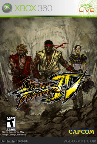
 Street Fighter IV Box Cover Comments
My latest work done in an hour or so...
I found the background on fightersgeneration.com
everything else google
well the temp I got from the forums but forgot from who... so if you know this is your temp please tell me and you shall be credited.
oh... btw... I don't think I'll do a back... I still can't do one well hehe
[ Reply ]
it looks great to me, the only flaw is the esrb logo looks a little fat but other than that it's great. 5/5
[ Reply ]
its good but i really dont like the logo much
is that offical logo ?
[ Reply ]
#3, yes, but the coloring is altered.
Nice box.
[ Reply ]
it's the original logo, only that I ltered it to look more like the art style of the game
[ Reply ]
nice
[ Reply ]
It is nice, you can tell the logo is a bit choppy in full size and I reckon you can use a better one.
[ Reply ]
I forgot to actually look at it in full size... I'll see waht I can do
[ Reply ]
this is good, but maybe you should get a template with a box around it, it tends to look better.
[ Reply ]
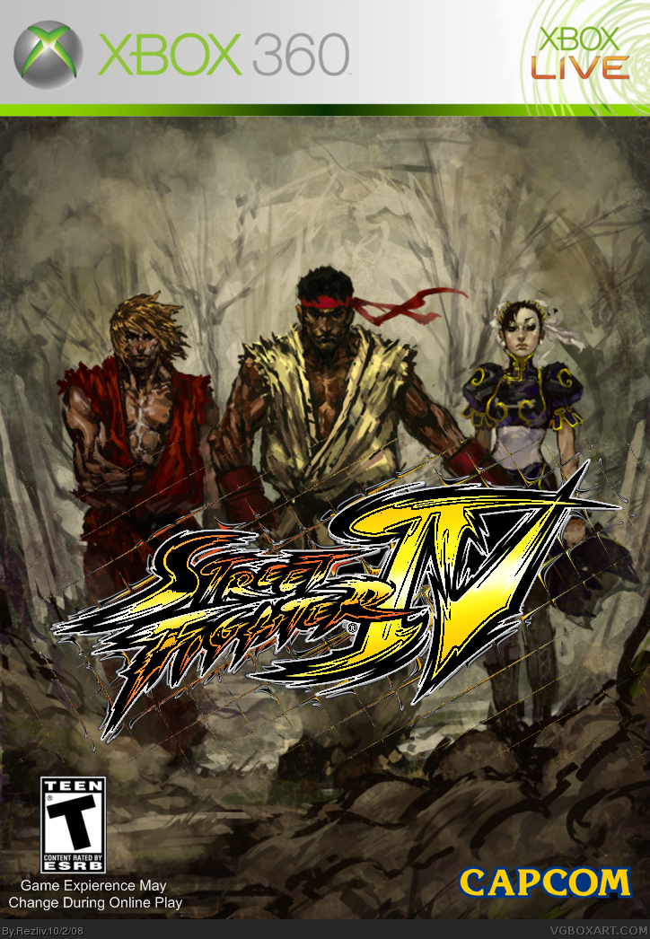
version 2 updates:
street fighter logo is now a little less chopier
grammar error in "online experience" fixed
[ Reply ]