[ Box updated on October 8th, 2008 ] [ original ]
 Tim Burton's Nightmare Before Chirstmas Box Cover Comments
Comment on gamerking's Tim Burton's Nightmare Before Chirstmas Box Art / Cover.
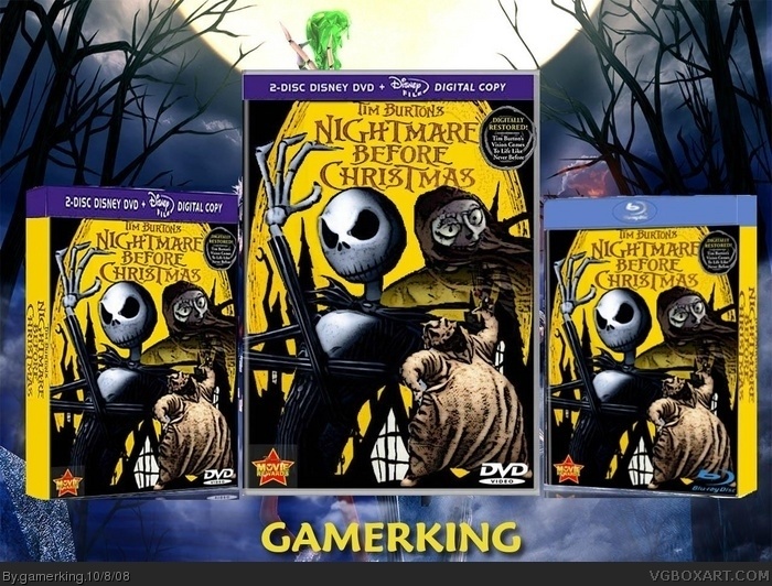
MY NIGHTMARE BOX!! lol. i love this movie so i made a dvd! hope you like and let me know what you think!
credit to silentman101 for the template.
-----------------------------------------------
NOBODY!?!?! lol.
Edited at 1 decade ago
[ Reply ]
okay, update! i added a bunch o' stuff onto it to make it more official looking. lol.
____________________________________________
wow, is it THAT bad?
Edited at 1 decade ago
[ Reply ]
Get rid of the back lol Its pretty bad, no offense.
#4, Lol do you see the back to my nightmare before christmas box? Its looks pretty good lol
#5, LOADS Better
Edited at 1 decade ago
[ Reply ]
okay, hold on. lol. at least i can MAKE backs. lol.
[ Reply ]
nah, yours was pretty bad too. lol. just kidding, but update!!
i got rid of the back. is it better now?
[ Reply ]
Very nice.
[ Reply ]
thanks! this will probably be the very last update unless any one has any thoughts. i decided to do a whole presentation of the box set version, the regular version, and the blu-ray version. enjoy!!
[ Reply ]
the reflection of the middle box is wrong, just putting that out in the open
[ Reply ]
oops! lol. i didn't noticed that. lol. i'll fix that tomorrow, thanks.
Edited at 1 decade ago
[ Reply ]
Probably your best.
[ Reply ]
wow!! thank you!! :)
[ Reply ]
Not bad.... Not bad at all!
However I dont think we need to see the same box 3 times on the same page do we?
[ Reply ]
i should take them off? i just kind of liked the idea of having the the regular dvd, the box set, and the blu-ray version all together.
[ Reply ]
Aspects of all your reflections are off, I would honestly remove them and place a Nightmare Before Christmas logo there instead. I like the idea of using all three versions, but the blu ray looks too thick. As far as double disc, I would actually give it a unique cover that differs from single disc. Also, replace the DVD Video logo with a Blu Ray logo. This piece has a lot of potential, just a lot of issues bringing it down. Right now, I give you 3.75 out of 5 and a tentative fav.
[ Reply ]
#13 I like the idea as well, but what #12 is saying is that it's the same cover 3 times on different templates. If you're willing to make 3 different covers for all 3 versions, than that would cool. Even though they usually manufacture films with universal artwork.
Edited at 1 decade ago
[ Reply ]
okay, thank you for the fav! i will work on it a little bit more and post the update when i finish. but i don't feel like making three different covers. too much work. lol.
[ Reply ]
okay, i fixed it up a bit. anything else i could change to make it better other than making two additional covers? lol.
[ Reply ]
Ok other then the movies award logo this looks perfect.
[ Reply ]
movie REwards logo? lol. what about it that's wrong?
Edited at 1 decade ago
[ Reply ]
The background you used has the copy right info for the Capcom game visible on the bottom! See if you can't crop that out of there. Lol, details man, details!
[ Reply ]
picky, picky. lol. okay, hold on. lol.
[ Reply ]
okay, i got rid of it. lol. anything else?
[ Reply ]
This looks really good. +fav
[ Reply ]
thank you!!
[ Reply ]
NICE!
[ Reply ]
thanks!! and thanks for the fav!
[ Reply ]
I still have my issues with it, but it's obvious a lot of effort and energy went into this, and that's what I'm all about.
Definitely your best so far, and keep at it with all the determination and dedication you do.
+fav!
[ Reply ]
thank you so much!!
[ Reply ]
Yay!! another fav! whoot!! lol. thanks ratchetcommand.
[ Reply ]
Shame, you could not brush up on the presentation!
[ Reply ]
Shame, you could not brush up on the presentation!
[ Reply ]