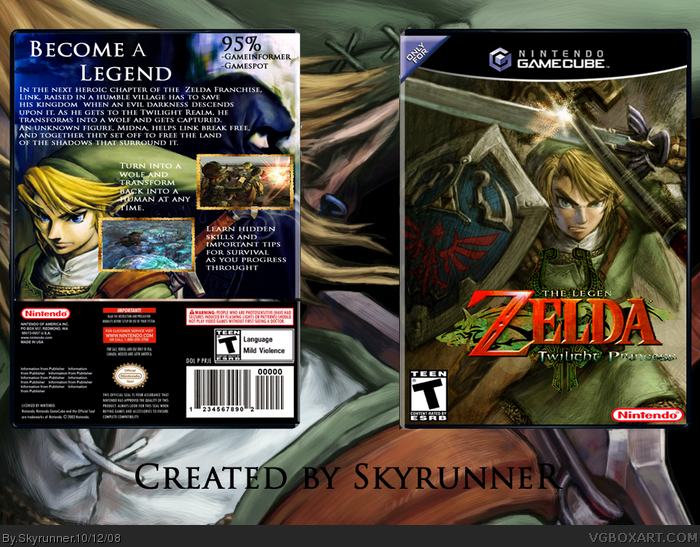
Ok well Im not part of BYTD, and everyone was dishin out great, spectacular boxes, so I just wanted to make a box. Im not sayin its great, Im just saying it was fun to make and what I think my best work is. Inspired by all of the Twilight Princess boxes on the site basically, they are all really, really, really, REALLY good. And when I saw Qwerty's i knew I had to make a box for it. Comments and crits appreciated.
Big credit to LK for screeshot borders and logo. Also credit to MG for temp. So...yeah enjoy. :)
The template says "only for Gamecube" when this game is also on Wii.
The logo on the front is messed up.
Nintendo logo is squished.
Spelling error on back, 'Throught' is not a word.
Its an okay box but nothing great 2.5/5
#2 Google
#3 It is, but I edited it a lot.
#4 Yeah i know I need to fix that.
#5 I edited
#6 I know the logo's messed up, and I meant to type throughout. There's also a lot of boxes that have only for's on tis site when it's on a lot of other systems.
#8 Thank you very much.
 The Legend of Zelda: Twilight Princess Box Cover Comments
Ok well Im not part of BYTD, and everyone was dishin out great, spectacular boxes, so I just wanted to make a box. Im not sayin its great, Im just saying it was fun to make and what I think my best work is. Inspired by all of the Twilight Princess boxes on the site basically, they are all really, really, really, REALLY good. And when I saw Qwerty's i knew I had to make a box for it. Comments and crits appreciated.
Big credit to LK for screeshot borders and logo. Also credit to MG for temp. So...yeah enjoy. :)
[ Reply ]
where did you get that art from?
[ Reply ]
#2, I think it's just a wallpaper...
[ Reply ]
pretty cool, but it says "LegeN" on the front, but that's just a small mistake which can easily be fixed. Good job
[ Reply ]
Is this just a wallpaper or did you edit it?
[ Reply ]
The template says "only for Gamecube" when this game is also on Wii.
The logo on the front is messed up.
Nintendo logo is squished.
Spelling error on back, 'Throught' is not a word.
Its an okay box but nothing great 2.5/5
Edited at 1 decade ago
[ Reply ]
#6, On the official box there's that "Only for" logo too.
I think it meend "Only For Nintendo" rather than for GC.
[ Reply ]
#6, My Silent Hill box had the 'only for N64' logo on it and nobody complained. This is very good btw.
[ Reply ]
#7 link
#8 So? Even if it is just a minor nitpick, its still a fault with the box and someone should point it out to him.
Edited at 1 decade ago
[ Reply ]
#9, The official PAL has it atleast.
[ Reply ]
#2 Google
#3 It is, but I edited it a lot.
#4 Yeah i know I need to fix that.
#5 I edited
#6 I know the logo's messed up, and I meant to type throughout. There's also a lot of boxes that have only for's on tis site when it's on a lot of other systems.
#8 Thank you very much.
[ Reply ]
Nice man
[ Reply ]
I don't like the text on the back, or the layout of the screens. The front logo is cut out poorly and you even cut off the D in legend.
I wouldn't mind you using a wallpaper for the front if you made up for it with the back, but that's a wallpaper too.
[ Reply ]
#12 Thanks
#13 I know, I need to stop using wallpapers. The logo I will work on and fix it up sometime later. Thanks for commenting though.
[ Reply ]
Yeah, I like the front, but not so much the text on the back.
[ Reply ]
Agreed with said criticisms, but you're improving. Keep up the good work. :)
[ Reply ]
Thanks guys :)
[ Reply ]