Full view please and view the printable too please(looks better than the 3D version because it's bigger and higher res).
My second box for the party =) If you opened this, please comment. I feel this is one of my better boxes. If the Japanese text is not accurate, I apologize, I do not know Japanese and simply used a font.
2. I will use what looks best =) Besides, it's better than me making another aged paper box.
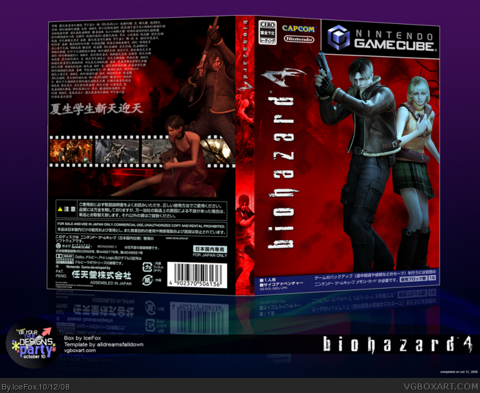
As for the lighting on Leon and Ashley on the front, it's design. I didn't want them to blend in. I wanted them to stand out. Instead of making them red hot, I made them ice cold.
#2 I dont see why Icefox should stop using something just because its been used many times before. I personally think the box looks great and I love the colours used. +fav
Sure, there`s the issue of the japanese/chinese text, but I think it`s kinda okay. After all it`s kinda hard to type japanese with a "western keyboard" and stuff. Not to mention the fonts you gotta get.
But... you cannot open japanese GC-packages like that. If you did, they were kinda f*** up. You know, that`s a cardboard-box and the plastic is inside it. You can get the plastic case if you pull it out on the upper or lower side of the cardboard.
Next time you should do a bit more research ;)
Personally I don`t like the blue look of the characters on the front and the red characters on the back don`t fit the colorful screenshots - but that`s just me.
Some little issues: If I am not mistaken you got the "rating pending" cero and you don´t mention the game got 2 CDs ;) Capcom and Nintendo are a bit small on the front
 Biohazard 4 Box Cover Comments
Full view please and view the printable too please(looks better than the 3D version because it's bigger and higher res).
My second box for the party =) If you opened this, please comment. I feel this is one of my better boxes. If the Japanese text is not accurate, I apologize, I do not know Japanese and simply used a font.
Edited at 1 decade ago
[ Reply ]
Please dont use the film strips for the screenshots its really old. Why are they a different color than the background.
[ Reply ]
2. I will use what looks best =) Besides, it's better than me making another aged paper box.
As for the lighting on Leon and Ashley on the front, it's design. I didn't want them to blend in. I wanted them to stand out. Instead of making them red hot, I made them ice cold.
[ Reply ]
#2 I dont see why Icefox should stop using something just because its been used many times before. I personally think the box looks great and I love the colours used. +fav
[ Reply ]
Definately not my favorite from you. I don't like the characters on the front and the back has a boring layout. And there's too much text.
It's well made, though.
Edited at 1 decade ago
[ Reply ]
#3 and #4, he said Please godamnit.
[ Reply ]
78 views. You all suck =p
No...Y'all. =D
[ Reply ]
Is this supposed to be a Japanese box? Because I'm pretty sure you used Chinese characters on the back.
[ Reply ]
#8 Theres a difference? 0_0
[ Reply ]
I actually really like the front layout, it's unique and fresh compared to a majority of RE (fine..Biohazard :P) boxes on the site.
Sure, the film strip screen is overused, but he really did a good job implementing it in the design. I also love the use of red here, nice work! :)
EDIT: jevan, you really don't have room to talk considering that you've used the same horizontal screenstrip layout on a majority of your boxes.
Edited at 1 decade ago
[ Reply ]
Oooh, I really like that.
[ Reply ]
I think this looks very nice, Hell I might even use the printable.
[ Reply ]
*Double post sorry*
Edited at 1 decade ago
[ Reply ]
Nice, very authentic look to it, almost like a bought one!
[ Reply ]
Sure, there`s the issue of the japanese/chinese text, but I think it`s kinda okay. After all it`s kinda hard to type japanese with a "western keyboard" and stuff. Not to mention the fonts you gotta get.
But... you cannot open japanese GC-packages like that. If you did, they were kinda f*** up. You know, that`s a cardboard-box and the plastic is inside it. You can get the plastic case if you pull it out on the upper or lower side of the cardboard.
Next time you should do a bit more research ;)
Personally I don`t like the blue look of the characters on the front and the red characters on the back don`t fit the colorful screenshots - but that`s just me.
Some little issues: If I am not mistaken you got the "rating pending" cero and you don´t mention the game got 2 CDs ;) Capcom and Nintendo are a bit small on the front
Edited at 1 decade ago
[ Reply ]
15, I actually am aware of the Chinese text...I couldn't find a Japanese font =p
I am aware of the packaging, I just wanted to do it like that for presentation purposes.
As for the Cero, I did research that, I guess I just fucked it up last minute =p
Thanks for the comments though, I appreciate them.
[ Reply ]