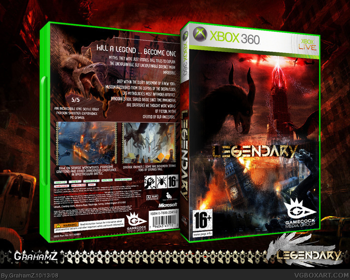
The front is uberpwns but I really hate the screenborders and the size of the text. I'd like it more if it was a lot of text with a smaller font. I'm just picky.
I agree dude, this looks really good. You dedication is starting to really pay off. Keep it up. You earned my fav as it is, but the back is a little to uniform, and the screen boarders aren't doing for me either.
#12,no need to credit I only gave you suggestions =]
this box has made massive changes!
but the end product is not bad at all
I think there is to much text and not enough images on the back but that just me
you are doing great =]
Really improving fast man, front is great amd back is good too, but the screnshot should be a bit smaller and there should be 3, and maybe a bit closer together/joint. But really improving man, text could be slated but it works efficiently, not great but not bad.
pretty awesome. I do wish the screenborders were different, and I don't know what that white line is above them, but all in all, it's a good one and you get my fav.
 Legendary Box Cover Comments
The front is uberpwns but I really hate the screenborders and the size of the text. I'd like it more if it was a lot of text with a smaller font. I'm just picky.
[ Reply ]
well this is my 12th box
hope you like it . :)
[ Reply ]
damn you bet me ¬_¬ lol
and ill update it with your suggestions later
i am at work now and have to do there graphics ¬_¬ haha
also i believe this is the first legendary box :)
Edited at 1 decade ago
[ Reply ]
Agreed but you are improving massivley. Also, don't bump :p
Oh, and isn't this on PS3?
Edited at 1 decade ago
[ Reply ]
thanks SR and i'm sorry i tried to delete the post but it didnt work :(
and its for PC XboX and PS3.
thanks for the fav :)
[ Reply ]
this is actually very good, i like it
[ Reply ]
you're improving man
[ Reply ]
I agree dude, this looks really good. You dedication is starting to really pay off. Keep it up. You earned my fav as it is, but the back is a little to uniform, and the screen boarders aren't doing for me either.
Edited at 1 decade ago
[ Reply ]
#3, No, it's not the first legendarty box.
I did one some time ago. You can check it in my profile.
Oh, And I like the box. the back is a little too plain, but front rocks.
[ Reply ]
#9 i ment the accuall game...
[ Reply ]
agreed wtih #1
[ Reply ]
thanks
credit does go to AT though she helped me through this :)
thanks to you all too for comments and faves
[ Reply ]
#12,no need to credit I only gave you suggestions =]
this box has made massive changes!
but the end product is not bad at all
I think there is to much text and not enough images on the back but that just me
you are doing great =]
[ Reply ]
yeah but still i was gonna post it with the back i showed you
i personally think that the front is as shoadow says "uberpwns" hehe
my new fav word ^_^
[ Reply ]
Really improving fast man, front is great amd back is good too, but the screnshot should be a bit smaller and there should be 3, and maybe a bit closer together/joint. But really improving man, text could be slated but it works efficiently, not great but not bad.
[ Reply ]
cheers man
p.s i want my fifa back ¬_¬
[ Reply ]
omg this is out collab file my bad i thought it was my one.
[ Reply ]
pretty awesome. I do wish the screenborders were different, and I don't know what that white line is above them, but all in all, it's a good one and you get my fav.
[ Reply ]
thanks i think this is my best box :)
[ Reply ]
thanks wonderful color
[ Reply ]
thank you appreciate it! :)
[ Reply ]