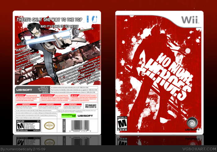
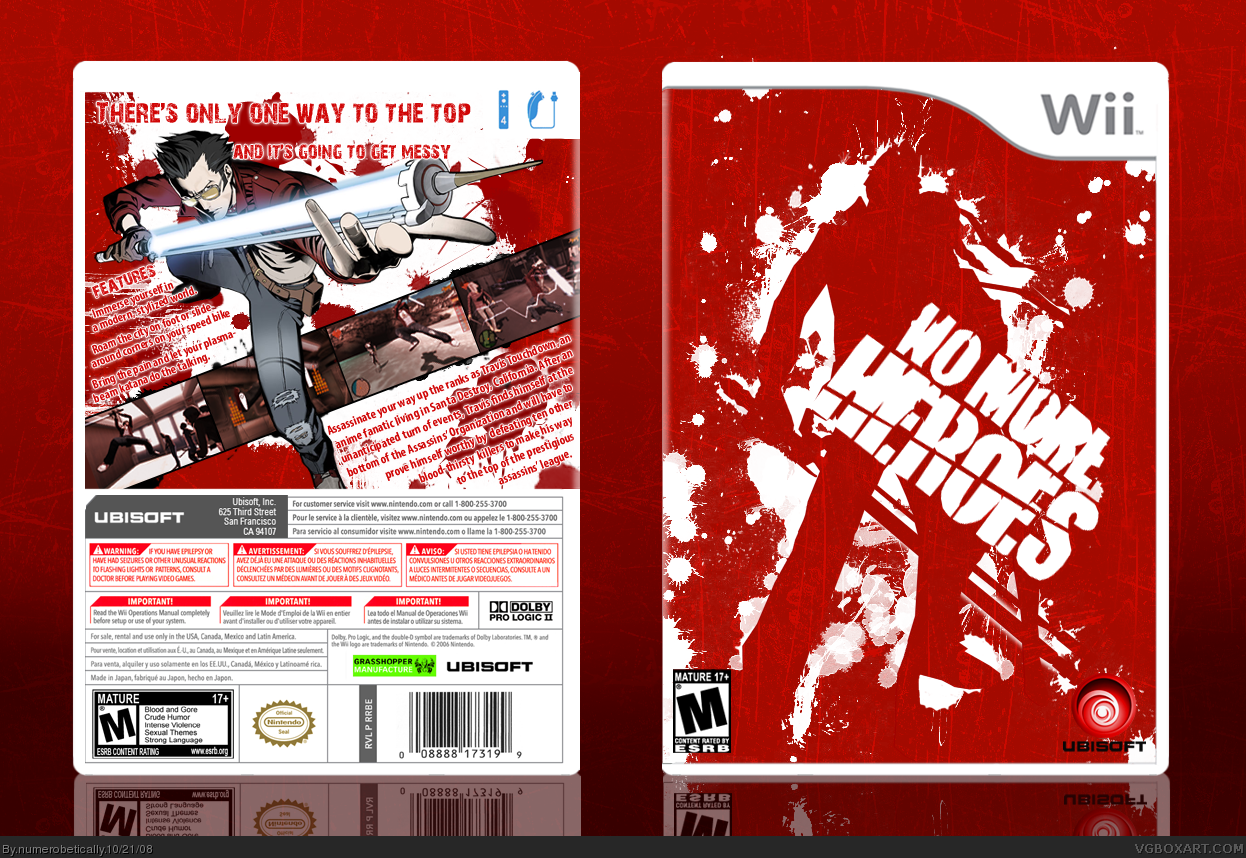
[ Buy No More Heroes at Amazon ] By numerobetically 42 on October 21st, 2008 No Printable Available [ Box updated on February 15th, 2009 ] [ original ] No More Heroes Box Cover Comments Comment on numerobetically's No More Heroes Box Art / Cover. Cancel Reply numerobetically 42 [ 1 decade ago ] I don't know why. It's an abomination O.O [ Reply ] ELCrazy 50 [ 1 decade ago ] Very nice, although I strongly suggest replacing the bg, as it blends in with the front of the box. EDIT: Better haha +fav =D Edited at 1 decade ago [ Reply ] HalfSwiss 43 [ 1 decade ago ] Drool. Edited at 1 decade ago [ Reply ] numerobetically 42 [ 1 decade ago ] Haha I did but I forgot to save. So this is the real version. [ Reply ] Blade 9 [ 1 decade ago ] 'Wee' :P The front is very creative and the back...well it's just amazing. :D...Ill fave... [ Reply ] super-mega-hyper-sonic 41 [ 1 decade ago ] Awesome! [ Reply ] tleeart 45 [ 1 decade ago ] Instant fav from me, I think the blue Ubisoft would have been better, so it doesn't disappear in the sea of red on the front, but I really love this. [ Reply ] Ervo 48 [ 1 decade ago ] I hate that font on the back but front is awesome :) [ Reply ] rasengan_boi 35 [ 1 decade ago ] fav [ Reply ] XCore 42 [ 1 decade ago ] Front... awesome. Use the same art style from the front, for the back, and you'll get my fav. Edited at 1 decade ago [ Reply ] numerobetically 42 [ 1 decade ago ] @ Ervo --- Which font? [ Reply ] ClonedX 35 [ 1 decade ago ] back =awesomer :P front= great [ Reply ] numerobetically 42 [ 1 decade ago ] Thanks [ Reply ] Ray Blade 40 [ 1 decade ago ] Oh that's sick nasty. [ Reply ] numerobetically 42 [ 1 decade ago ] Haha thanks :) [ Reply ] numerobetically 42 [ 1 decade ago ] Just a little update. I decided that I was overwhelmed by all the red, so I changed the color of the text as well as the Ubisoft Logo. [ Reply ]
 No More Heroes Box Cover Comments
I don't know why.
It's an abomination O.O
[ Reply ]
Very nice, although I strongly suggest replacing the bg, as it blends in with the front of the box.
EDIT: Better haha +fav
=D
Edited at 1 decade ago
[ Reply ]
Drool.
Edited at 1 decade ago
[ Reply ]
Haha I did but I forgot to save. So this is the real version.
[ Reply ]
'Wee' :P
The front is very creative and the back...well it's just amazing. :D...Ill fave...
[ Reply ]
Awesome!
[ Reply ]
Instant fav from me, I think the blue Ubisoft would have been better, so it doesn't disappear in the sea of red on the front, but I really love this.
[ Reply ]
I hate that font on the back but front is awesome :)
[ Reply ]
fav
[ Reply ]
Front... awesome.
Use the same art style from the front, for the back, and you'll get my fav.
Edited at 1 decade ago
[ Reply ]
@ Ervo --- Which font?
[ Reply ]
back =awesomer :P
front= great
[ Reply ]
Thanks
[ Reply ]
Oh that's sick nasty.
[ Reply ]
Haha thanks :)
[ Reply ]
Just a little update. I decided that I was overwhelmed by all the red, so I changed the color of the text as well as the Ubisoft Logo.
[ Reply ]