This took me 3 days!
credit to photo bucket for the temp and google for the controler and "super mario" part of the logo, os part of it is mine, credit to google for the screen shots of it.
Comment, rate, and enjoy!
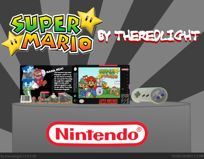
i tried somthing new on my last box, and now i tried it again tell me what you think. this is my best yet!The reason it's on snes is because it's like th remake of the first game like in super mario all stars
and i know the back temp is bad
#1, I like it, there's nothing bad about it and im speechless....
5/5......
What are you waiting for a fav?
........................................................................................+ Fav!
Hmm, here's what I think. It looks like you thought out the box well enough, but I don't like the presentation. It's way too big and your logo became way blurry because of it. The box itself is nice, though there is a little too much sky left bare on the front.
4/5 for the box, 1.5/5 for the presentation (I like the stage, just make it smaller, and I thought the SNES controller was a nice touch.)
If you can fix up your presentation, I'll fav this box.
 Super Mario Box Cover Comments
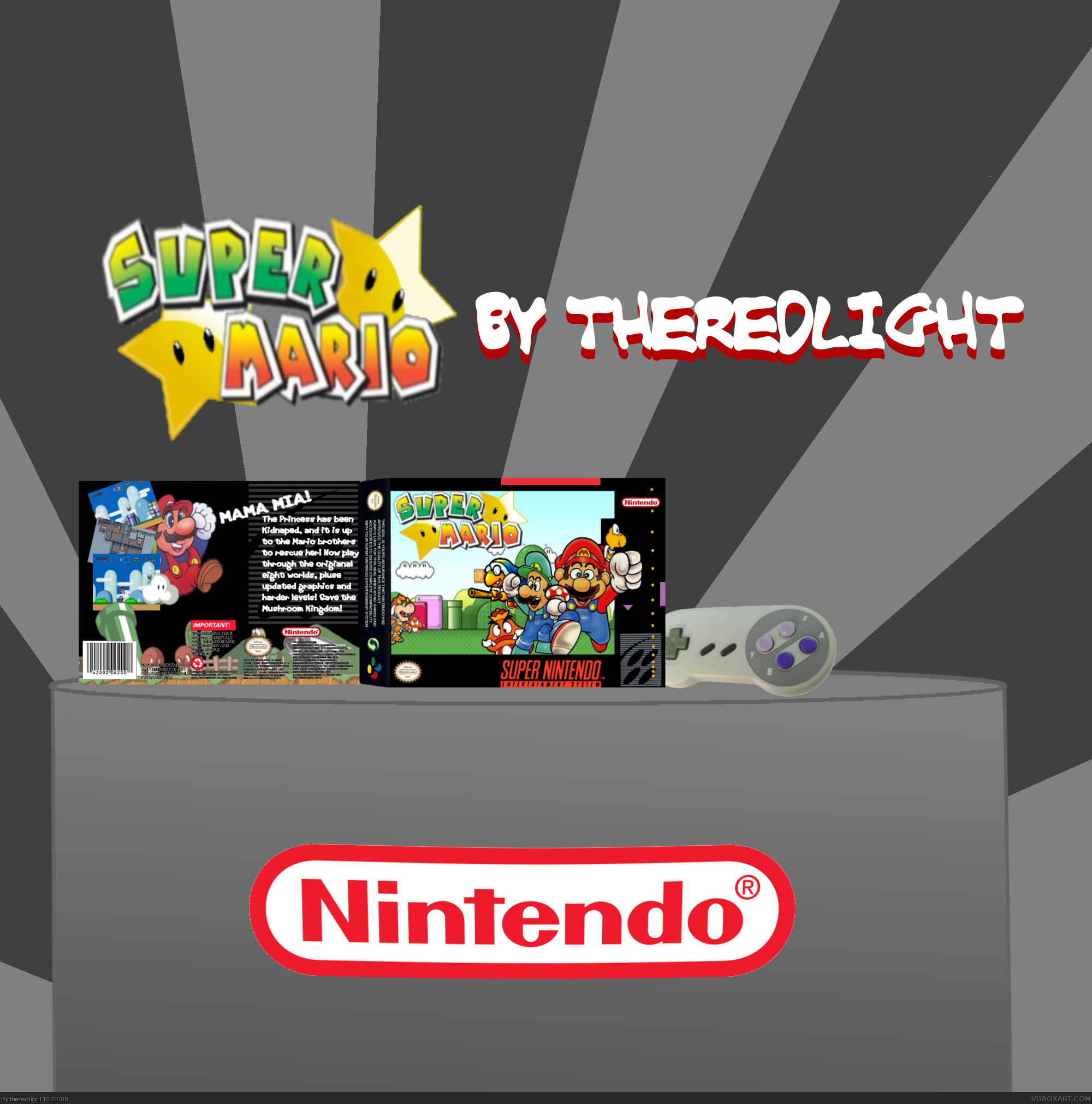
My latest box!
FULL VEIW
This took me 3 days!
credit to photo bucket for the temp and google for the controler and "super mario" part of the logo, os part of it is mine, credit to google for the screen shots of it.
Comment, rate, and enjoy!
i tried somthing new on my last box, and now i tried it again tell me what you think. this is my best yet!The reason it's on snes is because it's like th remake of the first game like in super mario all stars
and i know the back temp is bad
#2 thank you.
Edited at 1 decade ago
[ Reply ]
#1, I like it, there's nothing bad about it and im speechless....
5/5......
What are you waiting for a fav?
........................................................................................+ Fav!
[ Reply ]
Opps,Double post,Sorry!
Edited at 1 decade ago
[ Reply ]
nice.
[ Reply ]
Very nice man. Lookin good. I knew you had what it took to make an excellent box.
[ Reply ]
#4,#5 thank you, i am glad you like it.
[ Reply ]
Hmm, here's what I think. It looks like you thought out the box well enough, but I don't like the presentation. It's way too big and your logo became way blurry because of it. The box itself is nice, though there is a little too much sky left bare on the front.
4/5 for the box, 1.5/5 for the presentation (I like the stage, just make it smaller, and I thought the SNES controller was a nice touch.)
If you can fix up your presentation, I'll fav this box.
[ Reply ]
#7, i agree but i will fav
#9 the mario art is from google images i seen it before it form a wallpaper.
Edited at 1 decade ago
[ Reply ]
Who made the Mario art on the front?
[ Reply ]
#9, yeah it was soem cool art work i found and i wanted to use it. it was an official poster of mario bros 2 nes. i decided to use them
UPDATE! there i made it smaller i will fix the "big" logo
Edited at 1 decade ago
[ Reply ]
Fix the logo and you have my fav, that will be enough for me.
[ Reply ]
The only thing I don't like is how the characters overlap the temp. Fix that and I'll fave.
[ Reply ]
Update!
now the characters arn't going over the temp and i can't fix the logo so...yeah.
Edited at 1 decade ago
[ Reply ]
#13, I'll see if I can cook you up a logo tonight, k?
btw I liked the back you had before. And actually, despite it being incorrect, I liked the characters going outside the template, personally, lol.
Edited at 1 decade ago
[ Reply ]
when you send me the logo i will change it
[ Reply ]
Faved
[ Reply ]
check your PM's, I sent you the logo.
[ Reply ]
Update! i change the logo credit to teelart for the logo i wansn't to good whit the shadows so i did the best i could
added boo did some work on the back and did some editing on hte front.
[ Reply ]
Good enough, you get my fav.
teelart? lol
[ Reply ]
lol you spelled kidnapped "kidnaped" and plus "pluse"
[ Reply ]