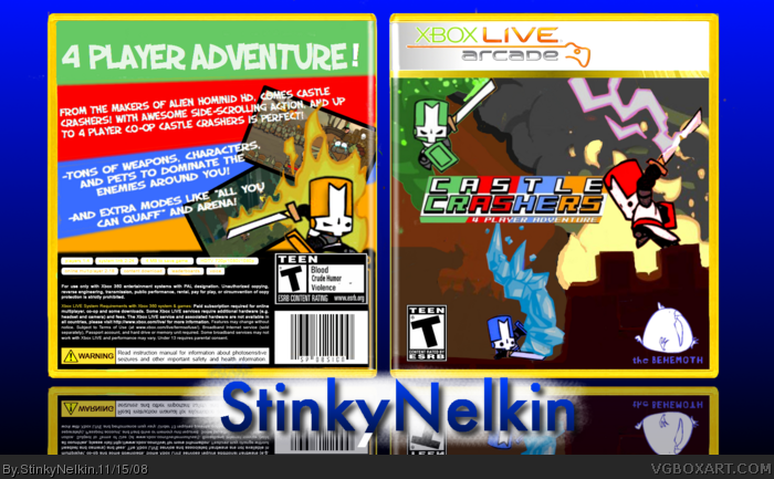
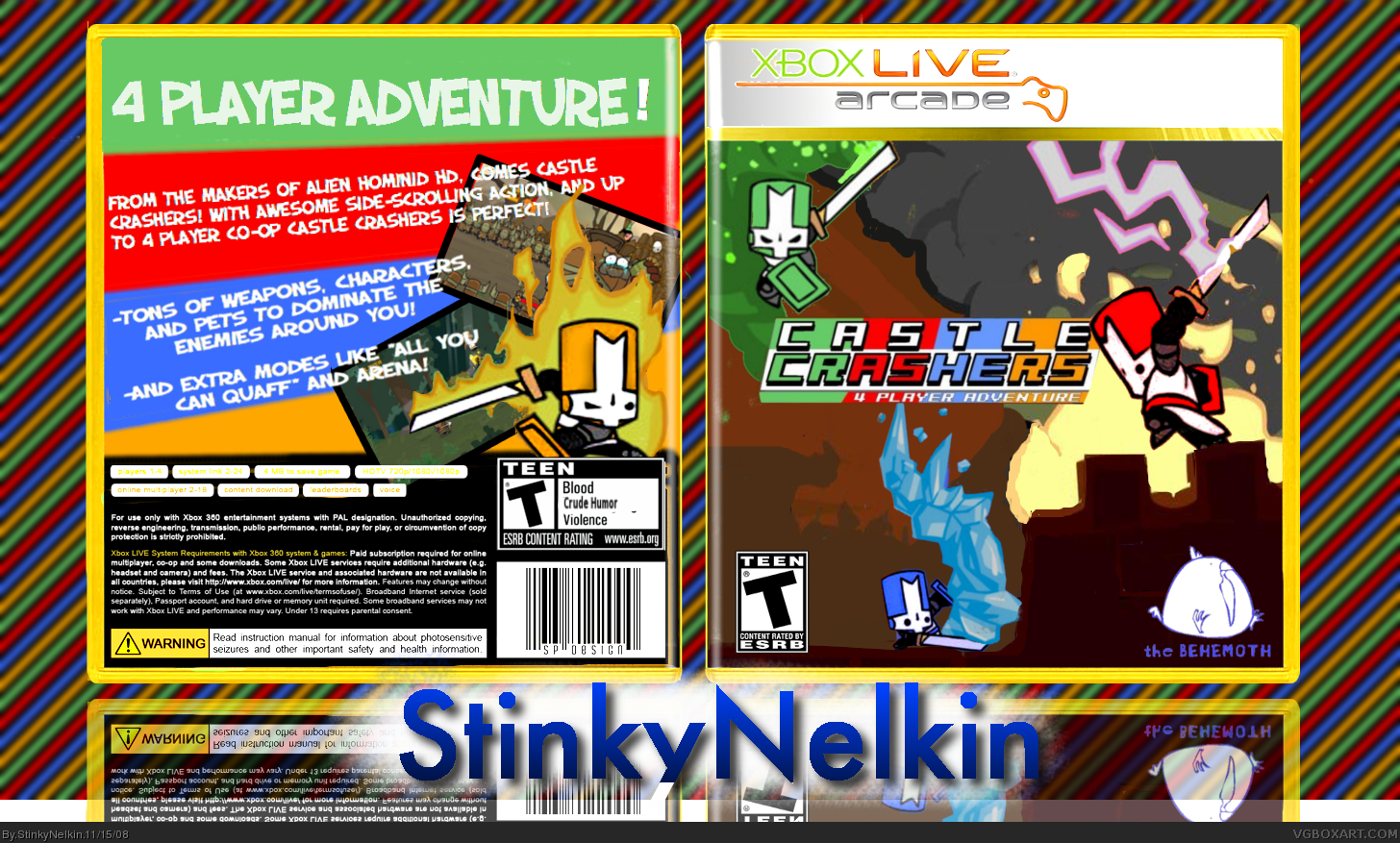
[ Buy Castle Crashers at Amazon ] By StinkyNelkin 31 on November 15th, 2008 No Printable Available [ Box updated on November 15th, 2008 ] [ original ] Castle Crashers Box Cover Comments Comment on StinkyNelkin's Castle Crashers Box Art / Cover. Cancel Reply StinkyNelkin 31 [ 1 decade ago ] Boom, Baby... Probably my best box. I really wanted to give it the "Feel" of the game. This Will probably be my last box with gimp, because I will most likely be using Pixelmator from now on. I made most of the things by myself, Minus the Esrb. Credit gos to El Crazy for his temp, which I edited. Enjoy! -Dylan Edited at 1 decade ago [ Reply ] CruSadEr 10 [ 1 decade ago ] It's pretty good, but the background drains out the color of the artwork itself. [ Reply ] StinkyNelkin 31 [ 1 decade ago ] Updated! [ Reply ] CruSadEr 10 [ 1 decade ago ] Now that's better. Let your work catch the viewer's attention! Some good stuff you got there, minus a few problemas of course. [ Reply ] StinkyNelkin 31 [ 1 decade ago ] #4, Care to elaborate? [ Reply ] CruSadEr 10 [ 1 decade ago ] It's nothing trifling, you really don't need to fix trivial things such as a black dot in the ESRB box. I'm sure people will like it. [ Reply ] StinkyNelkin 31 [ 1 decade ago ] #6, Thank You. And Lets just put our past fight behind us, eh? [ Reply ] CruSadEr 10 [ 1 decade ago ] #7, there was a fight? xD Sorry, you just forget about thes things after a while =/ [ Reply ] StinkyNelkin 31 [ 1 decade ago ] #8, You Are ~KG~, Right? [ Reply ] CruSadEr 10 [ 1 decade ago ] #9, Yuppers! =) [ Reply ] StinkyNelkin 31 [ 1 decade ago ] #10, Yeah, It was a while ago... Anyway, Lets stop with the convo :p [ Reply ] ~Pjtush~ 1 [ 1 decade ago ] Twinkle Twinkle little Boxart, I see you becoming a star! = fav! [ Reply ] RunawayRed 45 [ 1 decade ago ] In full view it's quite blurry. I think the text on the back needs a stroke, and the logo on the front needs to be bigger. Other than that I like the style of the box, nice work. [ Reply ] Skyrunner 33 [ 1 decade ago ] I like the back, but the front just seems sorta plain. [ Reply ] CubbieFan 32 [ 1 decade ago ] Dude, i realy like this. Back more so than the front, but i love how you got the feal of the game. +fav [ Reply ]
 Castle Crashers Box Cover Comments
Boom, Baby...
Probably my best box. I really wanted to give it the "Feel" of the game.
This Will probably be my last box with gimp, because I will most likely be using Pixelmator from now on.
I made most of the things by myself, Minus the Esrb. Credit gos to El Crazy for his temp, which I edited.
Enjoy!
-Dylan
Edited at 1 decade ago
[ Reply ]
It's pretty good, but the background drains out the color of the artwork itself.
[ Reply ]
Updated!
[ Reply ]
Now that's better. Let your work catch the viewer's attention! Some good stuff you got there, minus a few problemas of course.
[ Reply ]
#4, Care to elaborate?
[ Reply ]
It's nothing trifling, you really don't need to fix trivial things such as a black dot in the ESRB box. I'm sure people will like it.
[ Reply ]
#6, Thank You. And Lets just put our past fight behind us, eh?
[ Reply ]
#7, there was a fight? xD Sorry, you just forget about thes things after a while =/
[ Reply ]
#8, You Are ~KG~, Right?
[ Reply ]
#9, Yuppers! =)
[ Reply ]
#10, Yeah, It was a while ago... Anyway, Lets stop with the convo :p
[ Reply ]
Twinkle Twinkle little Boxart, I see you becoming a star! = fav!
[ Reply ]
In full view it's quite blurry. I think the text on the back needs a stroke, and the logo on the front needs to be bigger. Other than that I like the style of the box, nice work.
[ Reply ]
I like the back, but the front just seems sorta plain.
[ Reply ]
Dude, i realy like this. Back more so than the front, but i love how you got the feal of the game. +fav
[ Reply ]