Thats a hell of alot of blood XD nice anywyas..i'd suggest making the text another colour because its hard to read..other than that you got your hands on an awsome box.
nice buh i dont like the od bbfc logo, ps whed you get the Irish age ratings? been looking for 'em for ages, send me a link please,lso tis awesome, fav!
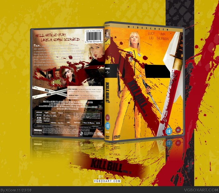
Synopsis text is horrible, can hardly read it and doesn't suit the theme at all, however the rest is pretty good, but the kill bill on the swords at the back is not needed. Love the front though, its really good and the image choices for the back are spot on, even though the boxes for them are a little odd, not sure whether I like that or not haha. Great effort though :)
 Kill Bill Vol. 1 Box Cover Comments
This box is made from %100 Pure Win.
[ Reply ]
The text on the back is hard to read... maybe make it black? Other than that... no visible issues.
[ Reply ]
I think you put wayy too much blood. It looks more like 300.
[ Reply ]
*favs*
[ Reply ]
Credit to Indexenos for plastic, and artwork, and credit to MARKER for the DVD template.
Also, credit to Star89er for help in some areas.
Expect Vol. 2 anytime soon.
[ Reply ]
#3, The official have alot of blood, so why can't I?
[ Reply ]
Thats a hell of alot of blood XD nice anywyas..i'd suggest making the text another colour because its hard to read..other than that you got your hands on an awsome box.
[ Reply ]
Looking good sir. I like how the blood is see through on the front.
[ Reply ]
Blood rules.
[ Reply ]
#2, I have to agree. This box is great, I think you'll rank up in no time.
[ Reply ]
this box is amazing
[ Reply ]
The reason the text is white, is because, when it's black, it doesn't blend in with the background/blood, and hence, more harder to read.
[ Reply ]
hey xcore, this box is pure awesomeness, and can you pm me markers template because i need a flat template, thanks!
Faved!
[ Reply ]
Sweet +fav
[ Reply ]
My eyes are hurting from the awesomeness rays this is emitting.
[ Reply ]
I've alwayys laughed at the line you have for a tagline :D nice job xcore!
[ Reply ]
very nice mate dont like the sword on the front.. and back's ok it just seems to be missing the wow effect!
+fav
[ Reply ]
#5, Expect a HoF soon!
[ Reply ]
Bloody awesome mate. Really stylish.
[ Reply ]
great work m8... fav :)
[ Reply ]
146+ my 6 points= hall of fame!!!! :D
[ Reply ]
Oh Tarentino, you make such family friendly movies.
[ Reply ]
#6, Im looking at the cover of the first and second kill bill covers right now and no blood.
[ Reply ]
#23 Look at the PAL versions and the Japanese uncut.
[ Reply ]
you should of made an overated box for this overated mov*shot* but this is an awesome bo*faints*
[ Reply ]
#25, Movie isn't overrated.. It's truely awesome. One of the best American Samurai movies.
Anyway, thanks for the HoF guys. Two HoFs in a matter of an hour, nice.
[ Reply ]
I dont care if i'm not helping it into the hall, i love this movie, this box and im gonna fave it
awesome work XCore
[ Reply ]
holy shit...
[ Reply ]
Damn.
[ Reply ]
Turned out great! ;)
[ Reply ]
Dang if you would have changed the background to a more yellow look on the back it would be epic. Great job.
[ Reply ]
nice buh i dont like the od bbfc logo, ps whed you get the Irish age ratings? been looking for 'em for ages, send me a link please,lso tis awesome, fav!
[ Reply ]
#32, I placed the old because:
1) Thats how ratings were at the time of the official KB: V1 release.
2) It comes with the template, I used.
I'll try to send you the ratings, later. I'm on my PS3 now..
[ Reply ]
Synopsis text is horrible, can hardly read it and doesn't suit the theme at all, however the rest is pretty good, but the kill bill on the swords at the back is not needed. Love the front though, its really good and the image choices for the back are spot on, even though the boxes for them are a little odd, not sure whether I like that or not haha. Great effort though :)
[ Reply ]
#34 Sypnosis text is like that on the official, and I can read, probably because I have a 1920x1080 monitor.
I added Kill Bill on the swords, as it looks terribly bland without, and just two slanted katanas.
[ Reply ]
I dont like have u have used the old 18 rating symbol..
[ Reply ]
Hmm, I like the idea used for this is pretty original, and I quite enjoy the colour of the blood.
[ Reply ]
I endorse this box going into MW.
[ Reply ]
nice
[ Reply ]