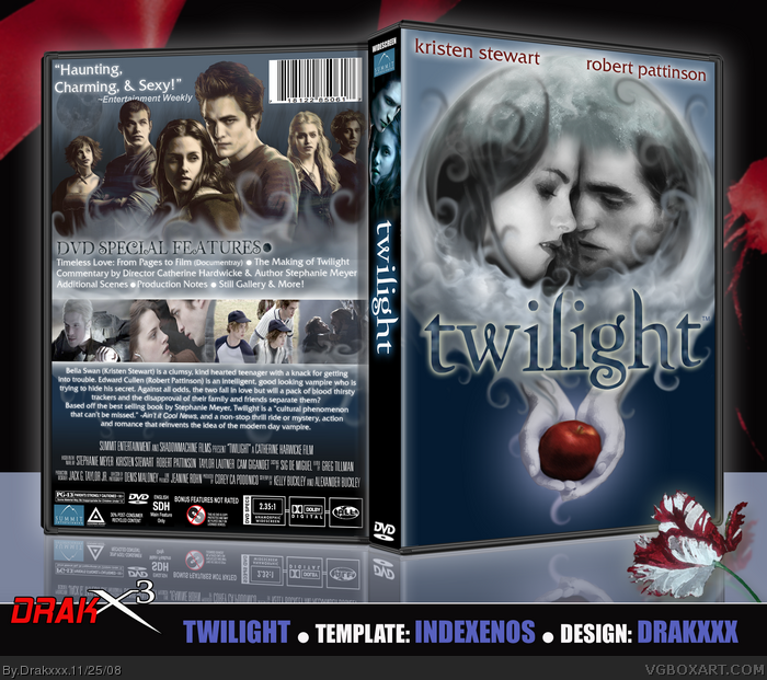
I designed the front of this DVD case as a custom book jacket for a friend who is a big fan of the Twilight books and film.
I thought it would be a good graphic design project to take the cover I created, and work it into a DVD design, so here it is.
I used a similar technique with the smoke/cloud effects on this one as I did on my Fallout 3 design, and I'm very pleased with the atmosphere I believe the smoke creates. Also, I did not draw this. :P
Thanks to everyone who supplied me with suggestions and feedback, especially the wonderful Mr. Marker.
I love how you combined an image from the movie with the image of the book cover. Really inventive design - what with the moon and the hands, and the contrast between blue/white/red.
Excellent front cover.
@#25, I'm guessing he messed around with the Contrast/brightness and hue/saturation. ;)
althought i pretty much hate twilight... this is a really attractive box--- the only thing i think i needs is to be darker and have higher contrast all around... but thats just my opinion.
#30, This movie isn't really that bad but the acting sucks considering Rob Pattinson REALLY can act (Watch Remember Me and you'll see what Im talking about"
#31, I 100% agree. I liked Rob Pattinson in the Remember Me, and also Kristian Stewart was also good in the Messengers, however this movie had horrible action play, scripting, acting, and also directing. I think this could have been so much better then it was.
Thanks guys. :) Yeah Rob Pattinson was pretty good in Remember Me, and Stewart was actually pretty good in this film called The Cake Eater, were she played a girl with a mental problem.
I believe you deserve to know what I think about this, taking into consideration that I loathe Twilight on levels that I can't even figure out how to elaborate.
This makes it actually look decent. I might even say that if I didn't know what it was, I might think it was good based on this.
 Twilight Box Cover Comments
Hey everyone,
I designed the front of this DVD case as a custom book jacket for a friend who is a big fan of the Twilight books and film.
I thought it would be a good graphic design project to take the cover I created, and work it into a DVD design, so here it is.
I used a similar technique with the smoke/cloud effects on this one as I did on my Fallout 3 design, and I'm very pleased with the atmosphere I believe the smoke creates. Also, I did not draw this. :P
Thanks to everyone who supplied me with suggestions and feedback, especially the wonderful Mr. Marker.
Enjoy folks!
[ Reply ]
:O you used official art XD nice box art dude :) i personally love the front.
[ Reply ]
*drools all over the keyboard, computer, house, and the united states*
...whoa. xD
[ Reply ]
Very nice box. lol, I kinda expected SilentMan to fav :P
[ Reply ]
Ew.
I still think the Harry Knowles quote is the best part, haha.
Edited at 1 decade ago
[ Reply ]
()
pussy.
[ Reply ]
Wow.
[ Reply ]
*Deleted*
(Double Post)
Edited at 1 decade ago
[ Reply ]
Dear God.
[ Reply ]
Greatness!
[ Reply ]
#6, WTF????
this boxart is a true example of pure, beautiful art. amazing job! 10/5 +fav, +author fav
[ Reply ]
hall of fame!...NOW!! xP
[ Reply ]
this is incredibility
[ Reply ]
beautiful :)
+fav
and dunno why i havent author faved yet but i will now :)
[ Reply ]
really nice!
[ Reply ]
Wow.
[ Reply ]
Thanks guys!
[ Reply ]
GOD DAMN!
[ Reply ]
Sick....
[ Reply ]
Turn out nice mate :)
[ Reply ]
Someone please pm that temp!
And Drakxxx This Box is beyond amazing!
its soo simple and well done!
faved
[ Reply ]
I love this movie, and this box...
5/5
[ Reply ]
I... love you...
[ Reply ]
Am....I in....Heaven?
*eats the box*
[ Reply ]
Fantastic work once again, my friend.
Do you mind telling me how you achieved that effect on the characters for the back? :]
[ Reply ]
the characters on the back look like they've had some of the old photo layer, which a touch of motion blur.
[ Reply ]
I love how you combined an image from the movie with the image of the book cover. Really inventive design - what with the moon and the hands, and the contrast between blue/white/red.
Excellent front cover.
@#25, I'm guessing he messed around with the Contrast/brightness and hue/saturation. ;)
Edited at 1 decade ago
[ Reply ]
#27 Thanks dm, and yes, I desaturated the color image and adjusted the hue saturation.
[ Reply ]
althought i pretty much hate twilight... this is a really attractive box--- the only thing i think i needs is to be darker and have higher contrast all around... but thats just my opinion.
[ Reply ]
Horrible movie = Amazing Box. ^^
[ Reply ]
#30, This movie isn't really that bad but the acting sucks considering Rob Pattinson REALLY can act (Watch Remember Me and you'll see what Im talking about"
But yeah Joel I really love this box.
[ Reply ]
#31, I 100% agree. I liked Rob Pattinson in the Remember Me, and also Kristian Stewart was also good in the Messengers, however this movie had horrible action play, scripting, acting, and also directing. I think this could have been so much better then it was.
Edited at 1 decade ago
[ Reply ]
Thanks guys. :) Yeah Rob Pattinson was pretty good in Remember Me, and Stewart was actually pretty good in this film called The Cake Eater, were she played a girl with a mental problem.
[ Reply ]
I believe you deserve to know what I think about this, taking into consideration that I loathe Twilight on levels that I can't even figure out how to elaborate.
This makes it actually look decent. I might even say that if I didn't know what it was, I might think it was good based on this.
[ Reply ]