Seriously, that is one AMAZING front man. I wish you did something about the little bit of text at the end of the synopsis paragraphs...but otherwise, it's a great back design as well. Outstanding design, my friend. :)
Yeah it's quality all around. The Mass Effect logo is ugly though. You should have used all of your talent and created a nice custom logo to go with this nice custom cover.
I don't like it. Never have. It clashes with the cover. It also clashes on the official cover. It looks like a tech font with some default Photoshop blending effects.
It gets the job done, even on the official. But I guess that's just your opinion though.
I was never a big fan of fancy logos, what's more important is that they match the theme of the game. And it's supposed to be a "tech font" considering the game's setting. As for the blending effects...aside from the stroke all I see is a bevel/emboss and a gradient overlay - no need to make it more complex than that.
 Mass Effect Box Cover Comments
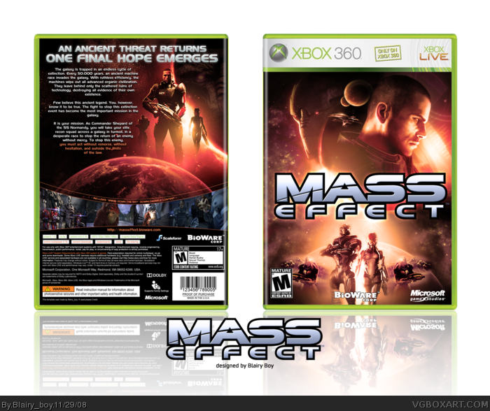
NEW BOX
love how the front turned out and am happy with the final version of the back, as i have gone through many versions to get the right feel!
[ Reply ]
Yay! Looks great. The front especially.
Edited at 1 decade ago
[ Reply ]
OMFG! Fav+
[ Reply ]
Woazerz +fav
[ Reply ]
this is really good I hope this goes in The Hall of Fame
[ Reply ]
damn...can you add a printable?
[ Reply ]
That's impressive. I love it.
[ Reply ]
Fantastic Double-B!
[ Reply ]
*faints*
Seriously, that is one AMAZING front man. I wish you did something about the little bit of text at the end of the synopsis paragraphs...but otherwise, it's a great back design as well. Outstanding design, my friend. :)
[ Reply ]
Yeah it's quality all around. The Mass Effect logo is ugly though. You should have used all of your talent and created a nice custom logo to go with this nice custom cover.
[ Reply ]
#10, "ugly"?
I think the official logo looks pretty damn good already. It's nice and simple, without all the extra junk logos usually have.
[ Reply ]
I don't like it. Never have. It clashes with the cover. It also clashes on the official cover. It looks like a tech font with some default Photoshop blending effects.
Edited at 1 decade ago
[ Reply ]
It gets the job done, even on the official. But I guess that's just your opinion though.
I was never a big fan of fancy logos, what's more important is that they match the theme of the game. And it's supposed to be a "tech font" considering the game's setting. As for the blending effects...aside from the stroke all I see is a bevel/emboss and a gradient overlay - no need to make it more complex than that.
[ Reply ]
That front...oh my goodness. Superb use of blending here my friend, I love it.
+AuthorFav
[ Reply ]
Hello. holy motherf- *dies*
[ Reply ]
Good gravy.
[ Reply ]
Holy mothershitballs....
[ Reply ]
This is absolutely fantastic. The back design blew my mind.
[ Reply ]
That looks Awsome
[ Reply ]
#10, i used the official logo because i like things looking as official as possible in my boxes!
thanks everyone for the comments and favs
Edited at 1 decade ago
[ Reply ]
#10, The Mass Effect logo rules, go home.
[ Reply ]
omg pass me the awsome
[ Reply ]
Probably my favorite box on this whole site.
[ Reply ]