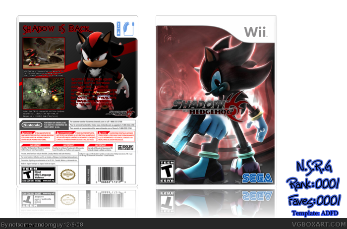
Hey, everybody! I'm new here, and I thought that I might go ahead and post a box. I tried my best, and please use constructive criticism!
Thanks, N.S.R.G.
P.S.
Please zoom in when you view.
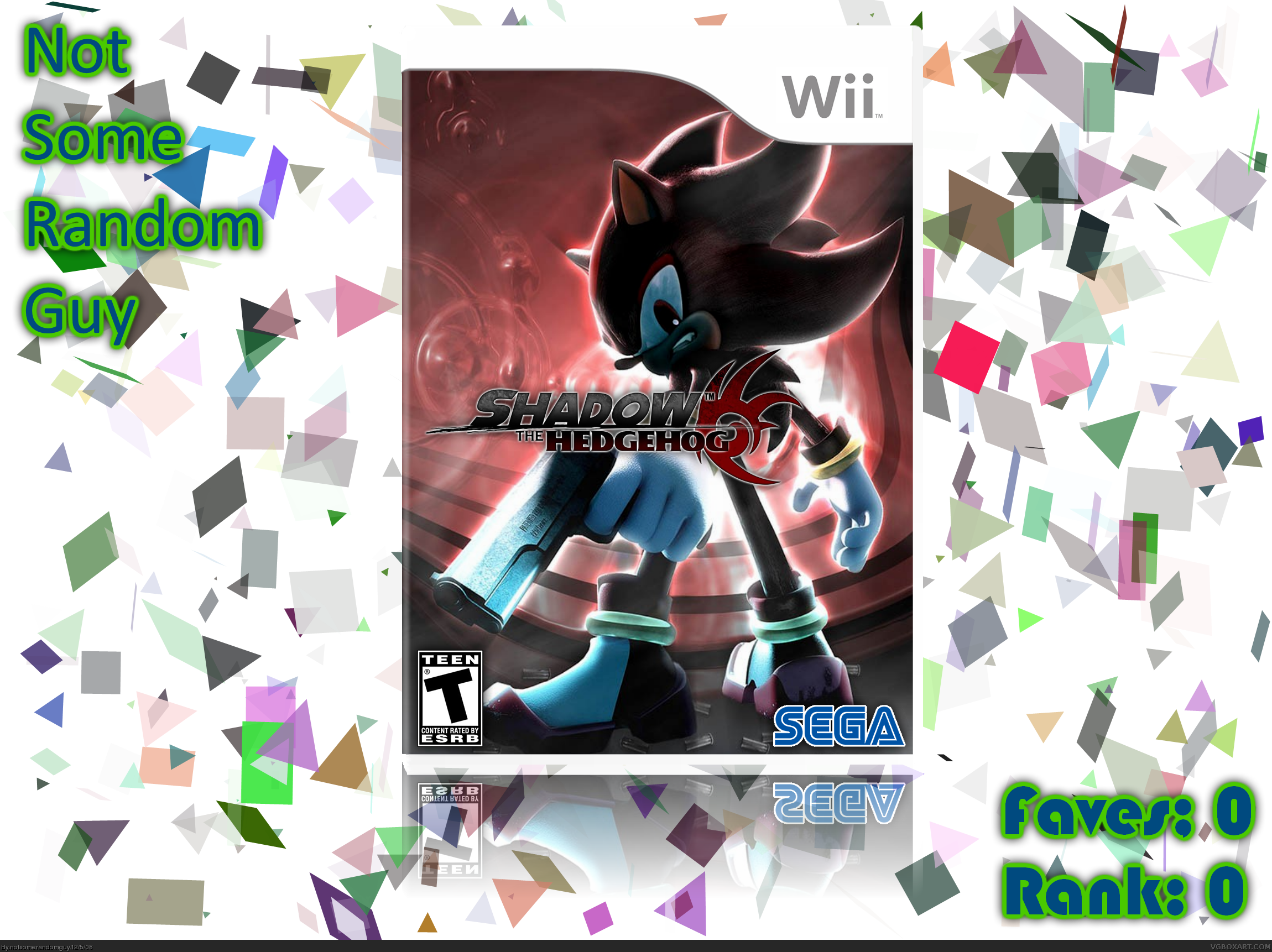
I updated, getting rid of the annoying confetti, slightly updating the reflexion, and changing the notsomerandomguy logo, along with the faves and rank parts.
#2, Thanks for your help, and hopefully, soon I might be able to get a little better background on the box.
Taking that confetti backdrop away makes this a lot better on a presentation level. The front is looking good, and as #4 mentions, it would be best to make a back for your box design rather then worry about a backdrop.
HORRIBLE! 0/5
Joking, buddy. I saw that you faved one of my boxes, and your screen name sort of pushed me to come to your page. When I saw that this was your first, I was amazed. You seem to already be WAY up there in skill. 4.5/5 and faved!
 Shadow the Hedgehog Box Cover Comments
Hey, everybody! I'm new here, and I thought that I might go ahead and post a box. I tried my best, and please use constructive criticism!
Thanks, N.S.R.G.
P.S.
Please zoom in when you view.
Edited at 1 decade ago
[ Reply ]
Kinda cool, not too new, visuals wise. At least your template and such is in good order.
I just found out this is your first, from the forums. That changes it. This is pretty good for a first!
I agree with Drakxxx, though, I'd do something other than that confetti-like design on the back.
Edited at 1 decade ago
[ Reply ]
I updated, getting rid of the annoying confetti, slightly updating the reflexion, and changing the notsomerandomguy logo, along with the faves and rank parts.
#2, Thanks for your help, and hopefully, soon I might be able to get a little better background on the box.
Edited at 1 decade ago
[ Reply ]
#3, It's fine even if you don't. I would rather see you work on a back for it.
[ Reply ]
this is very good for a new guy! :D
[ Reply ]
nice box. 5/5. fav.
[ Reply ]
Taking that confetti backdrop away makes this a lot better on a presentation level. The front is looking good, and as #4 mentions, it would be best to make a back for your box design rather then worry about a backdrop.
[ Reply ]
#6, Hay! You stole my old account's avatar!
[ Reply ]
I finally finished the update for the back. How does it look?
[ Reply ]
HORRIBLE! 0/5
Joking, buddy. I saw that you faved one of my boxes, and your screen name sort of pushed me to come to your page. When I saw that this was your first, I was amazed. You seem to already be WAY up there in skill. 4.5/5 and faved!
[ Reply ]
#8, sorry.
i thought you were gearblave. dude youve made like four accounts.
Edited at 1 decade ago
[ Reply ]
I love the simplicity of the back's design and the font you used for the info is pretty sweet looking. It's not perfect, but it is a great first.
I'll fav this partially on principal, mostly on skill and I hope to see more of your work soon!
[ Reply ]