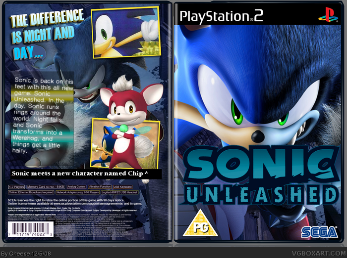
I like the front but I think you should make the sonic unleashed logo half light half dark. The back is rubbish though its just a couple of bictures on a stretched background. And I hate that template 2/5
Many things wrong with it.
The front is just basically the official but zoomed in on a different background
There is a PG logo on an American template
The Sega logo is choppy
The template is bad
The logo would of looked better in its original state
On the back, there is a render blocking half the screenshot
The whole "Sonic meets a new character" bit is uneeded
The top screenshot is just well... doesn't really tell you anything about the game does it?
The back text is poorly written. "Sonic Is Back On His Feet"?? What is that even suppose to mean?? "And Things Get A Little Hairy"?? Is that meant to be some sort of pun?
Anyway there are many things wrong with it but i'll still give it a 2/5
I like this pretty well, the top screenshot is pretty bad, Chip is covering the bottom screen, but other than that, pretty good. fix those things and I'll fav.
 Sonic Unleashed Box Cover Comments
Damn... >_>
[ Reply ]
You just took the one render on the official box and made it big enough to fit on the box...
[ Reply ]
I like the back though.
[ Reply ]
I don't really prefer the blue coloring for the logo, but the box overall is good.
[ Reply ]
Do you people not see the other boxes on this site? STRIVE for perfection, and give no less.
[ Reply ]
#5
That's a bit harsh don't you think?
Explain why you think that.
[ Reply ]
I like the front but I think you should make the sonic unleashed logo half light half dark. The back is rubbish though its just a couple of bictures on a stretched background. And I hate that template 2/5
[ Reply ]
Many things wrong with it.
The front is just basically the official but zoomed in on a different background
There is a PG logo on an American template
The Sega logo is choppy
The template is bad
The logo would of looked better in its original state
On the back, there is a render blocking half the screenshot
The whole "Sonic meets a new character" bit is uneeded
The top screenshot is just well... doesn't really tell you anything about the game does it?
The back text is poorly written. "Sonic Is Back On His Feet"?? What is that even suppose to mean?? "And Things Get A Little Hairy"?? Is that meant to be some sort of pun?
Anyway there are many things wrong with it but i'll still give it a 2/5
[ Reply ]
I like this pretty well, the top screenshot is pretty bad, Chip is covering the bottom screen, but other than that, pretty good. fix those things and I'll fav.
[ Reply ]