[ Box updated on December 6th, 2008 ] [ original ]
 Grand Theft Auto: San Andreas Box Cover Comments
Comment on master-chief-rocks-halo's Grand Theft Auto: San Andreas Box Art / Cover.
[ Box updated on December 6th, 2008 ] [ original ]
Comment on master-chief-rocks-halo's Grand Theft Auto: San Andreas Box Art / Cover.
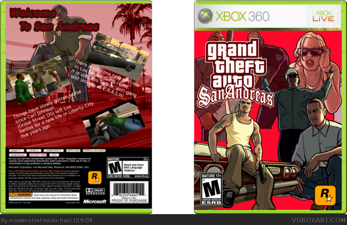
credit to techne for template
[ Reply ]
NNNIIIICEEEE
[ Reply ]
i don't lke the green color scheem 4/5, try red or blue
[ Reply ]
updated red scheme
[ Reply ]
It isn't that bad, but I'd suggest using a gradient rather than a solid color, like maybe fading from black to the red color scheme, that way you prevent some of the characters from looking like they're floating. Since of course, Big Smoke is in all senses of the work, floating.
[ Reply ]
ok better than mine
[ Reply ]