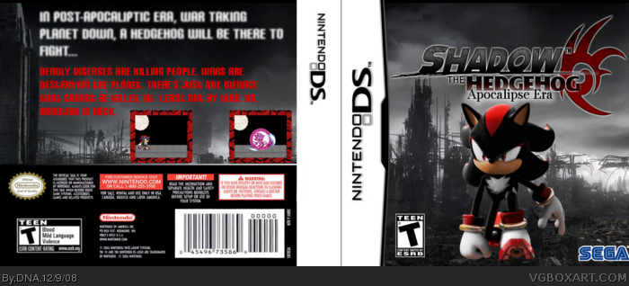
... really, no comments for this one. I think it's my best one, but... it really didn't came out as I expected. Anyway, enjoy. Ah! Credit Lord Arcanos for the logo (Photobucket, but as a few forum posts i've read, his new nick is Vengeance). And Sonic Art Archive for render, and Wallpaper Abyss for post apocaliptic bg. Now, Enjoy!
I didn't get it, was it supossed to be a insult? Actually my progress was fast! Compare... it passed less than a month and my boxes are WAY better than my first box.
Not bad...you should make the render and the bg blend and go together (youve got the positioning right but maybe the colour and contrast). Logo is a tad bit strenched, but I guess it's not a big deal. The back...add some renders and be a bit more creative with the text. 2.5/5
Front: Kinda plain, but nice looking. Needs a Sega logo where you have the Nintendo logo.
Spine: It's missing the game's logo.
Back: I don't like the description or the font choice. Since this is "Shadow the Hedgehog", the description has nothing to do with that game. I would have made up some sort of subtitle to make it a different game if it is one, like Shadow the Hedgehog: Apocalyptic Ruin or something similar. The font choice is bad due to the color, the red just doesn't set right with me, and the tagline is really blurry.
Now I like that you attempted original screens. It needs more work though, to make it feel authentic. Take a look at my Sonic: Team Battles boxes for examples of how to make them more authentic-looking.
I do agree that you have improved. Keep moving forward!
 Shadow the Hedgehog Box Cover Comments
It's decent, I'll give ya that.
[ Reply ]
... really, no comments for this one. I think it's my best one, but... it really didn't came out as I expected. Anyway, enjoy. Ah! Credit Lord Arcanos for the logo (Photobucket, but as a few forum posts i've read, his new nick is Vengeance). And Sonic Art Archive for render, and Wallpaper Abyss for post apocaliptic bg. Now, Enjoy!
[ Reply ]
this is realy nice. i like it, 4/5. fav.
[ Reply ]
O.o Chibi you're fast!
[ Reply ]
And rex, you're fast too! Thanks for fav and rate ^.^.
[ Reply ]
#4, yup! Ha ha ha. ;P You're getting better...slowly. :D
[ Reply ]
I didn't get it, was it supossed to be a insult? Actually my progress was fast! Compare... it passed less than a month and my boxes are WAY better than my first box.
[ Reply ]
Hummm.... You may think of this as a bump, but NO! It's a question: What do you think of summary and screenshots?
[ Reply ]
Not bad...you should make the render and the bg blend and go together (youve got the positioning right but maybe the colour and contrast). Logo is a tad bit strenched, but I guess it's not a big deal. The back...add some renders and be a bit more creative with the text. 2.5/5
[ Reply ]
#9, thanks, I will try to.
[ Reply ]
O.O That is perfect! I have never done such a perfect Box!!!
9'000000'00000/5 ^^" + fav
[ Reply ]
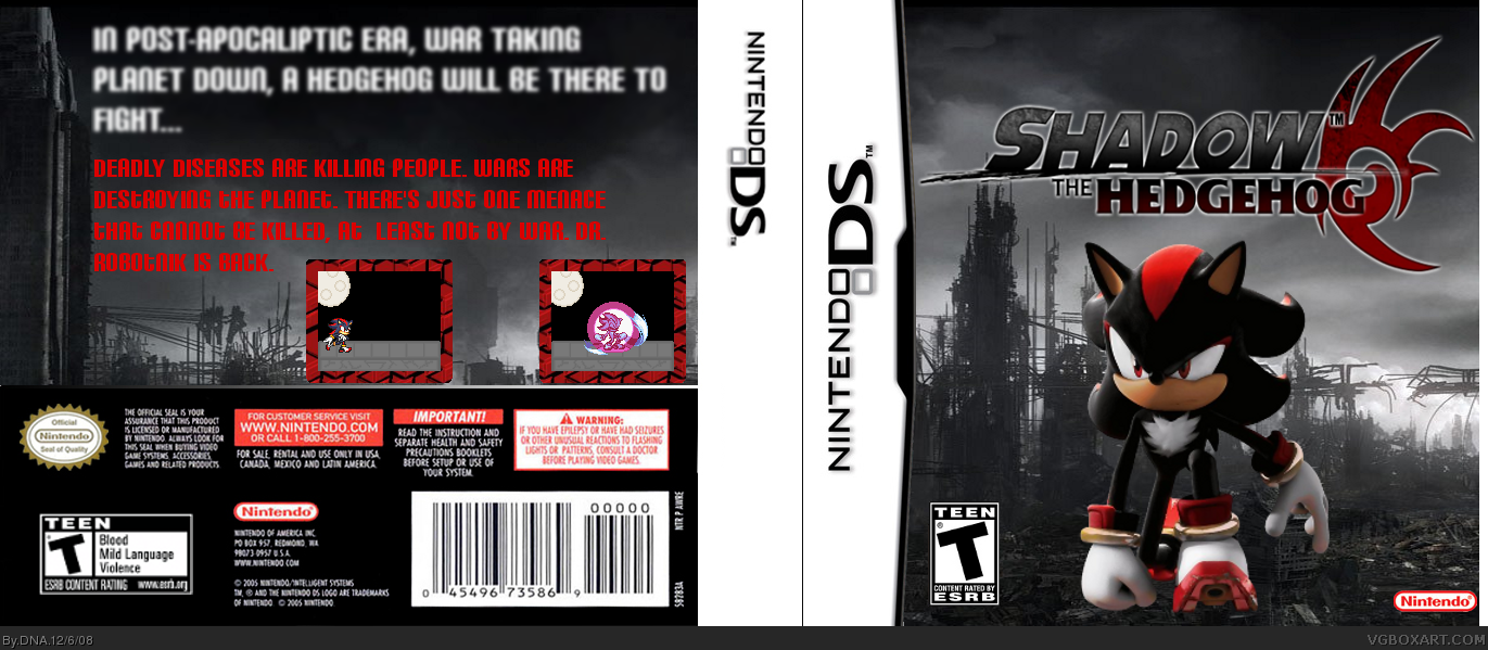
UPDATED! Corrected a minor flaw, there was a blank part on the temp, but now it isn't there anymore :-). Thanks for the Fav Wario 22 :-).
[ Reply ]
#7, no. What made you think that, DNA...? Ha ha ha. It's a compliment. ;)
[ Reply ]
Ah.. Ok... Anyway, comment on the box that is above you. And another thing... I'm rank 3!!!!!!
Edited at 1 decade ago
[ Reply ]
Okay, here's my take on it.
Front: Kinda plain, but nice looking. Needs a Sega logo where you have the Nintendo logo.
Spine: It's missing the game's logo.
Back: I don't like the description or the font choice. Since this is "Shadow the Hedgehog", the description has nothing to do with that game. I would have made up some sort of subtitle to make it a different game if it is one, like Shadow the Hedgehog: Apocalyptic Ruin or something similar. The font choice is bad due to the color, the red just doesn't set right with me, and the tagline is really blurry.
Now I like that you attempted original screens. It needs more work though, to make it feel authentic. Take a look at my Sonic: Team Battles boxes for examples of how to make them more authentic-looking.
I do agree that you have improved. Keep moving forward!
[ Reply ]
Oks... trying to update it, ok?
[ Reply ]
UPDATED! Apocalipse Era logo added, and Sega logo added. I know it's kinda boring (the AE logo) but... don't think in that.
[ Reply ]
This is pretty good. 4.5/5 Nice job! :D
[ Reply ]