Let me get this out of the way, I worked REALLY really Hard on this one. Considering I use Powerpoint, it wasn't too easy. Luckily, a lot of the features Photoshop has like texture importing, can be found by searching through some of the options. And to those wondering, I use PP 2008, so it's pretty advanced.
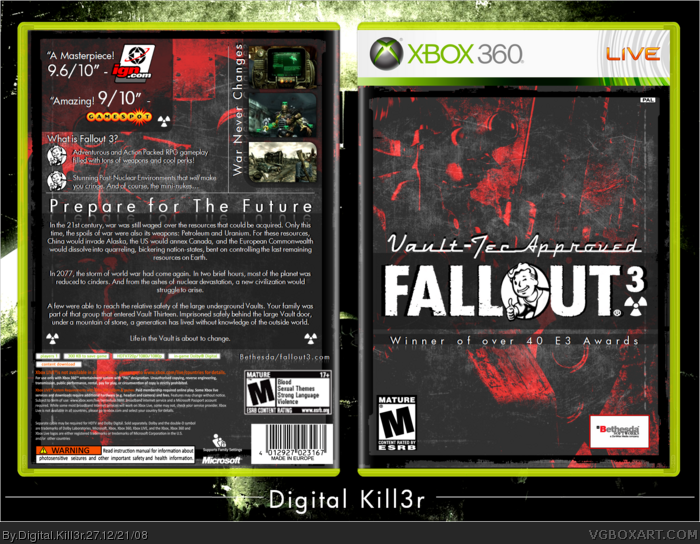
But onto the box. I kind of got a little ill from seeing EVERY Fallout 3 using the same colors and wallpapers, so I went off the beaten track and came up with this. I was inspired by 2 things: Bioshock, and Gears of War 2. I think you can see where the inspiration for those 2 toke place in my box. And sorry about the Bethseda logo, I couldn't find a good render of it.
So yeah, comments and such are much appreciated and *I love you guys
I like the logo, but the red contrast is so extreme I can hardly tell its the armored soldier from the game. It just looks like an abstract background. I like the red contrast but you might want to tone it down some maybe, so we can see the imagery. Also the legal info gets lost on the dark background. if it's possible to make that text white (you might have to re-type it) that would look a lot better.
#2 No I thnk that its okay, if its such a HUGE deal, I'll fix it. And for the back leagl info, I'm just going to get Indexnos's new back and fix it in the next update.
I added: Two Reviews, 3 Gameplay Pictures, and other things.
What I couldn't fix was the legal info. I didn't like the front of Indexnos' new temp, and the back case didn't match the front case. Oh well? Not just yet. When Indexnos (or someone else with a better temp) fixes his, I'll fix the legal info problem. Ok?
Well looking at it again, the abstract super red contrast is starting to grow on me as a design, but I personally don't care for the giant review scores on the front. Maybe making them smaller and towards the bottom would help. They're really distracting. the screenshots on the back are a bit small, but I like how they're set up.
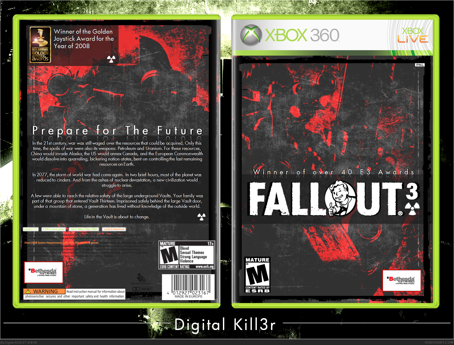
Got a better temp from Indexnos with WHITE Legal Text, put the reviews on the back, and Reduced the SUPER Red Contrast. I think Drakxxx will be pleased. :)
Dude, please. I know you're excited, but 14 out of 29 comments here are yours, you've even triple-posted twice. Anyways, it goes without saying, bumping in any form is frowned upon.
The front and back is over contrasted, it blocks a lot view in the box.Also,the red color is a bit dull and it looks more like a tank than a guy to me in the front. Overall it pretty good.
Lots of people (inc. me) work hard on boxes, and hope for the hall, and if it doesnt get in then theres not a lot you can do.
And those people dont bump their own boxes. They try to get it in honestly.
All you've done is just bump and bump.
And if he can get away with it why cant the rest of us.
Granted, its a great box, but... th bumping :(
Well im off to bump some of my old boxes repetedly to get them in the hall.
 Fallout 3 Box Cover Comments
Let me get this out of the way, I worked REALLY really Hard on this one. Considering I use Powerpoint, it wasn't too easy. Luckily, a lot of the features Photoshop has like texture importing, can be found by searching through some of the options. And to those wondering, I use PP 2008, so it's pretty advanced.
But onto the box. I kind of got a little ill from seeing EVERY Fallout 3 using the same colors and wallpapers, so I went off the beaten track and came up with this. I was inspired by 2 things: Bioshock, and Gears of War 2. I think you can see where the inspiration for those 2 toke place in my box. And sorry about the Bethseda logo, I couldn't find a good render of it.
So yeah, comments and such are much appreciated and *I love you guys
*Just kidding, lol
Edited at 1 decade ago
[ Reply ]
I like the logo, but the red contrast is so extreme I can hardly tell its the armored soldier from the game. It just looks like an abstract background. I like the red contrast but you might want to tone it down some maybe, so we can see the imagery. Also the legal info gets lost on the dark background. if it's possible to make that text white (you might have to re-type it) that would look a lot better.
Edited at 1 decade ago
[ Reply ]
really good 5/5 +fav
[ Reply ]
Put screenshots over Prepare for the Future.
[ Reply ]
I love the front except what happened to the back, its just text and plain. It's really good though.
[ Reply ]
Ace dude.
[ Reply ]
#2 No I thnk that its okay, if its such a HUGE deal, I'll fix it. And for the back leagl info, I'm just going to get Indexnos's new back and fix it in the next update.
And thanks for the comments guys!
[ Reply ]
UPDATE!!!!!
I added: Two Reviews, 3 Gameplay Pictures, and other things.
What I couldn't fix was the legal info. I didn't like the front of Indexnos' new temp, and the back case didn't match the front case. Oh well? Not just yet. When Indexnos (or someone else with a better temp) fixes his, I'll fix the legal info problem. Ok?
[ Reply ]
Any suggestions on the update?
[ Reply ]
Well looking at it again, the abstract super red contrast is starting to grow on me as a design, but I personally don't care for the giant review scores on the front. Maybe making them smaller and towards the bottom would help. They're really distracting. the screenshots on the back are a bit small, but I like how they're set up.
[ Reply ]
I'm liking the black/red design, but the IGN and Gamespot reviews on the front are way too big.
[ Reply ]
UPDATE!!!!!! AGAIN11111
Got a better temp from Indexnos with WHITE Legal Text, put the reviews on the back, and Reduced the SUPER Red Contrast. I think Drakxxx will be pleased. :)
[ Reply ]
Very nice update, I'm liking this one a lot.
[ Reply ]
You got it sir. Looking good, and a nice variation of your typical Fallout 3 box. +fav.
[ Reply ]
holy crap, powerpoint? fav
[ Reply ]
i see you put a lot of hours/days into this and for that +fav
really good i love your style. im a sucker for unique box's
+fav
+author
[ Reply ]
Thanks guys!
[ Reply ]
#15 Yeah, PowerPoint...
[ Reply ]
Only 18 more points lol
[ Reply ]
You used POWERPOINT?!
...
If I could fave this twice, I would.
[ Reply ]
#20 lol thanks
just 15 now lol
Edited at 1 decade ago
[ Reply ]
It was 130 for HoF right?
[ Reply ]
#22, it's 120 and great job,better than mine!
[ Reply ]
#23 If that's true, this should be in the Hall because it has 121...yeah, just ONE. lol
[ Reply ]
Actually, it's 150.
[ Reply ]
i've seen boxes, including mine, get in after 130...
this has 113. i doubled checked.
Edited at 1 decade ago
[ Reply ]
#25Well then I got 41 more points to go :(
Edited at 1 decade ago
[ Reply ]
#26 Oh, then I only need about 17. coooooool
#29 Why does it concern you? Am I stealing your spotlight? lol jk.
Edited at 1 decade ago
[ Reply ]
Dude, please. I know you're excited, but 14 out of 29 comments here are yours, you've even triple-posted twice. Anyways, it goes without saying, bumping in any form is frowned upon.
[ Reply ]
I've updated once more for a boost....against Brettska lol
[ Reply ]
The front and back is over contrasted, it blocks a lot view in the box.Also,the red color is a bit dull and it looks more like a tank than a guy to me in the front. Overall it pretty good.
[ Reply ]
#31 You think THIS is over contrasted? Check out v1 lol.
[ Reply ]
Holy crap! That...is incredible.
[ Reply ]
you tricked me...i clicked
good box through
[ Reply ]
My friends, history has been made. For this is the FIRST PowerPoint box inducted to the HoF!
Thanks guys for the honor!
Edited at 1 decade ago
[ Reply ]
shouldn't this be in the hall now? Its got enough points.
EDIT: Oh it is now,
congratulations mate!
Edited at 1 decade ago
[ Reply ]
Lots of people (inc. me) work hard on boxes, and hope for the hall, and if it doesnt get in then theres not a lot you can do.
And those people dont bump their own boxes. They try to get it in honestly.
All you've done is just bump and bump.
And if he can get away with it why cant the rest of us.
Granted, its a great box, but... th bumping :(
Well im off to bump some of my old boxes repetedly to get them in the hall.
[/endrant]
Edited at 1 decade ago
[ Reply ]
congrats on hall of fame, it's a really nice box.
[ Reply ]
tis awesome to the maxxx fav!!!
[ Reply ]
Oh my gosh guys, it was made in POWERPOINT! =O
[ Reply ]
#40, i no rite.
DK, you're my new hero, man.
[ Reply ]
#41 Thanks for the sarcasm. lol
[ Reply ]
serious you did this with power point amazing work
[ Reply ]
I'd say it's time to get photoshop for you :P [/jk]
Great box!
[ Reply ]
great box.... but... vault 13, wasn't that fallout 1?
[ Reply ]