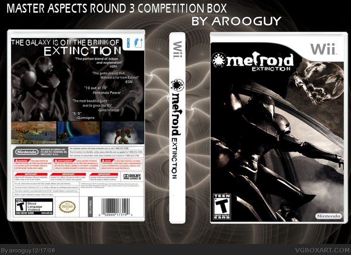
My Master Aspects Round 3 competition entry. I didn't put a description or anything because the theme of the competition was kind of a teaser box. Comments & criticism are welcome. You can vote here: link
Hmm, I like the over all feeling it gives me. Dark, dreary, etc. However, black with hints of copperish brown is just not Metroid to me, perhaps Zelda, but not Samus, space traveling, monster ass kicking Metroid to me.
 Metroid Extinction Box Cover Comments
My Master Aspects Round 3 competition entry. I didn't put a description or anything because the theme of the competition was kind of a teaser box. Comments & criticism are welcome. You can vote here: link
Edited at 1 decade ago
[ Reply ]
Hmm, I like the over all feeling it gives me. Dark, dreary, etc. However, black with hints of copperish brown is just not Metroid to me, perhaps Zelda, but not Samus, space traveling, monster ass kicking Metroid to me.
[ Reply ]
good monochrome look. stylish. like it.
[ Reply ]
Very nice style. It has a particular feel that really reminds me of all things Metroid. Great job!
[ Reply ]
nice cover, just i don't like the change in font sizes, it just doesn't work with the streamlined look of the rest of your box, but still good
[ Reply ]
Thanks.
[ Reply ]
I really like the front. Back could be a bit more polished, but I like the flow of text there. Good job.
[ Reply ]
The back is beyond awesome! The back... not even close..
But this is so going in my bcket-o-faves anyway.
[ Reply ]