Much better than my first. You actually made a back too, which you usually don't see on first boxes unless that artist is going to be awesome later on. Good job :)
The ninendo-logo is almost invisible and you did use the smae two images on both back and front. you also used a pretty easy way to avoid cutting-out the characters and logos. nothing bad with that but luigi is looking like a ghost due to that (he is somewhat transparent and glowing). unwanted parts were removed with a smooth brush, so luigi is missing his fingers on the back and some of his cap on the front.
Its pretty nice.
The logo could use a little work, the back ESRB is a little stretched, The box should have a tagline, I don't like how Luigi is sort of transparent, make him fully visible.
Don't be mad or intimidated by all the things that should be changed by myself and other users, were just trying to help you so this might be able to be in the HoF.
Its very nice though. I'm sorry, I won't fav it though. It needs a little work before I could.
Here I am clicking on "Luigi's Mansion DS" expecting it to be some crap, spam box... and I was wrong.
 Luigi's Mansion DS Box Cover Comments
My first box. I'm pretty happy with how it turned out.
[ Reply ]
for a first box, this is pretty good. :)
[ Reply ]
Much better than my first. You actually made a back too, which you usually don't see on first boxes unless that artist is going to be awesome later on. Good job :)
Edited at 1 decade ago
[ Reply ]
not true. some just don't get better.
[ Reply ]
Looks pretty good, especially for a first.
[ Reply ]
Looks like a real box to me XD
[ Reply ]
I actually like it. Great first.
[ Reply ]
What #2,#3,#4,#5 & #6 said... lol
It is really good... cannot wait to see your boxes in the future
[ Reply ]
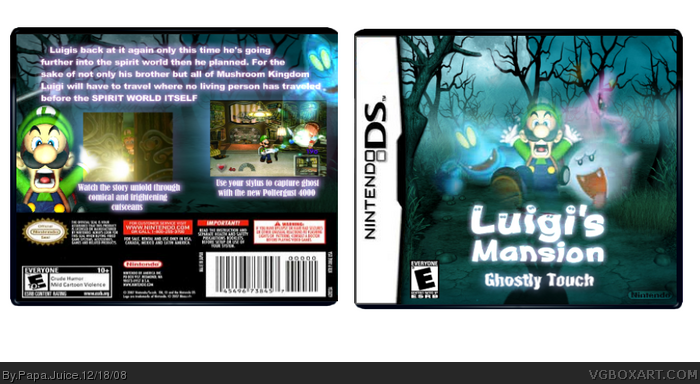
The ninendo-logo is almost invisible and you did use the smae two images on both back and front. you also used a pretty easy way to avoid cutting-out the characters and logos. nothing bad with that but luigi is looking like a ghost due to that (he is somewhat transparent and glowing). unwanted parts were removed with a smooth brush, so luigi is missing his fingers on the back and some of his cap on the front.
it's good for a first one though.
Edited at 1 decade ago
[ Reply ]
Its pretty nice.
The logo could use a little work, the back ESRB is a little stretched, The box should have a tagline, I don't like how Luigi is sort of transparent, make him fully visible.
Don't be mad or intimidated by all the things that should be changed by myself and other users, were just trying to help you so this might be able to be in the HoF.
Its very nice though. I'm sorry, I won't fav it though. It needs a little work before I could.
Here I am clicking on "Luigi's Mansion DS" expecting it to be some crap, spam box... and I was wrong.
[ Reply ]