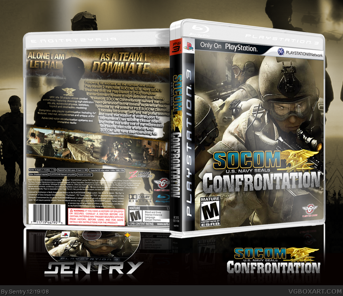
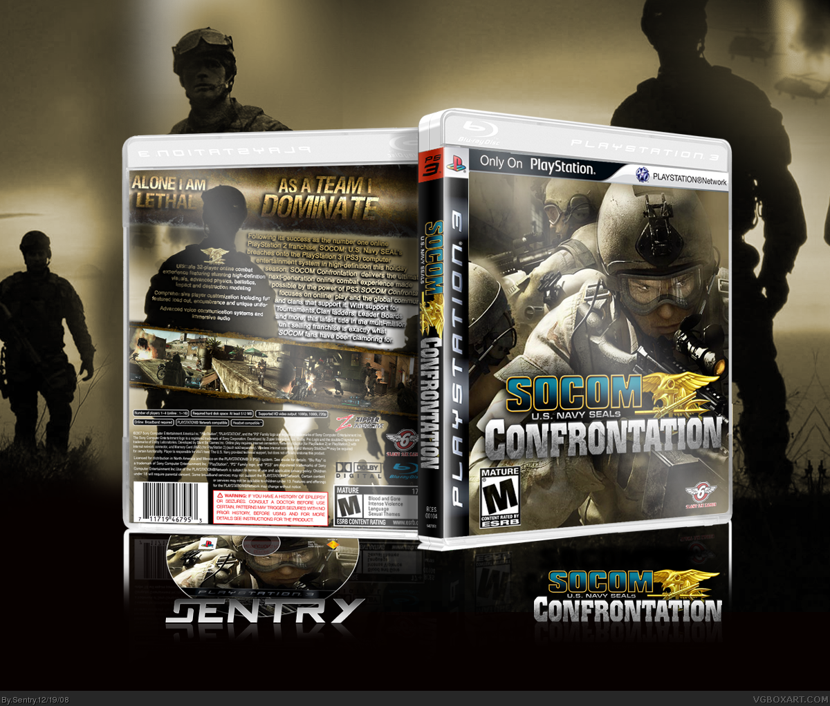
[ Buy SOCOM: Confr... at Amazon ] » 2008 Hall of Fame Winner! By Sentry 45 on December 19th, 2008 No Printable Available [ Box updated on December 19th, 2008 ] [ original ] SOCOM: Confrontation Box Cover Comments Comment on Sentry's SOCOM: Confrontation Box Art / Cover. Cancel Reply Drakxxx 46 [ 1 decade ago ] Sharp as a tack sir, and so darn official looking! [ Reply ] goku252525 42 [ 1 decade ago ] Cool! i see you made a 3d version of that 2d temp and it looks great:D [ Reply ] aC.Sleet 25 [ 1 decade ago ] WOW. [ Reply ] sd1833 48 [ 1 decade ago ] Very cool design and layout on the back. [ Reply ] XCore 42 [ 1 decade ago ] Thats a very tacking skew/reflection you got there. Back Has too much text. It's look quite cluttered up. Front looks nice. Edited at 1 decade ago [ Reply ] Sentry 45 [ 1 decade ago ] #5, Yea, I really suck at 3D reflections. #7, I'll try that next time. Edited at 1 decade ago [ Reply ] XCore 42 [ 1 decade ago ] #6, Use perspective. Thats what I use. Don't skew for 3D reflections. It'll end up scaled and off angled. [ Reply ] ClonedX 35 [ 1 decade ago ] freaking sweet. my only complaints is the "I" on the tagline ( as a team "I") it would look better if it had the same direction than the other letters. Still, amazing job Edited at 1 decade ago [ Reply ] Spiderpig24 48 [ 1 decade ago ] Incredible, deserves HOF. +fav [ Reply ] DemonLord555 15 [ 1 decade ago ] Awesome box. Too bad the actual game wasn't as good as this. :( [ Reply ] Ladykiller 42 [ 1 decade ago ] Looks very official as Joel said. Though the back has a bit too much text and some awkwardly positioned taglines. Otherwise, awesome job. ;) [ Reply ] shadysaiyan 42 [ 1 decade ago ] Sleeeeeeeeeeeeeeeeek! [ Reply ] XxSAV!ORxX 4 [ 1 decade ago ] This is pretty cool. I like the inclusion of the disk as well as the 3D effect. [ Reply ] Skyrunner 33 [ 1 decade ago ] Beautiful. [ Reply ] Skyrunner 33 [ 1 decade ago ] Beautiful. [ Reply ] wii13 5 [ 1 decade ago ] Awsome! your first HoF! 5/5+favourite [ Reply ] Karma 33 [ 1 decade ago ] #16, o.0 [ Reply ]
 SOCOM: Confrontation Box Cover Comments
Sharp as a tack sir, and so darn official looking!
[ Reply ]
Cool! i see you made a 3d version of that 2d temp and it looks great:D
[ Reply ]
WOW.
[ Reply ]
Very cool design and layout on the back.
[ Reply ]
Thats a very tacking skew/reflection you got there.
Back Has too much text. It's look quite cluttered up. Front looks nice.
Edited at 1 decade ago
[ Reply ]
#5, Yea, I really suck at 3D reflections.
#7, I'll try that next time.
Edited at 1 decade ago
[ Reply ]
#6, Use perspective. Thats what I use. Don't skew for 3D reflections. It'll end up scaled and off angled.
[ Reply ]
freaking sweet.
my only complaints is the "I" on the tagline ( as a team "I") it would look better if it had the same direction than the other letters.
Still, amazing job
Edited at 1 decade ago
[ Reply ]
Incredible, deserves HOF. +fav
[ Reply ]
Awesome box. Too bad the actual game wasn't as good as this. :(
[ Reply ]
Looks very official as Joel said. Though the back has a bit too much text and some awkwardly positioned taglines. Otherwise, awesome job. ;)
[ Reply ]
Sleeeeeeeeeeeeeeeeek!
[ Reply ]
This is pretty cool. I like the inclusion of the disk as well as the 3D effect.
[ Reply ]
Beautiful.
[ Reply ]
Beautiful.
[ Reply ]
Awsome! your first HoF! 5/5+favourite
[ Reply ]
#16, o.0
[ Reply ]