well, i was watching some trailers and i saw the one for this movie and it looks cool so i made a box. there's not much material but i did the best i could. :)
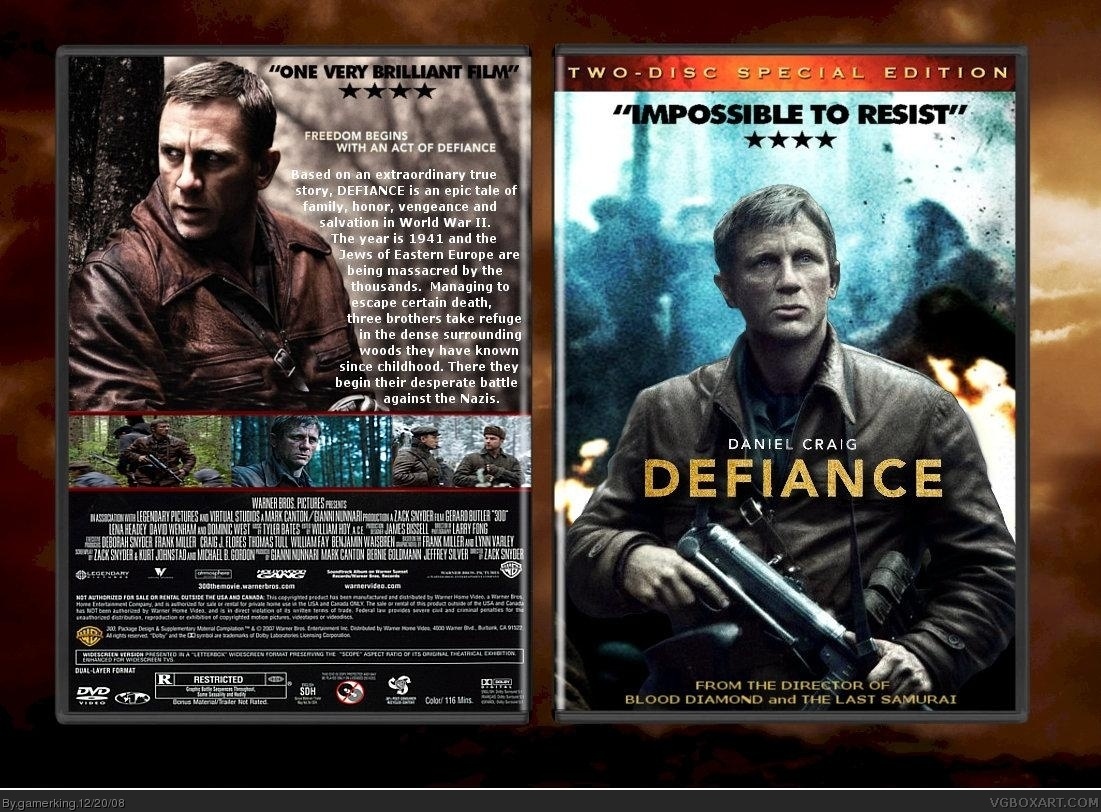
Pretty good! I like the grainy texture of the front. But the typography on the back isn't very good. The wrapping isn't perfect and spills out towards the end. Try a more suitable font too and try make the tagline a little bigger next time. ;)
Never heard of the movie, this box is really nice. Fix up the type (doesn't GIMP have paragraph formatting for text?) and another fav will come from me.
both versions looks exactly the same.
The screens on the back go into the outside of the template and its nothing different from your usual boxes but its still quite good.
and no they're not! lol. and maybe that's just my style? all of elcrazy's boxes look similar with the amazing the text on the back. should he change his style? noooooooooo. xD
#25 no he shouldn't but ( IMO ) he's the 2nd best boxartist on the website so... you know! I'm not saying you should change your style, just make one really original box.

 Defiance Box Cover Comments
yay! new box! lol.
well, i was watching some trailers and i saw the one for this movie and it looks cool so i made a box. there's not much material but i did the best i could. :)
enjoy! :D
[ Reply ]
Looks really good. :)
First Fav+
[ Reply ]
Love it
[ Reply ]
i like it
+fav
[ Reply ]
Its not amazingly spectacular but its very official looking + fav
[ Reply ]
Love the front, but the back..... your screens look the same as on your sweeny box. Still like it though, +fav
[ Reply ]
Your best, needs more attention!
[ Reply ]
Pretty good! I like the grainy texture of the front. But the typography on the back isn't very good. The wrapping isn't perfect and spills out towards the end. Try a more suitable font too and try make the tagline a little bigger next time. ;)
[ Reply ]
thanks guys!
and yes, i know. i have terrible typography skills. lol.
hey elcrazy...wanna help me out? xD
[ Reply ]
I like it, but it looks like the main guy on the front doesn't belong in the pic, but the back is great, so fav!
[ Reply ]
This looks really good. +fav
[ Reply ]
YES YES YES!
[ Reply ]
Never heard of the movie, this box is really nice. Fix up the type (doesn't GIMP have paragraph formatting for text?) and another fav will come from me.
[ Reply ]
good. grainy. good.
Edited at 1 decade ago
[ Reply ]
This is really good. Probably your best.
[ Reply ]
thanks guys! :D
[ Reply ]
again, the typography isn't the best, but it's not horrible. good box overall
[ Reply ]
thanks. and yes, i'm going to change the typography. lol.
[ Reply ]
#5, I disagree. IMO it really doesn't look official at all. Especially the text on the back.
I know it's the most classic way to place screenshots, but find a different arrangement for the screens.
[ Reply ]
umm...okay then...
i like the screens like that though, so i'm gonna keep them that way.
Edited at 1 decade ago
[ Reply ]
both versions looks exactly the same.
The screens on the back go into the outside of the template and its nothing different from your usual boxes but its still quite good.
[ Reply ]
1: the first version had a white line at the bottom of the orangy background so i removed that for version 2.
2: the screens don't go out of the template. :)
[ Reply ]
Like Tim says, everything is in place except that pesky description text. Your so close to doing an acceptable back...so darn close.
[ Reply ]
#22 it does it goes round the template onto the shiny bit :p
You should try something different, your boxes are a bit to similar.
[ Reply ]
thanks joel.
and no they're not! lol. and maybe that's just my style? all of elcrazy's boxes look similar with the amazing the text on the back. should he change his style? noooooooooo. xD
[ Reply ]
Yea your style has done good, just look at your HOFs. :D
[ Reply ]
thanks weezer. :)
and i've put the update on hold so i can continue working on my Resident Evil box, then i'll update the typography.
[ Reply ]
This movie is going to be soooo good, I'm not even kidding you right now.
Good box too. d^_^
[ Reply ]
#25 no he shouldn't but ( IMO ) he's the 2nd best boxartist on the website so... you know! I'm not saying you should change your style, just make one really original box.
[ Reply ]
great job, like the box
[ Reply ]
thanks #28, and #30. :D
i might come back to this box later. been busy with other boxes. xD
Edited at 1 decade ago
[ Reply ]