I like this, the front is very nice.. A different step from all the other Dark Knight boxes.. so nice job on that. The back is a more interesting look, I think because you used more color.. both ways, I like this.. +Fav
This is a very well thought out cover. the only thing i'd had done differentlly is darken the dark knight logo a bit. it's almost too bright and draws your attention from the joker's face. Other than that great job and keep it up!
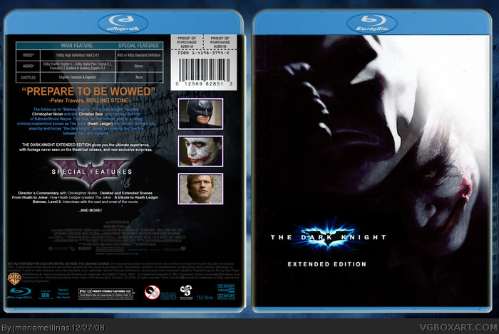
 The Dark Knight Extended Edition Box Cover Comments
So here it is: The Dark Knight Extended Edition ;)
[ Reply ]
the front is good :)
the back could do with something else- its practically all text at the moment.
[ Reply ]
Y SO SRS?
Cmon, people, at least the front uses some different art.
[ Reply ]
This isn't very fair.. no comments..
I like this, the front is very nice.. A different step from all the other Dark Knight boxes.. so nice job on that. The back is a more interesting look, I think because you used more color.. both ways, I like this.. +Fav
[ Reply ]
This is a very well thought out cover. the only thing i'd had done differentlly is darken the dark knight logo a bit. it's almost too bright and draws your attention from the joker's face. Other than that great job and keep it up!
[ Reply ]
can you make a printable
[ Reply ]