[ Buy 007: Quantam... at Amazon ] By a-beast-of-art 39 on December 27th, 2008 No Printable Available 007: Quantam of Solace Box Cover Comments Comment on a-beast-of-art's 007: Quantam of Solace Box Art / Cover. Cancel Reply a-beast-of-art 39 [ 1 decade ago ] What I was going for with this box is that sleek and stylish feel of the 007 movies/games. I hope that I achived that with this box. Enjoy! [ Reply ] paper sonic 37 [ 1 decade ago ] very nice [ Reply ] Skyrunner 33 [ 1 decade ago ] Pretty cool. +fav [ Reply ] Firebrand 35 [ 1 decade ago ] all I don't like is the unbondiness of the gun on the front. What about the 7 gun from the logo? +fav,cause it is sleek and stylish. [ Reply ] Ray Blade 40 [ 1 decade ago ] Awesome design, but I think It'd have been better with a tan theme instead of gray. [ Reply ] Squall234 44 [ 1 decade ago ] I like the idea, like it's from the the opening sequence from the movie. Amazing job 4.5/5 [ Reply ] Digital Kill3r 27 33 [ 1 decade ago ] I'm pretty sure that the Bond on the front is Pierce Brosnan, not Daniel Craig. Edited at 1 decade ago [ Reply ] YoshiStar 46 [ 1 decade ago ] Very Stylish. Wish the font used on the back was different, though. And the bullets had a space before the text (the features bit) [ Reply ] Drakxxx 46 [ 1 decade ago ] Slick design man. Looks pretty darn sharp! [ Reply ] a-beast-of-art 39 [ 1 decade ago ] Hey, thanks soooo much guys!!! [ Reply ] YoshiStar 46 [ 1 decade ago ] Looking back at this - man, this is good. I know I'm telling you this again, but I really like this. I agree with that #5 said - a tan theme would make this awesome. I honestly think this deserves HoF for its slick vector style and good placement. [ Reply ]
 007: Quantam of Solace Box Cover Comments
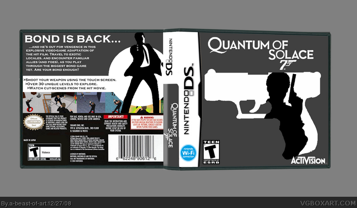
What I was going for with this box is that sleek and stylish feel of the 007 movies/games. I hope that I achived that with this box. Enjoy!
[ Reply ]
very nice
[ Reply ]
Pretty cool. +fav
[ Reply ]
all I don't like is the unbondiness of the gun on the front. What about the 7 gun from the logo?
+fav,cause it is sleek and stylish.
[ Reply ]
Awesome design, but I think It'd have been better with a tan theme instead of gray.
[ Reply ]
I like the idea, like it's from the the opening sequence from the movie. Amazing job 4.5/5
[ Reply ]
I'm pretty sure that the Bond on the front is Pierce Brosnan, not Daniel Craig.
Edited at 1 decade ago
[ Reply ]
Very Stylish. Wish the font used on the back was different, though. And the bullets had a space before the text (the features bit)
[ Reply ]
Slick design man. Looks pretty darn sharp!
[ Reply ]
Hey, thanks soooo much guys!!!
[ Reply ]
Looking back at this - man, this is good. I know I'm telling you this again, but I really like this. I agree with that #5 said - a tan theme would make this awesome.
I honestly think this deserves HoF for its slick vector style and good placement.
[ Reply ]