you made fun of mine?
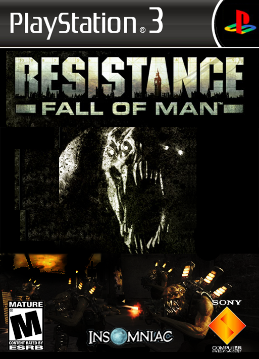
1. i would not have used the ps3 bar
2.add some indication of online play
3.fade your pictures into each other so it doesn't look like you copied and pasted a couple photos
1.I have no idea what you mean "i would not have used the ps3 bar"
2. XBOX360 doesn't have an online play indication on the front, I'm imagining the PS3 will follow suit.
3. I don't think you can comprehend how much fading and pixel work went into the bottom picture..
Don't rate my box art low just because it is highly superior to your piece of crap stretched picture.
I think he rated it low because you were overly critical of his other box, not because yours is "highly superior."
Anyways, the only point I agree with him on is the fading (I wouldn't phrase it like he did though). You could try setting the other images as different layer styles, maybe set the bottom ones to "lighten" if you want them to blend in with the primary picture.
Anyways, there's no reason for you guys to tear eachothers boxes apart, because as you acknowledged they have a similar feel. You can only really focus on the smaller differences that way, and for the most part I don't think it matters as much.
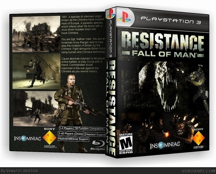
overly critical of his? I was completely honoust. His original box-art (the one that I responded to) was a stretched picture of a chimera with a stretched logo ontop of it with a pretty bad PS3 template and the back was just text ripped from the official resistance site and 3 pictures of resistance.
His new one is even worse, with things not relating to resistance on it such as pentograms all over it (inside the chimera's mouth) and as wickedgamer pointed out about 7 spelling mistakes. I gave him a 2 and pointed out all of the things wrong with it.
You call that being overly critical? I'm getting pissed off at the guy because he's being a tard at everyone who responds to his stretched picture with negative feedback, he can't admit that it's a bad box art in which he ripped pretty much mostly from me.
I almost forgot, all of the information (like vibration feedback enabled, 1-4 players etc) was all wrong too.
Oh and by the way, my resistance box was rated 4.38 or so, until this clown came and voted it low because he holds a grudge with everyone who doesn't like his box.
i can wait for this game, to be honest i think it looks crap ! all the PS3 is about is the new graphics and for that its costing around twice as much as other consoles ! its pathetic, i myself will be getting the Wii. but thats juts my opinion, some people may like new graphics :)
#22, if you actually took the time to read about this game, you'd know that great graphics were only half of this game. This game's going to have amazing weapons, extremely realistic physics, huge environments, excellent AI. This game isn't just a gears of war or assassin's creed, where it just tries to wow you with the graphics.
hey ,GoW has great gameplay from the loks of it. That's all i care about in games, take Dead Rising (the demo) for example. :) anyways, i like the double-sidedness, it loks cool.
looks really good, but i do not like the chimera on the right side of the front cover. the template is really nice, and we all know thats all that matters ;]
#25 the dead rising demo is hilarious !! i was beating the shit out of a horde of zombie with guitars. skateboards and even a gaint yellow soft toy bear :P
 Resistance: Fall of Man Box Cover Comments
Anyone?
[ Reply ]
awsome 10/10
[ Reply ]
I was late, nice box's
I cannot see any flaws as such.
[ Reply ]
Wow, thanks!!!
[ Reply ]
thats amazing. i was just about to start one, but this completely blows away anything i could have done.
[ Reply ]
Can someone rate this please?
Thanks wickedgamer1, yours is really really good though..
[ Reply ]
kooler than kool-aid ;)
[ Reply ]
you made fun of mine?
1. i would not have used the ps3 bar
2.add some indication of online play
3.fade your pictures into each other so it doesn't look like you copied and pasted a couple photos
[ Reply ]
#8
1.I have no idea what you mean "i would not have used the ps3 bar"
2. XBOX360 doesn't have an online play indication on the front, I'm imagining the PS3 will follow suit.
3. I don't think you can comprehend how much fading and pixel work went into the bottom picture..
Don't rate my box art low just because it is highly superior to your piece of crap stretched picture.
[ Reply ]
I think he rated it low because you were overly critical of his other box, not because yours is "highly superior."
Anyways, the only point I agree with him on is the fading (I wouldn't phrase it like he did though). You could try setting the other images as different layer styles, maybe set the bottom ones to "lighten" if you want them to blend in with the primary picture.
Anyways, there's no reason for you guys to tear eachothers boxes apart, because as you acknowledged they have a similar feel. You can only really focus on the smaller differences that way, and for the most part I don't think it matters as much.
[ Reply ]
overly critical of his? I was completely honoust. His original box-art (the one that I responded to) was a stretched picture of a chimera with a stretched logo ontop of it with a pretty bad PS3 template and the back was just text ripped from the official resistance site and 3 pictures of resistance.
His new one is even worse, with things not relating to resistance on it such as pentograms all over it (inside the chimera's mouth) and as wickedgamer pointed out about 7 spelling mistakes. I gave him a 2 and pointed out all of the things wrong with it.
You call that being overly critical? I'm getting pissed off at the guy because he's being a tard at everyone who responds to his stretched picture with negative feedback, he can't admit that it's a bad box art in which he ripped pretty much mostly from me.
[ Reply ]
I almost forgot, all of the information (like vibration feedback enabled, 1-4 players etc) was all wrong too.
Oh and by the way, my resistance box was rated 4.38 or so, until this clown came and voted it low because he holds a grudge with everyone who doesn't like his box.
[ Reply ]
No hard feelings
i was a little tict off at the time. rated 4.0
[ Reply ]
i would update your box though
[ Reply ]
It's all good.
I'll update it now..
[ Reply ]
Any better?
[ Reply ]
i can see the cut-off line under the logo 0_0 still good though. i missed it before though.
[ Reply ]
#11 Just calling it as I saw it. Glad you guys managed to work things out.
[ Reply ]
OMG this took my FOREVER!! I better get some comments out of this!!
Updated template and made it double sided.
[ Reply ]
Sweet i like really much . I can't wailt for this game.
[ Reply ]
Neither can I, it's the first one I'm getting when I get a PS3, second one will be Warhawk.
[ Reply ]
i can wait for this game, to be honest i think it looks crap ! all the PS3 is about is the new graphics and for that its costing around twice as much as other consoles ! its pathetic, i myself will be getting the Wii. but thats juts my opinion, some people may like new graphics :)
[ Reply ]
It 2006 rigth now . The griphics will get beter in 2 or 3 years from now .
[ Reply ]
#22, if you actually took the time to read about this game, you'd know that great graphics were only half of this game. This game's going to have amazing weapons, extremely realistic physics, huge environments, excellent AI. This game isn't just a gears of war or assassin's creed, where it just tries to wow you with the graphics.
[ Reply ]
hey ,GoW has great gameplay from the loks of it. That's all i care about in games, take Dead Rising (the demo) for example. :) anyways, i like the double-sidedness, it loks cool.
[ Reply ]
I think Gears of War looks like one of those "graphic-whore" games like Doom3, Assassin's Creed
[ Reply ]
looks really good, but i do not like the chimera on the right side of the front cover. the template is really nice, and we all know thats all that matters ;]
[ Reply ]
good job it looks way better than your original
[ Reply ]
#25 the dead rising demo is hilarious !! i was beating the shit out of a horde of zombie with guitars. skateboards and even a gaint yellow soft toy bear :P
[ Reply ]
Update!!! Made it 3d after recently discovering the joys of imandix!!!
[ Reply ]