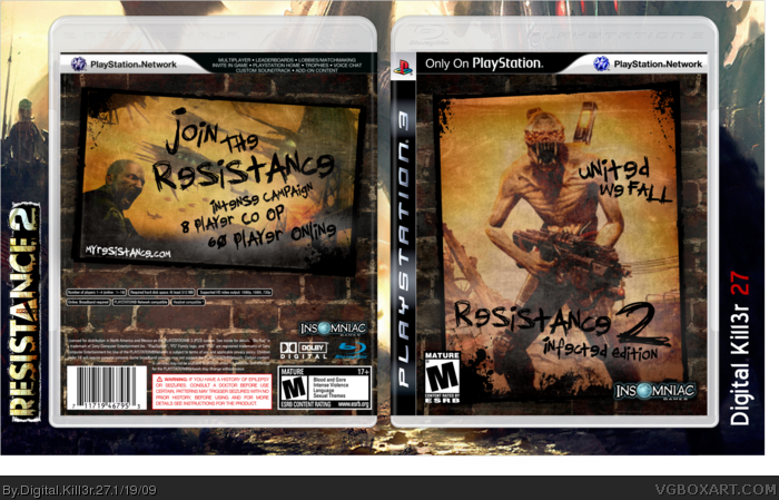
I went for a minimalistic approach here. The theme of the box is that "survivors" have scribbled and wrote phrases on these posters. Kind of hard to grasp, I know. But I think it turned out pretty nice.
I think it's pretty good. But you went really overboard with the backwards letters. I'm supposing that's just the font, but it kinda loses the effect when every single E is spelt backwards. Also you've got a big empty space on the back (between the game info and copyright info) and there's no Sony logo on the front. Fix those and I might give you a fave.
#3 The backward E's are the font, so nothing to do about that.
If you have problems with the temp, I suggest you take it up with Sens.
And yeah, I'll get a Sony logo
#6, You know that I don't use Photo shop, so I can't just move it down. I can't even move it to begin with. And I don't see what your problem is with the backward E's, it ain't THAT big of a deal.
#7, I don't use Photoshop either... it's easy to do. The font isn't really a big deal, but they all look like 9's. Obviously, I know what it's saying, but it's sorta ruined the whole "messy, scribbled writing" effect.
 Resistance 2: Infected Edition Box Cover Comments
I went for a minimalistic approach here. The theme of the box is that "survivors" have scribbled and wrote phrases on these posters. Kind of hard to grasp, I know. But I think it turned out pretty nice.
Please rate, comment, and enjoy!
[ Reply ]
Meh...it's ok. It's a bit TOO minimalistic for my taste. Though, if you had made this a slip cover, it would've been sweet.
[ Reply ]
I think it's pretty good. But you went really overboard with the backwards letters. I'm supposing that's just the font, but it kinda loses the effect when every single E is spelt backwards. Also you've got a big empty space on the back (between the game info and copyright info) and there's no Sony logo on the front. Fix those and I might give you a fave.
[ Reply ]
#3 The backward E's are the font, so nothing to do about that.
If you have problems with the temp, I suggest you take it up with Sens.
And yeah, I'll get a Sony logo
[ Reply ]
I like the front.
[ Reply ]
well, then get a different font or something, or simply edit it. do the same with the copyright info. that could be EASILY moved down a few pixels.
[ Reply ]
#6, You know that I don't use Photo shop, so I can't just move it down. I can't even move it to begin with. And I don't see what your problem is with the backward E's, it ain't THAT big of a deal.
[ Reply ]
#7, I don't use Photoshop either... it's easy to do. The font isn't really a big deal, but they all look like 9's. Obviously, I know what it's saying, but it's sorta ruined the whole "messy, scribbled writing" effect.
[ Reply ]
#8 I use Powerpoint. I'm telling you, IT CAN"T BE DONE.
[ Reply ]
#'s 3, 6, and 8
That^
[ Reply ]
#5 Thanks
[ Reply ]
Pretty nice, but I agree with #3 about the backwards letters. If you can't change it, use a different font.
[ Reply ]
It's myresistance.net. ;]
[ Reply ]
#13 Ah shit, I knew it but I was too lazy to make sure. I'll fix it in the next update.
[ Reply ]