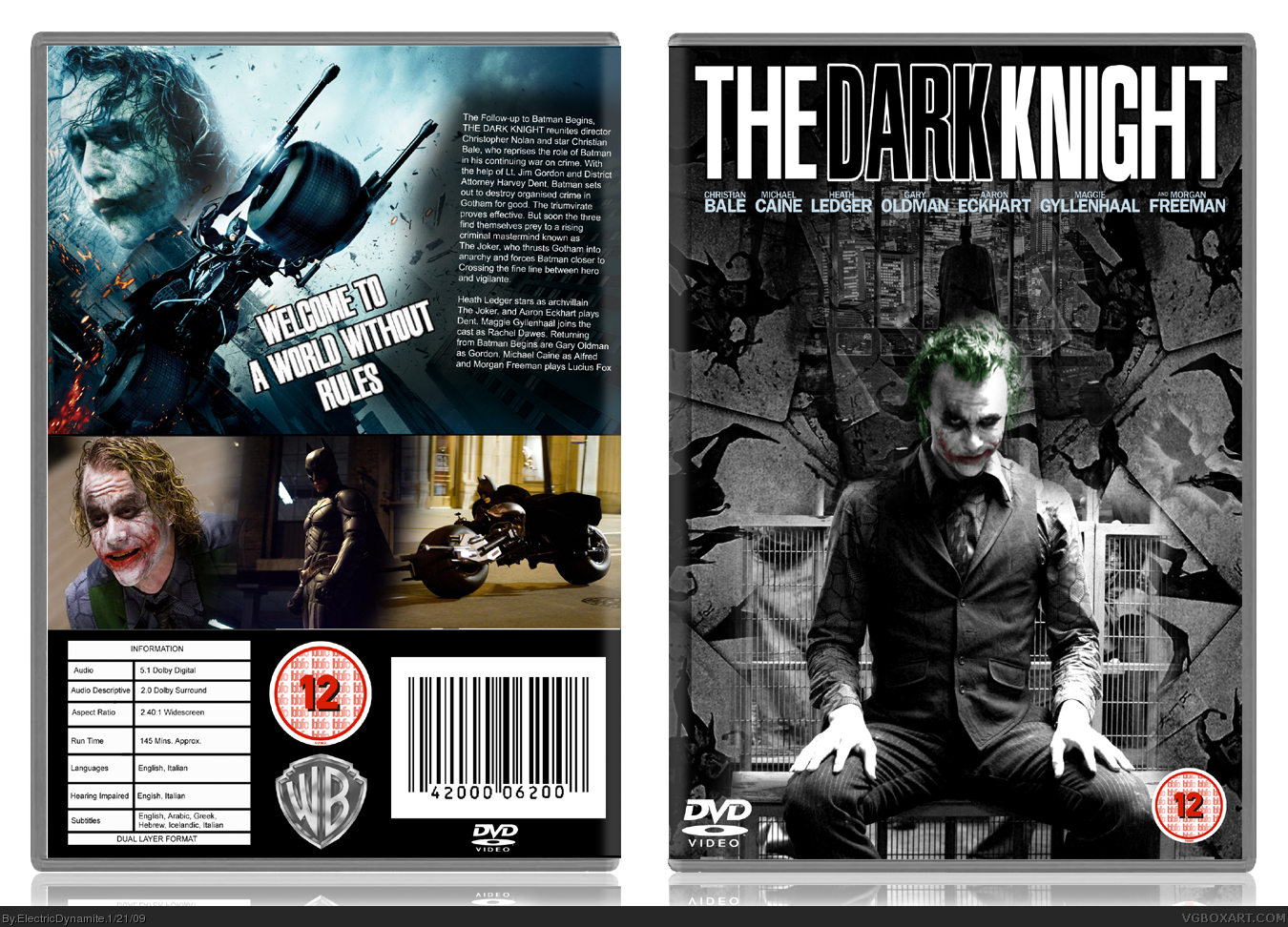
update it then mate... i lke the front he whole grayed out look with colour on the head :D
the back images are good but you need some work on the screenshots and the sypnosis needs to be bigger other than that... it pretty unique :D
#7, I agree, update it! The front looks very unique, in a good was. And I really like that. I also love the Joker you used, it's actually one of my favorite.
 The Dark Knight Box Cover Comments
like the front
[ Reply ]
GO GO GADGET BANDWAGON JUMPER!
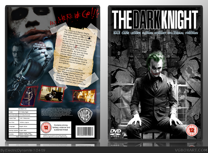
well well well, here's a dark knight box for y'all
logo is custom, nothing in his pockets but knives and lint
*cowers in fear of bad pun*
printable will be available as always
[ Reply ]
its ok i suppose don't like logo.
[ Reply ]
the back is pretty lame, but I like the front.
[ Reply ]
The back could use some adjustments. But the front, as everyone else has pretty much mentioned, is very nice. original too!
[ Reply ]
yeah i'm not too happy with the back either
[ Reply ]
update it then mate... i lke the front he whole grayed out look with colour on the head :D
the back images are good but you need some work on the screenshots and the sypnosis needs to be bigger other than that... it pretty unique :D
+fav (cause your scottish) :P
[ Reply ]
#7, I agree, update it! The front looks very unique, in a good was. And I really like that. I also love the Joker you used, it's actually one of my favorite.
[ Reply ]
UPDATED!
[ Reply ]
make a printable
[ Reply ]