I must say, I'm not entirely impressed. You didn't take any of my advice on the actual box, from the empty back template to the unreadable back text. Also, the back has a pretty boring layout, to be honest. Coupled with the unreadable text, it's almost bad. Quantity doesn't necessarily mean quality. I can see you put a lot of effort into making it all, and probably put more effort into the layout that most members put into their entire box, but the resulting whole doesn't make up for the lack of quality in the pieces. Were we under the rating system, I would give you a 4.5.
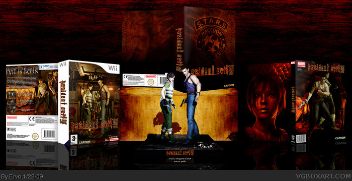
I can see what Koopa is saying about the back text, but that is the only issue I would have with anything in this design. The figures are great, as is the leather slip cover, which I think is really cool.
the zero on the spine is upside down ¬_¬ lol but i love this just as kuch as apollo's so for the comp i will not vote as it would be a crime to go against either box ¬_¬
+fav
sorry, but the presentation is getting some little failure from me. The box in the middle as well as the box to the right are almost invisible ´cause the look like the background. kudos on trying to make your own logo - most don´t do that here!
If some of the designs I see here on this site were real, I think the gaming world would be a very different place. There'd be lots and lots more collectors items, and souvenirs.
*That leather case would probably be the most wanted Resident Evil Collectors item besides a life sized Claire or Leon doll.
I really like it. I may be a sucker for collector's editions, but I still think this product exudes quality. Great job on the leather texture, and while some may have felt the arrangement was strange, I thought it made perfect sense. One left, one right, one center, and one elevated center. Somebody doesn't watch enough QVC.
Anyway, my only complaints are:
- The statue being the cover image. More variety with that would've been nice. Good job on altering the coloring and lighting, though. It makes up for it.
- The upside-down "zero" on the spine. No big deal, just doesn't appeal to me, you know?
Oh, and as for the text on the back, I could read it. It wasn't as high resolution as it could have been, but I still didn't have a lot of trouble. I'm surprised this isn't in the hall, yet.
 Resident Evil Zero: Wii Edition Box Cover Comments
Why hello thar.
Only thing in this that I do not like is that the "zero" on spine is upside down.
oldpprs.
Edited at 1 decade ago
[ Reply ]
My competition box against Apollo. RE Zero for Wii with a leather slip cover, Marvel Comics graphic novel and two figures. I hope you like it.
[ Reply ]
I must say, I'm not entirely impressed. You didn't take any of my advice on the actual box, from the empty back template to the unreadable back text. Also, the back has a pretty boring layout, to be honest. Coupled with the unreadable text, it's almost bad. Quantity doesn't necessarily mean quality. I can see you put a lot of effort into making it all, and probably put more effort into the layout that most members put into their entire box, but the resulting whole doesn't make up for the lack of quality in the pieces. Were we under the rating system, I would give you a 4.5.
[ Reply ]
I can see what Koopa is saying about the back text, but that is the only issue I would have with anything in this design. The figures are great, as is the leather slip cover, which I think is really cool.
Good job, and great effort man!
[ Reply ]
the zero on the spine is upside down ¬_¬ lol but i love this just as kuch as apollo's so for the comp i will not vote as it would be a crime to go against either box ¬_¬
+fav
[ Reply ]
Yea I mean its all kewl and all but I dont like the logo at all. Plus what koopa said was right.
Edited at 1 decade ago
[ Reply ]
I will update the back and the logo but this is the version you will see at the competition.
Edited at 1 decade ago
[ Reply ]
Sweet job dude, You'll be covering all my flaws in the update
[ Reply ]
pure awesomness surrounds this box
[ Reply ]
looks great but the age rating is 3+, shouldnt that be 16+ or 18+?
[ Reply ]
sorry, but the presentation is getting some little failure from me. The box in the middle as well as the box to the right are almost invisible ´cause the look like the background. kudos on trying to make your own logo - most don´t do that here!
[ Reply ]
Nice. Not your best, but I still like it alot. Gets a fav from me. :) I don't like the upside down logo though.
[ Reply ]
Absolute awesomness, but, 3+? >_>
[ Reply ]
#13, LOL WUT, HOW DID I FORGOT IT :DDDDDDDDD I'm gonna update this as soon as i get some ideas for a new back.
[ Reply ]
I like all the individual stuff but they are arranged very strangely.
[ Reply ]
If some of the designs I see here on this site were real, I think the gaming world would be a very different place. There'd be lots and lots more collectors items, and souvenirs.
*That leather case would probably be the most wanted Resident Evil Collectors item besides a life sized Claire or Leon doll.
Edited at 1 decade ago
[ Reply ]
I really like it. I may be a sucker for collector's editions, but I still think this product exudes quality. Great job on the leather texture, and while some may have felt the arrangement was strange, I thought it made perfect sense. One left, one right, one center, and one elevated center. Somebody doesn't watch enough QVC.
Anyway, my only complaints are:
- The statue being the cover image. More variety with that would've been nice. Good job on altering the coloring and lighting, though. It makes up for it.
- The upside-down "zero" on the spine. No big deal, just doesn't appeal to me, you know?
Oh, and as for the text on the back, I could read it. It wasn't as high resolution as it could have been, but I still didn't have a lot of trouble. I'm surprised this isn't in the hall, yet.
[ Reply ]
This is a great box, however:
-Is the 3+ a joke?
Faved anyway. :)
[ Reply ]
this is so great!
a very good job..
congratulations!!
[ Reply ]