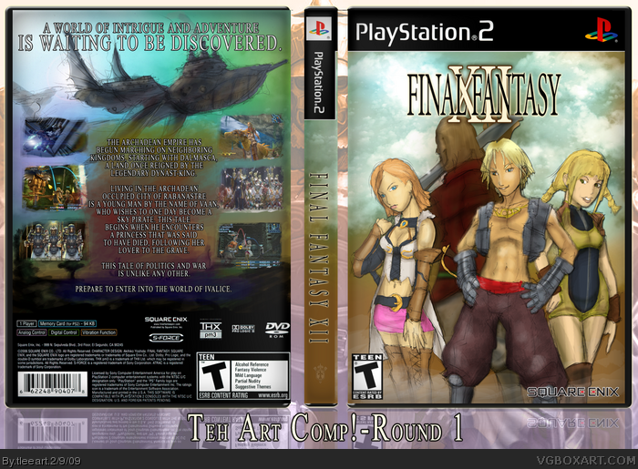
Okay, so this is my First Round design for rasengan_boi's "Teh Art Comp!" Yes, I spelled this correctly. Anyway, I had a real hard time determining what I wanted to do, maybe I'll eventually post what I had before, but this feels a lot better to me.
Nothing too innovative, again. Sorry about that, but I wanted to stick with simple to keep my focus on making the art how I wanted to. The artwork is all either sketched, photoshopped, or both. I was going for a sketchy, rough look. The template was from the cover project, and the legal info is from a "custom" version of the cover a user did on there.
If you don't like it because it's not in the game's art style or you think I didn't put my heart into it, sorry. I did put my heart in this.
Its really good (better than i could do) for a box in which you drew the renders yourself. :P
Good Luck in "Teh Art Comp!"
( How did you draw on photoshop?)
The colors have a nice feel to it, it comes together quite well. The sketchy look is alright, but I think a more painted product would look more fitting.
Either way, as someone who frequently starts to draw his own boxes and never finishes them, good job! +fav for concept and effort.
Looks fantastic man. Awesome job on the characters, and I really love how your airship sketch came out on the back. The sketchy lines on it give it a really strong artistic styling, as well as give the impressions that it's in flight.
I should have my box together by tomorrow, so game on!
I really like the art aspect of it, and the front really blends together for me. The colors are great.
The tag line text on the back seems a bit misplaced (kinda hard to explain). Aah, I think I know, the ship should have covered parts of the text, somehow I think it'd would have made the actual drawn scenery show through more than the digitally added parts.
in any case, great job done. Certainly worth HoF, and a fav from me. :]
I'm glad that people can see the thought I went to when I made this one. If it makes HoF, that would make me happy, but still, it's okay if it doesn't. It felt good to draw characters again and do some coloring/painting.
Holy cow f***er, goodbye DrakXXX.
Small feeling that you use this style, and I use a certain style, were gonna have a bit of trouble with round 2
I've created a monster...
 Final Fantasy XII Box Cover Comments
Okay, so this is my First Round design for rasengan_boi's "Teh Art Comp!" Yes, I spelled this correctly. Anyway, I had a real hard time determining what I wanted to do, maybe I'll eventually post what I had before, but this feels a lot better to me.
Nothing too innovative, again. Sorry about that, but I wanted to stick with simple to keep my focus on making the art how I wanted to. The artwork is all either sketched, photoshopped, or both. I was going for a sketchy, rough look. The template was from the cover project, and the legal info is from a "custom" version of the cover a user did on there.
If you don't like it because it's not in the game's art style or you think I didn't put my heart into it, sorry. I did put my heart in this.
[ Reply ]
Its really good (better than i could do) for a box in which you drew the renders yourself. :P
Good Luck in "Teh Art Comp!"
( How did you draw on photoshop?)
[ Reply ]
#2, I use a Wacom tablet. Also, downloading custom brushes makes certain things easier to do, such as the clouds. I'm glad you liked it!
[ Reply ]
The colors have a nice feel to it, it comes together quite well. The sketchy look is alright, but I think a more painted product would look more fitting.
Either way, as someone who frequently starts to draw his own boxes and never finishes them, good job! +fav for concept and effort.
[ Reply ]
Looks fantastic man. Awesome job on the characters, and I really love how your airship sketch came out on the back. The sketchy lines on it give it a really strong artistic styling, as well as give the impressions that it's in flight.
I should have my box together by tomorrow, so game on!
[ Reply ]
I really like the art aspect of it, and the front really blends together for me. The colors are great.
The tag line text on the back seems a bit misplaced (kinda hard to explain). Aah, I think I know, the ship should have covered parts of the text, somehow I think it'd would have made the actual drawn scenery show through more than the digitally added parts.
in any case, great job done. Certainly worth HoF, and a fav from me. :]
[ Reply ]
#6, Hmm, yes, I see your point.
I'm glad that people can see the thought I went to when I made this one. If it makes HoF, that would make me happy, but still, it's okay if it doesn't. It felt good to draw characters again and do some coloring/painting.
[ Reply ]
Looks very good!
[ Reply ]
It has a very nice watercolor vibe to it. Wonderful job.
[ Reply ]
Holy cow f***er, goodbye DrakXXX.
Small feeling that you use this style, and I use a certain style, were gonna have a bit of trouble with round 2
I've created a monster...
Edited at 1 decade ago
[ Reply ]
Hmmm... your style on the bodies reminds me of my own, though not so much the faces. Fantastic job :)
[ Reply ]
Wow, I really don't know how I missed this one,the smudging effects and the watercolour style works perfectly. Absolutely beautiful Tim.
[ Reply ]