Here it is, took me a fair few hours, not my best box to date, but I'd say its one of them, credit to Sens for the tem(s). Enjoy! [And please tell me what you think, not trying to be pushy]
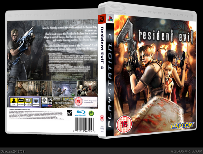
Definitely your best! Did you add in the chainsaw to the image on the front? Because I don't recall seeing an image like that for RE4. If you did, thats awesome, if you didn't it's still awesome and makes for a great front image!
#7 thanks man, and naw, i didnt put the chainsaw there, it was already on the image, and do you know how many points a box needs to make the HoF?
#9 Naw I just found the image, and thought it looked pretty good, at first I was gonna change it but nothing else I tried looked any good.
AWESOME! I love the chain-saw man's view on the front. The back is great too, but I think it could have gone a bit more with the color scheme of the front, and if you were to center the text a bit more, at least enough to get a render of saddler across from Leon, it'd be killer. Nevertheless, very, very nice work.
#10-16 thanks for the comments and to those who faved
#13+15 actually its not the fact that it's low quality, they all fit the 2D temp perfectly, its the fact that, when I imported a flattened version to the 3D temp, it turned out too big so I had the shrink it a lot!This made it go a little blurry at points, but I know the logo is low quality but its all I had and I thought it added a sense of horror to it TBH
#15 yeah, I used that bright grey colour because I didnt want it to stand out too much, but Ill see what i can do, thanks
Job well done, I say. It looks good, and you did a pretty good job with the back. I like how Leon is straddling the screenshot bar. It's always nice to see the illusion of 3D like that.
If I had to pick out something that I think -needs- to be improved, it would be the RE4 logo on the cover. It's resolution is far too small. I don't know where you could find a high resolution one, but I've no doubt that it's out there somewhere. Other than that, I don't see any major flaws.
nice one. The font you used for the tagline doesn't quite fit into the box and a grey or black glow would look a lot better on the white text. Also, I would change the font you used for the main description to the same one you used for the "New Features" and "New Survival Action" descriptions.
#22 thanks, the reason I chose that tagline font is because I liked how it faded out at the bottom and i used differen fonts for the description and features because, i have seen a few boxes that do it and it also shows that they are about different things but thanks again, i'll try and fix the glow and a friend spotted two typos so those too when I get back to school and I may just add a printable!
Other than the somewhat blurry front I really like it. Well, maybe shouldn't have 3 different fonts on the back but otherwise it looks pretty darn good.
#25 thanks, the spine is plain because a lot of UK boxarts for the PS3 have that type of spine so I wanted to keep my design close to that. Thanks none-the-less
Oh wow, a RE4 box that defines it as Survival Action and not Survival Horror, thank you, because RE4 is not scary in the slightest.
Either way, you made a typo for 'character' on the back, but, theres no flaws apart from that, it's sexy, really.
+Fav, and hopefully, #30, this gets you into the hall.
EDIT: Hey, yeah, got you into the hall, well done. ^^
 Resident Evil 4 Box Cover Comments
Your best box by FAAAAAARRRR.
[ Reply ]
Here it is, took me a fair few hours, not my best box to date, but I'd say its one of them, credit to Sens for the tem(s). Enjoy! [And please tell me what you think, not trying to be pushy]
#1 woah that was FAAAST!
#3 might if i was a woman lol!
Edited at 1 decade ago
[ Reply ]
Have my babies...
[ Reply ]
whoa #3, geting out of hand there are ya?
[ Reply ]
yes
[ Reply ]
Woah, did'nt expect this box to get so many fav's! thanks to all of those who have faved and commented! ^_^
[ Reply ]
Definitely your best! Did you add in the chainsaw to the image on the front? Because I don't recall seeing an image like that for RE4. If you did, thats awesome, if you didn't it's still awesome and makes for a great front image!
[ Reply ]
#7 thanks man, and naw, i didnt put the chainsaw there, it was already on the image, and do you know how many points a box needs to make the HoF?
#9 Naw I just found the image, and thought it looked pretty good, at first I was gonna change it but nothing else I tried looked any good.
Edited at 1 decade ago
[ Reply ]
#8, Hang on, did you actually do the front?
[ Reply ]
Great work :)
+fav
[ Reply ]
AWESOME! I love the chain-saw man's view on the front. The back is great too, but I think it could have gone a bit more with the color scheme of the front, and if you were to center the text a bit more, at least enough to get a render of saddler across from Leon, it'd be killer. Nevertheless, very, very nice work.
[ Reply ]
:D
[ Reply ]
I'm glad I seen this, its a solid design, but a lot of the stuff is low quality, but I don't think thats on your front, just the resources.
However, not a fan of getting messaged to look at boxes, but thanks for the add as a friend, probably the thing that made me view this.
[ Reply ]
nice 3Ding, 5/5. fav
[ Reply ]
You've got some low res issues, and the glow on white text should never be that bright. Try black, or gray or pretty much any other dark color.
[ Reply ]
Really really nice. +fav
[ Reply ]
#10-16 thanks for the comments and to those who faved
#13+15 actually its not the fact that it's low quality, they all fit the 2D temp perfectly, its the fact that, when I imported a flattened version to the 3D temp, it turned out too big so I had the shrink it a lot!This made it go a little blurry at points, but I know the logo is low quality but its all I had and I thought it added a sense of horror to it TBH
#15 yeah, I used that bright grey colour because I didnt want it to stand out too much, but Ill see what i can do, thanks
[ Reply ]
Job well done, I say. It looks good, and you did a pretty good job with the back. I like how Leon is straddling the screenshot bar. It's always nice to see the illusion of 3D like that.
If I had to pick out something that I think -needs- to be improved, it would be the RE4 logo on the cover. It's resolution is far too small. I don't know where you could find a high resolution one, but I've no doubt that it's out there somewhere. Other than that, I don't see any major flaws.
I like it.
[ Reply ]
Really cool. It has a kind of fun 3D effect.
[ Reply ]
Cool, I think the glow on the back text can be reduced a bit though.
[ Reply ]
You had my fav just by looking at that beautiful front cover!
[ Reply ]
nice one. The font you used for the tagline doesn't quite fit into the box and a grey or black glow would look a lot better on the white text. Also, I would change the font you used for the main description to the same one you used for the "New Features" and "New Survival Action" descriptions.
[ Reply ]
#22 thanks, the reason I chose that tagline font is because I liked how it faded out at the bottom and i used differen fonts for the description and features because, i have seen a few boxes that do it and it also shows that they are about different things but thanks again, i'll try and fix the glow and a friend spotted two typos so those too when I get back to school and I may just add a printable!
[ Reply ]
Other than the somewhat blurry front I really like it. Well, maybe shouldn't have 3 different fonts on the back but otherwise it looks pretty darn good.
[ Reply ]
The front looks really nice. The spine feels very plain, so you might want to add some something to it. +fav
[ Reply ]
Love it! +fav
[ Reply ]
#25 thanks, the spine is plain because a lot of UK boxarts for the PS3 have that type of spine so I wanted to keep my design close to that. Thanks none-the-less
#26 thanks
Edited at 1 decade ago
[ Reply ]
Awesome 5/5 +fav
this is defo HOF
[ Reply ]
Where did you find that spectacular image?The back probaly has just a little to much text but other than that this is a really good box.
[ Reply ]
O.K. I'm confused? This now has 153 points, and the limit to reach HoF is 150, what's the deal?
#31 thanks, I agree about the sacriness mostly but the Regenorators did freak me out abit, yeah hope fully it does, cheers ^^. Thanks again!
Edited at 1 decade ago
[ Reply ]
Oh wow, a RE4 box that defines it as Survival Action and not Survival Horror, thank you, because RE4 is not scary in the slightest.
Either way, you made a typo for 'character' on the back, but, theres no flaws apart from that, it's sexy, really.
+Fav, and hopefully, #30, this gets you into the hall.
EDIT: Hey, yeah, got you into the hall, well done. ^^
Edited at 1 decade ago
[ Reply ]
Congrats!
[ Reply ]
Congratulations man! Well deserved!
[ Reply ]
First HoF.. Congrats.
[ Reply ]
Congrats!
[ Reply ]
Congrats on your first Hall Roza!
[ Reply ]
Finally you recognised for you hard work :) WELL DONE!
[ Reply ]
It sur eis not bad but I am missing a bit the "own style" on the front. It is almost just official artwork.
[ Reply ]
#38, Its offical artwork with a chainsaw on it.. to be correct
[ Reply ]
#39, that`s why I said "almost just"
[ Reply ]
Thanks to everyone who faved and commented on this box and I know my comment is a bit late but my internets been on the fritz lately so thanks again!
[ Reply ]
THIS IS GREAT! I just have one question. Whatcha buyin'?
[ Reply ]
#42 Hahahaah, good one, "Any time- Stranger!" ^^
[ Reply ]
How could I get the printable version?
[ Reply ]