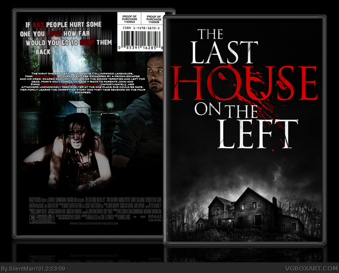
Anyways, The box looks good, and theres just a few things catching my eye wrong on it. The red border on the screenshots is clashing with the character render you have in front of it, maybe making the border darker, or removing it altogether would fix this problem.
As Ray Blade mentions, I like the tagline as well, but i think it might look better if It were a little bigger, and not slanted.
FINALLY... The title on the front seems like it should be centered just a bit more.
I saw the commercial for this today, and it looks NOTHING like the original movie. Anyway, about the box.
The tagline, like the others, said, isn't good. Also, you made the same mistake as your last box, 2-disc special edition with no mention of special features to be found. The girl on the back who's glowing white could be taken out, looks like she was placed there for filler.
Not a real big problem, but you could also choose better screen shots, the ones you have tell me nothing about what the movie is about.
That's all I can see wrong, the back information could be properly typed, but it doesn't matter since it's not a printable.
Was this the movie with all the torture and rape? My friend told me about it, but he also tells me about a number of other movies, so they tend to blend together in my head.
#12, After seeing the commercial again, it does look kinda similar to the original, but the commercial alone I've seen several changes from the original already.
 The Last House On The Left Box Cover Comments
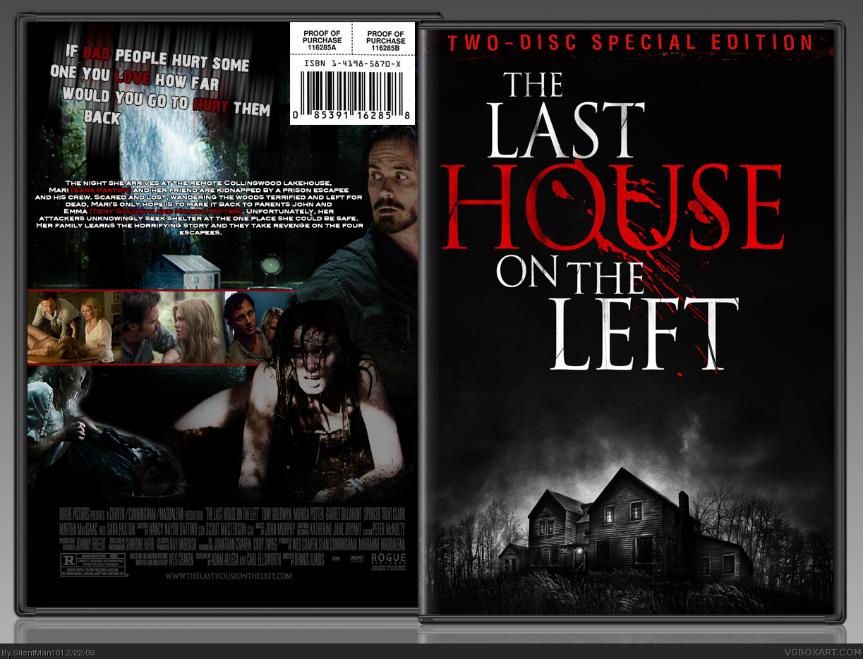
Nice! I really like how you did the tagline on the back. The scary effect is pulled off nicely with this. Great Job!
[ Reply ]
Oh no Kyle... There remaking this as well? GEEZ!
Anyways, The box looks good, and theres just a few things catching my eye wrong on it. The red border on the screenshots is clashing with the character render you have in front of it, maybe making the border darker, or removing it altogether would fix this problem.
As Ray Blade mentions, I like the tagline as well, but i think it might look better if It were a little bigger, and not slanted.
FINALLY... The title on the front seems like it should be centered just a bit more.
[ Reply ]
I saw the commercial for this today, and it looks NOTHING like the original movie. Anyway, about the box.
The tagline, like the others, said, isn't good. Also, you made the same mistake as your last box, 2-disc special edition with no mention of special features to be found. The girl on the back who's glowing white could be taken out, looks like she was placed there for filler.
Not a real big problem, but you could also choose better screen shots, the ones you have tell me nothing about what the movie is about.
That's all I can see wrong, the back information could be properly typed, but it doesn't matter since it's not a printable.
[ Reply ]
#3, well I entend on fixing these problems tomorrow and I did fix my watchmen to have the special features
[ Reply ]
I like the update, but I think the description text could be wider.
[ Reply ]
Was this the movie with all the torture and rape? My friend told me about it, but he also tells me about a number of other movies, so they tend to blend together in my head.
[ Reply ]
#6, Um you would be right lol
[ Reply ]
Nice update Kyle! Looking sharp.
[ Reply ]
Make a box for the original.
[ Reply ]
#9, Mmk lol I'll see what I can whip up :)
[ Reply ]
bumps before kyle cries again...
[ Reply ]
#3, And Pan what are you saying? lol it looks VERY similar to the original!
[ Reply ]
#12, After seeing the commercial again, it does look kinda similar to the original, but the commercial alone I've seen several changes from the original already.
[ Reply ]
#13, Well of course since its a remake there are bound to be some changes :D
[ Reply ]