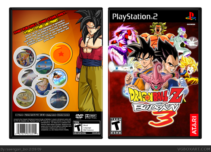
I would think it would make more sense to have 6 screen borders with the dragonball (to equal 7), but hey, It still rocks. I love the front. 4.5/5: Great!
Yeah, this really looks unfinished! The front needs an Earth render below the logo, and the back needs captions that explain the features of the game beside those snapshots.
I think the tagline would have looked fine the traditional way, and the description text would be better traditionally laid out as well.
The front is really well composed (spare the look of it being unfinished). Like I said in the WiP, I like where you were going with this.
 Dragon Ball Z: Budokai 3 Box Cover Comments
DBZ box, huge template, forget who to credit, enjoy! Back is kinda plain...
Wow, these days, I have fav's within seconds...
Edited at 1 decade ago
[ Reply ]
Fronts okay, the back seems kind of empty though.
[ Reply ]
Sorry, but I though your Black Knight box was sooooooo much better. Try making something like that again.
[ Reply ]
#2, no DBZ game is packed to the brim
#3, I know, I seriously don't know how I did it :P
[ Reply ]
I would think it would make more sense to have 6 screen borders with the dragonball (to equal 7), but hey, It still rocks. I love the front. 4.5/5: Great!
[ Reply ]
Looks unfinished, good, but unfinished.
[ Reply ]
Yeah, this really looks unfinished! The front needs an Earth render below the logo, and the back needs captions that explain the features of the game beside those snapshots.
I think the tagline would have looked fine the traditional way, and the description text would be better traditionally laid out as well.
The front is really well composed (spare the look of it being unfinished). Like I said in the WiP, I like where you were going with this.
[ Reply ]
#7, i agree, it looks unfinished, but nice box anyway, your front is very good, 7.2/10
[ Reply ]