[ Buy MadWorld at Amazon ] By Fraught 12 on February 28th, 2009 No Printable Available MadWorld Box Cover Comments Comment on Fraught's MadWorld Box Art / Cover. Cancel Reply Fraught 12 [ 1 decade ago ] I tried to retain the black, red and white, 2D bloody feeling of MadWorld, and I hope I succeeded. :) [ Reply ] a-beast-of-art 39 [ 1 decade ago ] nice! Edited at 1 decade ago [ Reply ] Galactic_Compound 1 [ 1 decade ago ] tight,but the front boring. [ Reply ] GameRoomProductions 42 [ 1 decade ago ] #3, On the contrary, I love the style of the front. [ Reply ] Fraught 12 [ 1 decade ago ] #3, I actually liked it that way. Well, those are opinions, and everyone has them, be them similar or different. #2, Thanks. :p #4, Yeah, I liked it too. :) Glad you like it. Edited at 1 decade ago [ Reply ] sd1833 48 [ 1 decade ago ] I really like this! You should switch the positions of the ESRB and SEGA logos and make the rating Mature. Great job! [ Reply ] Ninty 43 [ 1 decade ago ] Stylish ;) fav+ [ Reply ] Weezer 9 [ 1 decade ago ] Nice job on the back. The front has a good style to it, but you could have added more in my opinion. Edited at 1 decade ago [ Reply ] nothing94 35 [ 1 decade ago ] I dont like it, sorry. Its too simple for a game like mad world. Nice effort though. [ Reply ] paper sonic 37 [ 1 decade ago ] best Mad world box on the site fav fav autor wooooo much better than mine [ Reply ] Fraught 12 [ 1 decade ago ] #9, Too simple for a game like MadWorld? I actually did it the way it is, because I thought it fit the theme of the game. #10, Thank you, very, very much. ;) [ Reply ] Fraught 12 [ 1 decade ago ] #7, Uhh, thanks. Can I hope for a fav too? ;p [ Reply ]
 MadWorld Box Cover Comments
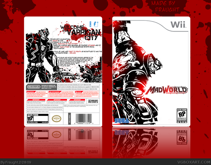
I tried to retain the black, red and white, 2D bloody feeling of MadWorld, and I hope I succeeded. :)
[ Reply ]
nice!
Edited at 1 decade ago
[ Reply ]
tight,but the front boring.
[ Reply ]
#3, On the contrary, I love the style of the front.
[ Reply ]
#3, I actually liked it that way. Well, those are opinions, and everyone has them, be them similar or different.
#2, Thanks. :p
#4, Yeah, I liked it too. :) Glad you like it.
Edited at 1 decade ago
[ Reply ]
I really like this! You should switch the positions of the ESRB and SEGA logos and make the rating Mature. Great job!
[ Reply ]
Stylish ;) fav+
[ Reply ]
Nice job on the back. The front has a good style to it, but you could have added more in my opinion.
Edited at 1 decade ago
[ Reply ]
I dont like it, sorry. Its too simple for a game like mad world. Nice effort though.
[ Reply ]
best Mad world box on the site fav
fav autor wooooo much better than mine
[ Reply ]
#9, Too simple for a game like MadWorld? I actually did it the way it is, because I thought it fit the theme of the game.
#10, Thank you, very, very much. ;)
[ Reply ]
#7, Uhh, thanks. Can I hope for a fav too? ;p
[ Reply ]