#3, good advice even though your rank 1. Also, I'm a rank 2 but, I'm good with advice! I don't know why you have sonic unleashed at the bottom! I also agree with #2, It's very annoying! Shadow's logo is choppy! The render is cut at an angle between them, it doesn't fade much! The sonic logo is too small and the "&" is choppy and hard too see! You'll get it eventually. But, for now I'm giving it a 1.5/5. Also feel free to PM any member for resources! Don't get everything off google images and badly edit them! Example: Look at the Sonic Unleashed logo! Now look up and left! That doesn't look at all like Super Sonic! You can even go to the forums section in this site! You can get better resources and see what people think of the box and edit it before you post it!
#4 im rank one cos i only posted 4 boxes!!!
(which are kick ass-if you dont believe me look at them)
but no more spamming - hes right though andi noticed that you didnt actually cut the sonic and shadow and merge them theres a pic of them like tht online.
#4, You're not rank 2.
And why shouldn't a rank one give good advices?
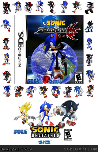
Anyway, I like the editing, but Sonic/Shadow is floating, which liiks bad.
And as #2 said, the border is annoying.
 Sonic & Shadow Box Cover Comments
This is my 4th boxart named sonic & shadow for nintendo DS
[ Reply ]
O_o that border of sonics and shadows around the box is freaking confusing, i simply cant concentrate on the box... D:
[ Reply ]
#2 i agree
i like the idea but he looks more sonic than shadow. and the background looks quite simple i like it 3/5 good for your 4th!
[ Reply ]
#3, good advice even though your rank 1. Also, I'm a rank 2 but, I'm good with advice! I don't know why you have sonic unleashed at the bottom! I also agree with #2, It's very annoying! Shadow's logo is choppy! The render is cut at an angle between them, it doesn't fade much! The sonic logo is too small and the "&" is choppy and hard too see! You'll get it eventually. But, for now I'm giving it a 1.5/5. Also feel free to PM any member for resources! Don't get everything off google images and badly edit them! Example: Look at the Sonic Unleashed logo! Now look up and left! That doesn't look at all like Super Sonic! You can even go to the forums section in this site! You can get better resources and see what people think of the box and edit it before you post it!
Edited at 1 decade ago
[ Reply ]
#4 im rank one cos i only posted 4 boxes!!!
(which are kick ass-if you dont believe me look at them)
but no more spamming - hes right though andi noticed that you didnt actually cut the sonic and shadow and merge them theres a pic of them like tht online.
[ Reply ]
#4, You're not rank 2.
And why shouldn't a rank one give good advices?
Anyway, I like the editing, but Sonic/Shadow is floating, which liiks bad.
And as #2 said, the border is annoying.
Edited at 1 decade ago
[ Reply ]
#6, was...
[ Reply ]
The Sonic/Shadow border overshadows the box.
[ Reply ]