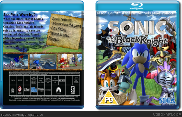
This is my first movie box and I think this is my best. Hope you like it. and please tell me ways to improve on this box.
credit
~Sega
~Centry for temp.
~Screen borders-google
The box doesnt make any sense. Dont use screenshots if that is a movie, if this is an animated movie dont use actors at the front. All in all not average, everything a bit streched, text on the back is hard to read, boring, so sorry but 5.2/10 :(
Japanese logo on an English box is a no-no. You might also consider using a less boring font for the back description and maybe some shading on the VA names. Otherwise this is pretty decent.
I like the overall feel, as opposed to seeing to many paper looking ones. the logo is a little pixelated aroundthe edge, and the info at the bottom of the back looks kind of squashed.
I'll fav, try to fix some of that up. :)
 Sonic and the Black Knight Box Cover Comments
This is my first movie box and I think this is my best. Hope you like it. and please tell me ways to improve on this box.
credit
~Sega
~Centry for temp.
~Screen borders-google
[ Reply ]
That's great!
[ Reply ]
The box doesnt make any sense. Dont use screenshots if that is a movie, if this is an animated movie dont use actors at the front. All in all not average, everything a bit streched, text on the back is hard to read, boring, so sorry but 5.2/10 :(
[ Reply ]
#3, Yeah but the actors on the front are the characters voices.
[ Reply ]
cool box dude, whered you get those pics on the front?
[ Reply ]
Rex, got sonic from planetrenders.net, everyone else ign.com
[ Reply ]
you need to improve it some more.
[ Reply ]
ok, what parts.
[ Reply ]
Japanese logo on an English box is a no-no. You might also consider using a less boring font for the back description and maybe some shading on the VA names. Otherwise this is pretty decent.
[ Reply ]
will update soon
[ Reply ]
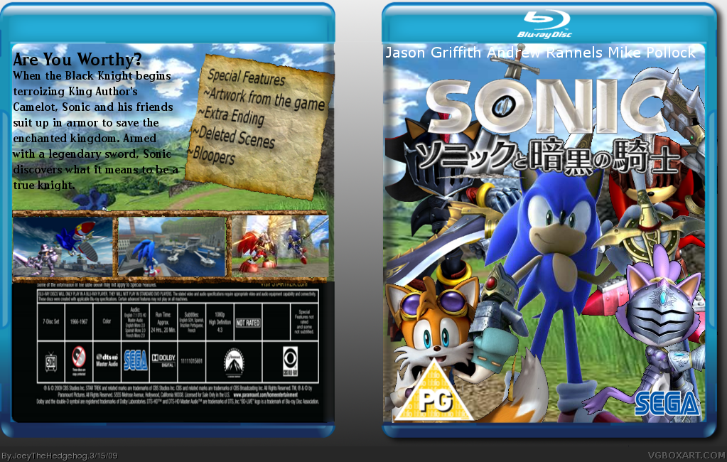
box updated
[ Reply ]
very nice, awesome, link
[ Reply ]
I like the overall feel, as opposed to seeing to many paper looking ones. the logo is a little pixelated aroundthe edge, and the info at the bottom of the back looks kind of squashed.
I'll fav, try to fix some of that up. :)
[ Reply ]
#1, You missed Silent Oblivion. Tut-tut.
[ Reply ]
This is pretty cool. I'll Fav.
[ Reply ]
Thanks for all the favs.
[ Reply ]
Its good, i like it a lot but the front looks like it has too much, but all in all 4/5 + fav
[ Reply ]