Whew!
Most comments made by authors of NG2 boxes usually start the same way:
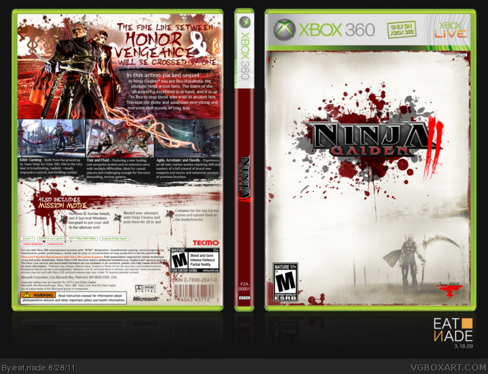
"This box was very tough to make", well my box is no exception. Anyone who has attempted to make a NG2 box knows there is virtually nothing to work with in regards to pictures of Ryu. For some reason there just aren't promo materials good enough for a box. Enemies and screenshots, no problem. Just Ryu.
Anyway this took me a good 5 days to get this all finished. I went through so many phases with the front, tried all kinds of combinations, but nothing was working. So I decided to focus not on Ryu but the second most prominent aspect of the game; the blood.
That "II" on the logo is probably the hardest thing I've ever rendered. Good lord it took me a while.
Hope you enjoy it!
P.S. I have 1250 GS in this game. Legit.
Who wants to touch me?
Brilliant. Very decorate, I love the way you did the spine as well. Btw I'll add you on xbox live.
Couple of small things to note:
You can't properly see ryu's face in the background and though I respect your decision to not make him the main feature of this box, I stil feel you need a picture of him showing him at least a little more prominently. Also I think some of that plain white could be added more of that excellent parchment feel you've added.
This box popped up in the random HoF, and I must say this was very impressive as it quickly grabbed my attention.
I like the careful control of splatters/grunge. If it is one thing people don't know or get a hang of is when to stop with the grunge brush.
A future tip: Don't use masking or the pen tool to render something like the "II" in the logo. It is a big waste of time. Use channels and you could've render the same thing in less than 2 minutes. ;)
P.S. What is the brush-stroke font you used for the tagline? that may come in handy.
#17, You are right :) Since that "II" debacle I've been a "channels man". Actually I used channels on a box before, Vagrant Story I think, but I don't think I had quite the experience I have with it now. So I just stuck with what I knew.
But that font can be found here: link
I tried out a bunch of different ones for that tagline, and this was by far the best.
 Ninja Gaiden 2 Box Cover Comments
Whew!
Most comments made by authors of NG2 boxes usually start the same way:
"This box was very tough to make", well my box is no exception. Anyone who has attempted to make a NG2 box knows there is virtually nothing to work with in regards to pictures of Ryu. For some reason there just aren't promo materials good enough for a box. Enemies and screenshots, no problem. Just Ryu.
Anyway this took me a good 5 days to get this all finished. I went through so many phases with the front, tried all kinds of combinations, but nothing was working. So I decided to focus not on Ryu but the second most prominent aspect of the game; the blood.
That "II" on the logo is probably the hardest thing I've ever rendered. Good lord it took me a while.
Hope you enjoy it!
P.S. I have 1250 GS in this game. Legit.
Who wants to touch me?
[ Reply ]
You're getting really good.
What's your gamertag?
[ Reply ]
eat Zeppelin
[ Reply ]
Amazing just amazing I love the front
[ Reply ]
Wow Balls.
[ Reply ]
DEAR GOD
[ Reply ]
Ninjagasm o_o
[ Reply ]
WOW o.0
[ Reply ]
wow, awesome.
[ Reply ]
Brilliant. Very decorate, I love the way you did the spine as well. Btw I'll add you on xbox live.
Couple of small things to note:
You can't properly see ryu's face in the background and though I respect your decision to not make him the main feature of this box, I stil feel you need a picture of him showing him at least a little more prominently. Also I think some of that plain white could be added more of that excellent parchment feel you've added.
Edited at 1 decade ago
[ Reply ]
D-D-D-Dewwwwwd! fav+
[ Reply ]
O.o
wow
[ Reply ]
very stylish
[ Reply ]
So Awesomely Artistic
[ Reply ]
congrats for HoF :)
[ Reply ]
Thanks man :D
[ Reply ]
This box popped up in the random HoF, and I must say this was very impressive as it quickly grabbed my attention.
I like the careful control of splatters/grunge. If it is one thing people don't know or get a hang of is when to stop with the grunge brush.
A future tip: Don't use masking or the pen tool to render something like the "II" in the logo. It is a big waste of time. Use channels and you could've render the same thing in less than 2 minutes. ;)
P.S. What is the brush-stroke font you used for the tagline? that may come in handy.
Edited at 1 decade ago
[ Reply ]
#17, You are right :) Since that "II" debacle I've been a "channels man". Actually I used channels on a box before, Vagrant Story I think, but I don't think I had quite the experience I have with it now. So I just stuck with what I knew.
But that font can be found here: link
I tried out a bunch of different ones for that tagline, and this was by far the best.
Thanks for the comments. I appreciate it, man.
[ Reply ]
Printable please?
[ Reply ]
0_0. Wow. The coolest box art i've ever seen.
[ Reply ]
Appreciated 8D
[ Reply ]