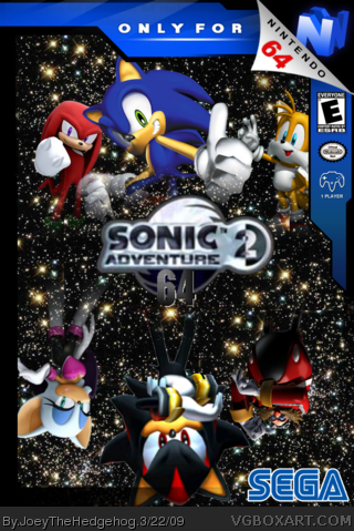
Alright, thanks for copying me. It's a bad render of Shadow, character placement on the top is alright, but the bottom should be like a parallel of the top, and Rouge is too far away from the middle of the box to be a parallel. Logo's blurry, and the "64" isn't, making the logo hard to look at. But I guess you put some effort into it, so 1.75/5.
 Sonic Adventure 2 64 Box Cover Comments
Note To everyone-
DON'T USE FUCKING LIVE ACTION BACKGROUNDS!
Edited at 1 decade ago
[ Reply ]
I just made this in photoshop. If i'm missing something please tell me. hope you like it
~credit~
YoshiStar-template
Sega-sonic pics
[ Reply ]
not bad, 4/5.
[ Reply ]
Well, um... yeah. The logo is very choppy, extremly choppy. But the box itself is nice so 7.0/10.
[ Reply ]
Sonic on the N64, that's like putting Mario on the 360...
[ Reply ]
weird concept, why would sonic adventure 2 be out on N64,oh well, it's pretty good though.
[ Reply ]
Its Pretty Good and #1,Calm Down
[ Reply ]
it's cool
[ Reply ]
Alright, thanks for copying me. It's a bad render of Shadow, character placement on the top is alright, but the bottom should be like a parallel of the top, and Rouge is too far away from the middle of the box to be a parallel. Logo's blurry, and the "64" isn't, making the logo hard to look at. But I guess you put some effort into it, so 1.75/5.
Edited at 1 decade ago
[ Reply ]