The front just looks like a gradient with a logo and 3 faded out renders. although it doesn't looks that bad, it can probably be much better. you may want to add a bit more. I suggest adding some more effects to the box, maybe some sparkles and stuff. The back however is pretty good, although it seems pretty plain and bland, it looks like you wanted stick with the same color scheme as your emeralds of time 2 box, which isn't very original.
Overall, it's an average box, a 2.7/5, you may want to work on it a bit more.
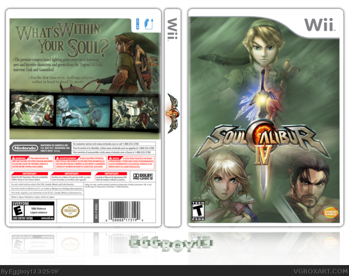
I wish this game was for Wii :( I bet if they ever make a Soul Calibur V, Kratos will be the PS3 character. They should have done that with IV, instead of Yoda and Darth.
i have to agree with the others on this
it does look goog...
but it also looks unfinished.
i tried making one of these awhile back, and alot of people beat me because it looked a LITTLE like that.
only difference is that you have a back, and ours are different colors.
 Soul Calibur IV Box Cover Comments
your recent work is not bad, but this looks unfinished.
[ Reply ]
I thought it would have been really cool if it had been ported to wii! Especially if they brought back link from SC-II!!
Twchnee:temp
PLanet renders: logo, some of the renders,
Google: screens, borders?, etc.
Me: everything else
Enjoy!
[ Reply ]
#1, How so?
[ Reply ]
#3, it looks empty and kind of boring to be honest. It's not "bad", but it looks sort of like a WIP.
[ Reply ]
The front just looks like a gradient with a logo and 3 faded out renders. although it doesn't looks that bad, it can probably be much better. you may want to add a bit more. I suggest adding some more effects to the box, maybe some sparkles and stuff. The back however is pretty good, although it seems pretty plain and bland, it looks like you wanted stick with the same color scheme as your emeralds of time 2 box, which isn't very original.
Overall, it's an average box, a 2.7/5, you may want to work on it a bit more.
I wish this game was for Wii :( I bet if they ever make a Soul Calibur V, Kratos will be the PS3 character. They should have done that with IV, instead of Yoda and Darth.
[ Reply ]
The color scheme is nothing like TEOT2, and it's plain because iI wanted to keep it like the official... wich kinda sucked didn't it?... :l
And yeah, it felt empty, but I tried to make it like the official, but I wasn't sure what else I could add to it...
Edited at 1 decade ago
[ Reply ]
Dont beat me guys.
I really like it.
7.8/10 +fav
[ Reply ]
#7, At least somone does! xD
[ Reply ]
i have to agree with the others on this
it does look goog...
but it also looks unfinished.
i tried making one of these awhile back, and alot of people beat me because it looked a LITTLE like that.
only difference is that you have a back, and ours are different colors.
[ Reply ]