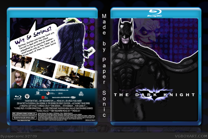
i prefered it when it was yellow for some reason. you could see the comic strip in the background and it looked cool. i like this version also as it is something different from the others. have a cookie for originality.
This is much better than I typically would expect from you. I'm not sure if I approve of using comic book style artwork for the cover of the film, it's still pretty good though. You've done well with the back.
May I suggest making the dots more transparent so they're more subtle, and maybe changing the color of the Joker on the cover to a more blue hue to match the background? It might look better, it might not. I don't know.
I agree that this is a nice alternative to many of The Dark Knight boxes we see, but the comic images on the front clash with the concept that this is a box design for a live action film.
You could perhaps alter the design to be an interactive comic book on BluRay, or make the cover you have already a slip cover of the sorts, for an edition of the film that comes with a comic book or something.
Both the back and front are good on there own, but together it doesn't work as well as I'd like unfortunately. Nice design work regardless though, and you can count on my fav if you can make the design work a little better within itself.
 The Dark Knight Box Cover Comments
FIRST!!
Amazing box!
...but you didn't make cartoon screens... D:
Edited at 1 decade ago
[ Reply ]
hahah yeah the TDK boxes look the sam so i try something new and i love it my best box!!! hope you enjoy PS
[ Reply ]
Posted deleted me.:D
Edited at 1 decade ago
[ Reply ]
Meh,It is alright.
Breaks the chain of simalar TDK Boxes.
[ Reply ]
#3, HOW CAN I IMPROVE???
[ Reply ]
I really like the comic look, definite fav, 8.7/10 :)
[ Reply ]
You have no discription and the font is terible. 6/10, sorry. Good idea but not executed too well in my oppinion
[ Reply ]
#5, CARTTOON
SCREENS!
[ Reply ]
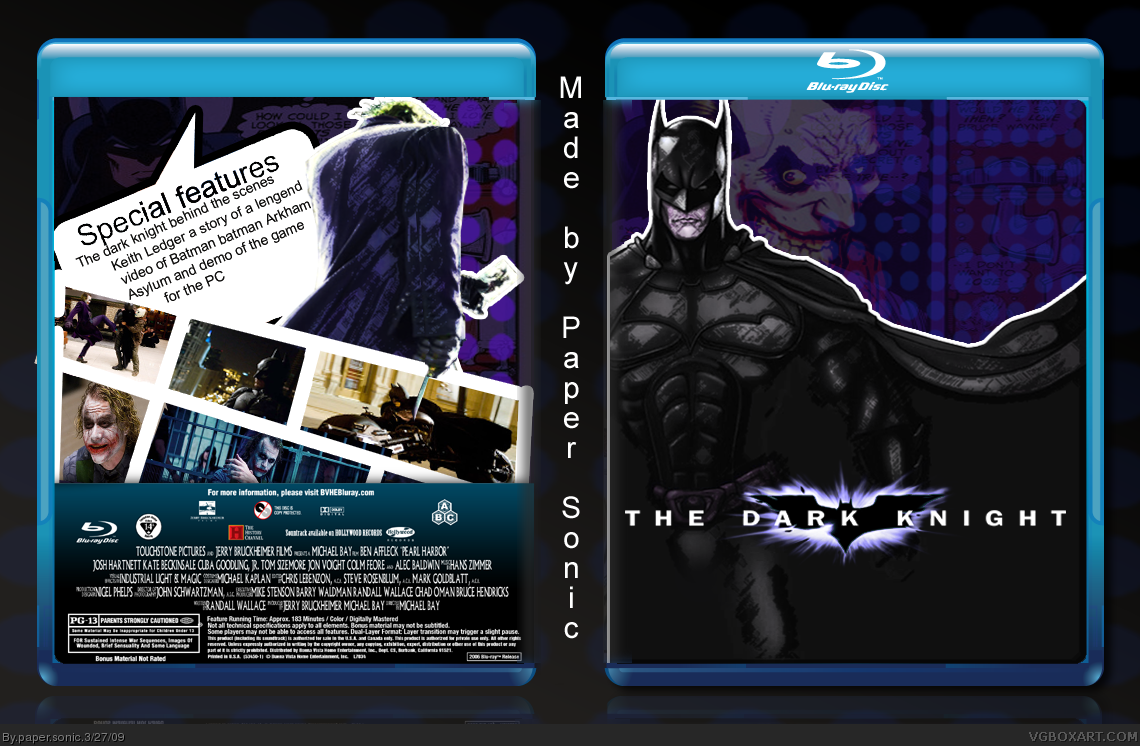
His name is NOOOT KEITH LEDGER! It is Heath Ledger (or was)
If you change it i'll fav it
@10. Faved ;)
Edited at 1 decade ago
[ Reply ]
#9, UPDATED
[ Reply ]
#8 Will you shut up with the cartoon screens already!
[ Reply ]
#11, lol anymore
[ Reply ]
#3, what do you mean
[ Reply ]
#13, IM RANK 6!!!!!!!!!!!!
[ Reply ]
#14, what/
[ Reply ]
#15, he just got rank 6.
Congrats Paper Sonic :)
[ Reply ]
Love the box for one reason. It's something different. =) +fav.
[ Reply ]
Finally an original TDK box, congrats on that! fav!
[ Reply ]
i prefered it when it was yellow for some reason. you could see the comic strip in the background and it looked cool. i like this version also as it is something different from the others. have a cookie for originality.
[ Reply ]
#18. #19. thanks!!!!!!!!!!!!!
[ Reply ]
cool box ps1! 5/5
[ Reply ]
This is much better than I typically would expect from you. I'm not sure if I approve of using comic book style artwork for the cover of the film, it's still pretty good though. You've done well with the back.
May I suggest making the dots more transparent so they're more subtle, and maybe changing the color of the Joker on the cover to a more blue hue to match the background? It might look better, it might not. I don't know.
[ Reply ]
I agree that this is a nice alternative to many of The Dark Knight boxes we see, but the comic images on the front clash with the concept that this is a box design for a live action film.
You could perhaps alter the design to be an interactive comic book on BluRay, or make the cover you have already a slip cover of the sorts, for an edition of the film that comes with a comic book or something.
Both the back and front are good on there own, but together it doesn't work as well as I'd like unfortunately. Nice design work regardless though, and you can count on my fav if you can make the design work a little better within itself.
Keep at it man.
[ Reply ]