Ok,you said you were a heartless vgboxartwoman. But stop ruining my boxes by commenting all the time and just saying negative things. If you want to say something about my boxes,say something nice.
#9,
The box is awesome. I love it. The pic is awesome- never so such a hi-res pic before, the logo is off the charts. the template is purely awesome, the pegi logo is pwnsome. All in all the best box of VGboxart.
Wow, youre improving. You just turned from joke to boxartist, congrats. Front is nice, but the bottom looks weird. Search for the official logo (in hi-res), you will find it at super-mega-hyper-duper-super-mighty-special-ultra-sonics site.
Place the dev logo at the bottom and change the text on the back. But your best box.
5.8/10 :)
Aaahhh my final update. Hope you like the 3D and also the new background and back. I know it's a bit fuzzy and blurry but don't judge that, judge the box
 Batman Arkham Asylum Box Cover Comments
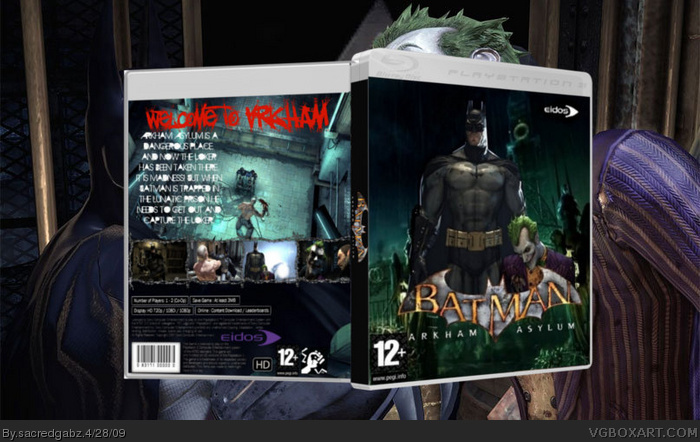
Ok, its not thatgood, and the background is from the makers of the game so please comment. Also,I'm sorry I cut the right edge off the box.
[ Reply ]
#1, its not THAT good? This is horrible!
[ Reply ]
Why?
[ Reply ]
Umm... The Batman looks demented. PEGI is too near the edge, the side, as you said was cut... And all the box is a temp, BG and Logo.
[ Reply ]
The pic is choppy and glimmers, the right edge is cut off, the logo is bad (use the official!), the pegi symbol is weird and too big.
[ Reply ]
Ok 2 things: I'm doing it on a work laptop which only has paint, and the picture came with the logo so it is official
[ Reply ]
I haven't edited the pic
[ Reply ]
#6, shut up. Make a good box or make a bad box. I dont care HOW you make the box, i just care HOW the box is.
[ Reply ]
Ok,you said you were a heartless vgboxartwoman. But stop ruining my boxes by commenting all the time and just saying negative things. If you want to say something about my boxes,say something nice.
[ Reply ]
#9,
The box is awesome. I love it. The pic is awesome- never so such a hi-res pic before, the logo is off the charts. the template is purely awesome, the pegi logo is pwnsome. All in all the best box of VGboxart.
[ Reply ]
No edit.Do somthing creative.Not just an image.
[ Reply ]
I would really suggest posting your boes in the critiques forum before uploading.
[ Reply ]
I'm gonna update it
[ Reply ]
Wow. Thats worse than before.
Edited at 1 decade ago
[ Reply ]
Stop it please
[ Reply ]
Can you tell me where you got that logo please?
[ Reply ]
#16,
shall i pm it you?
[ Reply ]
I renedered it from the official
box
[ Reply ]
Ok I've updated it. I think this is better than my others.
[ Reply ]
It is OK now.The text on the back is a bit bad.Dev needs to be at bottom and get rid of the white space.3/5.
[ Reply ]
Wow, youre improving. You just turned from joke to boxartist, congrats. Front is nice, but the bottom looks weird. Search for the official logo (in hi-res), you will find it at super-mega-hyper-duper-super-mighty-special-ultra-sonics site.
Place the dev logo at the bottom and change the text on the back. But your best box.
5.8/10 :)
[ Reply ]
#21, lol.
[ Reply ]
#21, Rolf:P
Here is the Logo BTW link
Edited at 1 decade ago
[ Reply ]
Thanks guys.
[ Reply ]
Aaahhh my final update. Hope you like the 3D and also the new background and back. I know it's a bit fuzzy and blurry but don't judge that, judge the box
[ Reply ]
sorry for the triple post but theres an update
[ Reply ]
Good, but i don`t like the back.
[ Reply ]