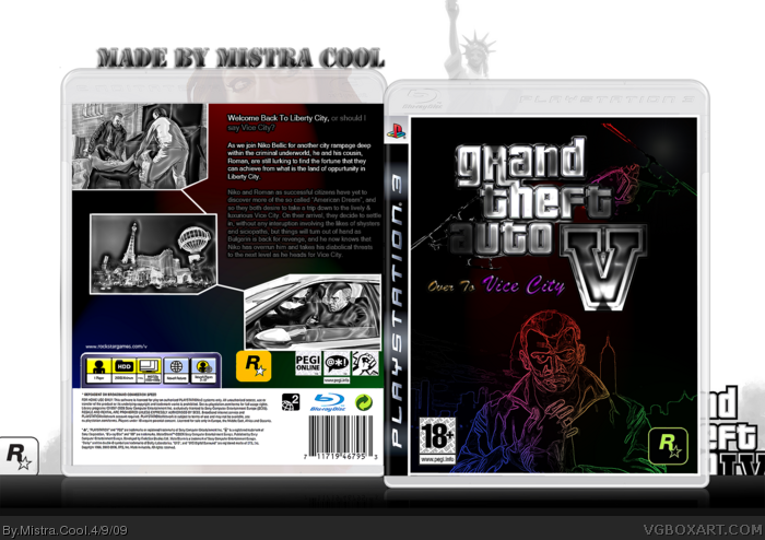
This here is a re-edited version of my other box art design, as you can see I have used some special effects which contrasts with the cities colours and the layout is aligned differently.
Overall, this is pretty much the last of my box art that I will be creating.
Well.. in general I thought that the filtering worked effectively well, although I may have overdone it on the front. The logo was meant to look more prominent and realistic than the original one, and the first line on the back cover is a tag-line - meaning they set off at liberty city just before moving to vice city.
 Grand Theft Auto V ; Over To Vice City Box Cover Comments
This here is a re-edited version of my other box art design, as you can see I have used some special effects which contrasts with the cities colours and the layout is aligned differently.
Overall, this is pretty much the last of my box art that I will be creating.
[ Reply ]
awesome +fav
[ Reply ]
#2 What's so awesome? I don't like it. I don't like the front background and the logo
[ Reply ]
This looks more like Grand Theft Filter.
Also, the subtitle is "Over to Vice City" but the first line on the back says "Welcome back to Liberty City."
1/5
[ Reply ]
too funky for Grand theft auto
Edited at 1 decade ago
[ Reply ]
Well.. in general I thought that the filtering worked effectively well, although I may have overdone it on the front. The logo was meant to look more prominent and realistic than the original one, and the first line on the back cover is a tag-line - meaning they set off at liberty city just before moving to vice city.
[ Reply ]
sorry man but this is awful, really unprofessional, nothing like a gta cover
[ Reply ]