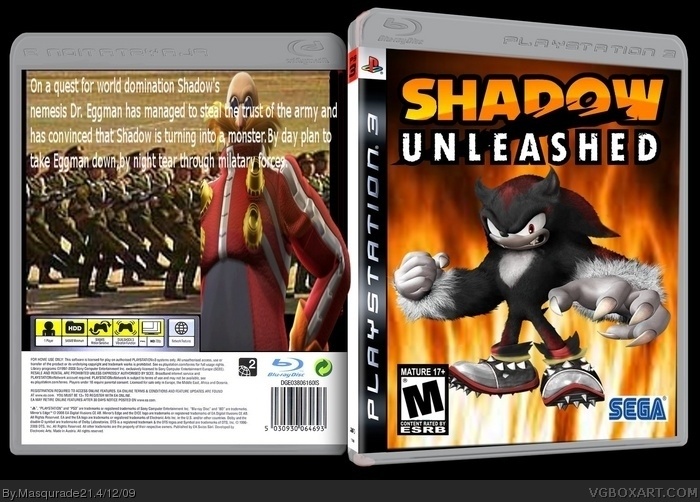
-The front looks really weird. You should use a 2D template.
-You used an ESRB rating on a PAL box.
-The background on both sides looks weird and that goes double for the back.
-The WereShadow render in the front is squished.
-The text on the back is weird and looks bad.
-Sega logo on the font isn't rendered.
-M? Really?
-That's a nice logo. Where did you get it?
 Shadow Unleashed Box Cover Comments
really need to fix the back. If you have gimp or photoshop, download some fonts. And also add screenshots. the fronht is good.
[ Reply ]
Ahem...
-The front looks really weird. You should use a 2D template.
-You used an ESRB rating on a PAL box.
-The background on both sides looks weird and that goes double for the back.
-The WereShadow render in the front is squished.
-The text on the back is weird and looks bad.
-Sega logo on the font isn't rendered.
-M? Really?
-That's a nice logo. Where did you get it?
And that's about it.
[ Reply ]
And you need to crdit!
[ Reply ]
crdit to eggboy13 for the shadow
Edited at 1 decade ago
[ Reply ]
can i have the link for the were-shadow pic?
Edited at 1 decade ago
[ Reply ]
nevermind
Edited at 1 decade ago
[ Reply ]