![]() »
»
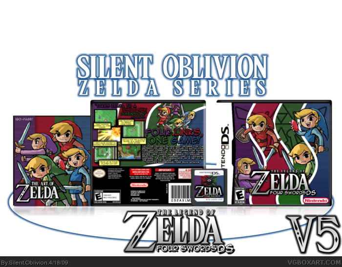
[ Box updated on April 18th, 2009 ] [ original ]
 The Legend of Zelda: Four Swords Adventures Box Cover Comments
Comment on Silent Oblivion's The Legend of Zelda: Four Swords Adventures Box Art / Cover.
Hey!
I've had a lot of freetime recently, so I've been doing a lot of boxes :P
Last in my Zelda series, wanted to go out with the best Zelda box I've done yet.
C&C as always, dudes, and enjoy!
Edited at 1 decade ago
[ Reply ]
pretty cool =]
[ Reply ]
The back is a little too dark and cluttered for my liking, but +FAV for the front. I really like what you were going for there!
[ Reply ]
too much outer glow on the typography. The font choices are fine, just make them white/yellow with a simple crisp drop shadow. The logo is pretty much unreadable.
I like the layout a lot, just needs some tweaks in the text.
[ Reply ]
It looks cool, but there's WAY too much outer glow on the text and logo. It's hard to read.
[ Reply ]
:()
Edited at 1 decade ago
[ Reply ]
I don't like it much, the backs to crowded and I don't like the front design. Good job though.
[ Reply ]
Awesome, i love it.
[ Reply ]
I think it looks great! Fav
[ Reply ]
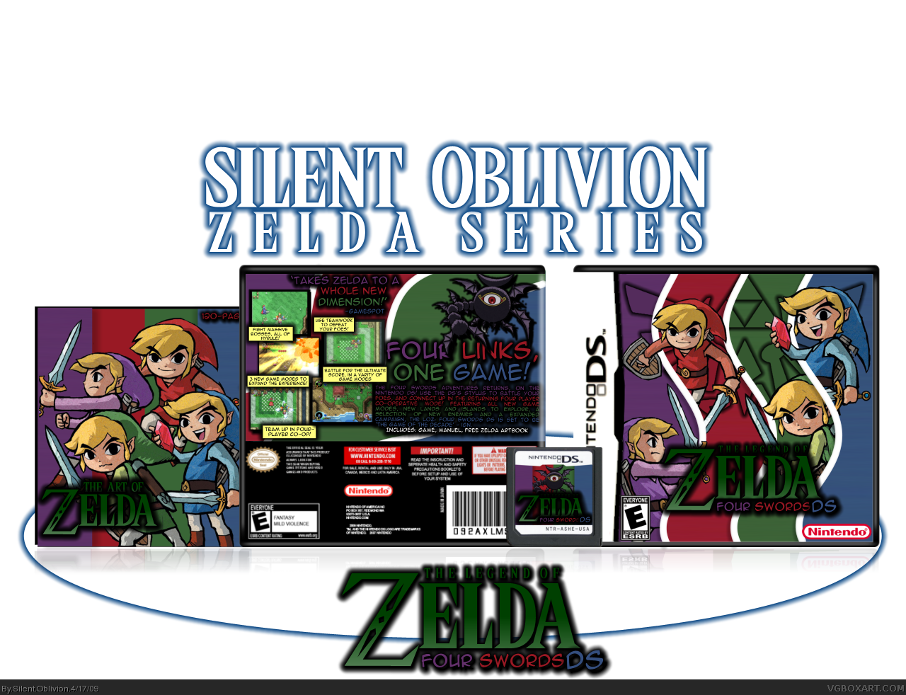
Update!
Dimmed the outer glow, on everything, fixed logo problem.
Enjoy!
[ Reply ]
Awesome, it looks so much better now. Great job!
[ Reply ]
Woah, great.
P.S. Congrats on rank 7 ;)
[ Reply ]
Not bad. But I would add some gradient to background or some overlay. Cos it feels a bit empty.
[ Reply ]
#13 - Will do!
Thanks for the comments and fav's guys!
[ Reply ]
Sorry for double post :/
Updated.
Made the background more interesting, by added gradiants and colour lines.
[ Reply ]
It's an huge improvement over the first one, great job!
[ Reply ]
One thing that I think would make a world of difference, is changing the Zelda logo color to something that contrasts the background. Gold or white, basically something light would help separate it from the rest of the image. Right now it doesn't stand out.
Back is good, just a few typos:
Variety (Varity) in the screen description
Fight Massive Bosses, All OF(?) Hyrule! - All over Hyrule? Nothing big, but I noticed it.
Overall it's really great, but I think making the Logo a light gold (just not green) will make it a lot better.
[ Reply ]
#16 - Thanks!
#17 - I'll get to it, damn typos :P
[ Reply ]
I like the different take on separating the Links and the comic book back. It's really inventive. Great job!
[ Reply ]
Looks alright, actually. Really nice job!
5/5
Edited at 1 decade ago
[ Reply ]
Really colorful!
[ Reply ]
Very nice Josh. Remind me of the art direction for Castle Crashers a bit, which I think is really neat. Great job man!
[ Reply ]
Alright, but Josh its too dark
[ Reply ]
Coool!
[ Reply ]
P... PERFECT! +fav
Edited at 1 decade ago
[ Reply ]
verahnoice.
[ Reply ]
Much better, my man. Looks a lot cleaner and legible.
[ Reply ]
Nice job!
[ Reply ]
Why can't this be real?
[ Reply ]
This is an amazing boxart!!!!! 5/5!
but the only thing is that the links look sorta like they have no personality.
other than that its perfect ^__^
nice job
[ Reply ]
When I looked, I saw that the Links on the cover are the same as the ones on the booklet. Normally that would be a major turnoff for me, but you made it so unique, it made me go WOW! 5/5 +Fav
[ Reply ]
haha nice :) well i cant say much for it, it looks good in my eyes and deservs a Fav :) Gj
[ Reply ]