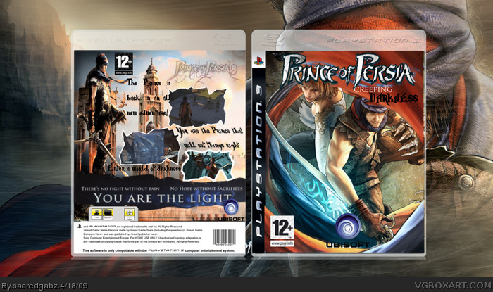
[ Box updated on April 18th, 2009 ] [ original ]
 Prince of Persia: Creeping Darkness Box Cover Comments
Comment on sacredgabz's Prince of Persia: Creeping Darkness Box Art / Cover.
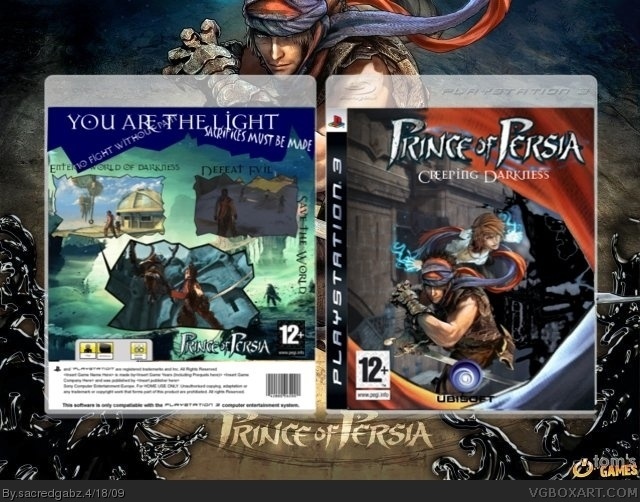
[ Box updated on April 18th, 2009 ] [ original ]
Comment on sacredgabz's Prince of Persia: Creeping Darkness Box Art / Cover.
Yeah it went a bit small but I think it turned out well x)
[ Reply ]
Not your best box, but alright. The front is choppy, the title is placed wrong and a bit streched. The back is too simple, you should make the screenbords smaller (But keep the border!), get rid of the "Prince of Perisa" on the back. The you are the light looks alright, but the text is a bit hard to read sometimes.
Now to the positive things: The blue-red border looks nice and give the box and innovative feeling.
Work harder on your boxes, your improving. Keep up the work :)
I would rate it 5.8/10 at the moment ;)
[ Reply ]
cool
[ Reply ]
It's been updated
The background's HD
[ Reply ]
Isnt that a kind of... copy from the original box (I mean, scanning parts and paste them? The previous version was better).
[ Reply ]
I only copied the you ae the light
[ Reply ]
Wow that freaking sucks I was going to do a front similar to this one... I actually gathered all the material to do it to... Great idea I guess lol.
[ Reply ]
#7, the box sucks or does the world suck because you were gong to do it
[ Reply ]