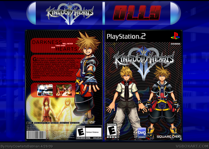
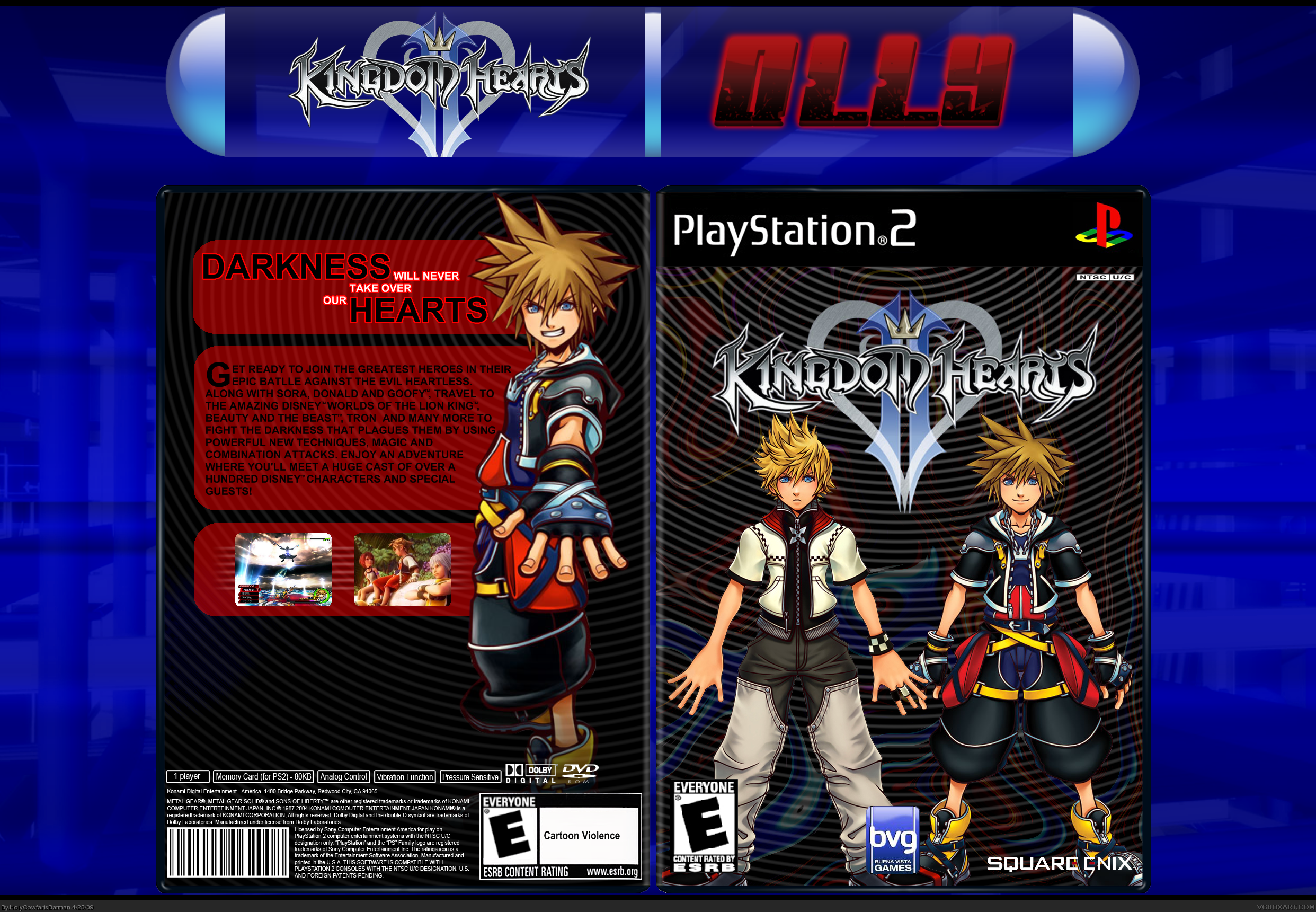
Basically, my computer crashed completely causing my two day absence from the site, but I started this before, I've just finished it, my computer is still going through a load of problems (damn Windows XP) but it's okay... anyway, Load of work has gone into this one, that BG on the front is custom made... enjoy!
Updated! Minimized the the stroke on the smaller text and filled the empty space.
Anyway...
#6, I made them using the drop ripple on Paint.NET.
#7, Sorry you don't like it Lenny, but to be quite honest... I don't care.
#8, I don't even know what the real box looks like :P but it's nice to know that it's different.
#10, Ha...ha...
#11, I've played it briefly, it's Kingdom Hearts I that I hate, Kingdom Hearts II is pretty cool.
#12, Thank you.
Hello HolyCow!
i'd like to make comments on your work but my technical english is not perfect and i don't want you to feel offend about what i can say...
and also what i can say is only about details and mounting mistakes, nothing else as
why the rated box on the front is pixelised, or the back one a bit blurry, or the dvd logo a bit streched or the big image on the back a bit blurry... and i confirm the back is a bit empty it misses something
the rest of you cover is fine
The back composition is nice, but as #3 says, the image on the bottom is throwing it off a bit. I like the swirly background idea, but it's clashing with the character renders a bit to me. Maybe if you experimented with the color contrasts you could find something cool that works with it.
I do really like the black and read color scheme on the back, and the text, though simple is really nice as well.
I can easily see myself faving if you can make those renders work better with your background.
 Kingdom Hearts II Box Cover Comments
Basically, my computer crashed completely causing my two day absence from the site, but I started this before, I've just finished it, my computer is still going through a load of problems (damn Windows XP) but it's okay... anyway, Load of work has gone into this one, that BG on the front is custom made... enjoy!
Olly.
[ Reply ]
I really like this. Fav.
[ Reply ]
Aside form the back bottom this is nice
[ Reply ]
Lower the stroke on the smaller text of the tagline and put something on the lower third of the back, and I think it's worthy of a fav.
[ Reply ]
Hmm, I like the new look, the back is a bit empty and I agree with tleeart. I see potential in this box.
[ Reply ]
I like the design HCFB, 5/5. Fav+. How did you get that circle/stripe effect in the background?
[ Reply ]
Looks like a bad disco party.
[ Reply ]
Nice box HCFB. Nice to see a different KH box :P
[ Reply ]
Awesome! Fav'd!
[ Reply ]
How cute, they are holding hands:D
[ Reply ]
Have you even played KHII, HCFB? Didn't you say you hated it? Anyway, this looks nice. +fav.
[ Reply ]
Awesome :D!!
[ Reply ]
Updated! Minimized the the stroke on the smaller text and filled the empty space.
Anyway...
#6, I made them using the drop ripple on Paint.NET.
#7, Sorry you don't like it Lenny, but to be quite honest... I don't care.
#8, I don't even know what the real box looks like :P but it's nice to know that it's different.
#10, Ha...ha...
#11, I've played it briefly, it's Kingdom Hearts I that I hate, Kingdom Hearts II is pretty cool.
#12, Thank you.
[ Reply ]
Better.
[ Reply ]
I just noticed the copyright info...Metal Gear Solid 2: Sons of Liberty, lol
It is quite different from the usual Kingdom Hearts style, and still holds up well.
[ Reply ]
#15 I just noticed that myself. ha ha. Over all, different. I like it. fav
[ Reply ]
#15, Yeah, can I be bothered to change it? No. :P
[ Reply ]
Hello HolyCow!
i'd like to make comments on your work but my technical english is not perfect and i don't want you to feel offend about what i can say...
and also what i can say is only about details and mounting mistakes, nothing else as
why the rated box on the front is pixelised, or the back one a bit blurry, or the dvd logo a bit streched or the big image on the back a bit blurry... and i confirm the back is a bit empty it misses something
the rest of you cover is fine
that's it good work!!
[ Reply ]
The back composition is nice, but as #3 says, the image on the bottom is throwing it off a bit. I like the swirly background idea, but it's clashing with the character renders a bit to me. Maybe if you experimented with the color contrasts you could find something cool that works with it.
I do really like the black and read color scheme on the back, and the text, though simple is really nice as well.
I can easily see myself faving if you can make those renders work better with your background.
Good job though sir.
[ Reply ]
#19, i completely agree!
if you fix those then tell me and i'll fav.
[ Reply ]
I like it, fave.
[ Reply ]
good +fav
[ Reply ]
I like the back, but the front seems somewhat...lacking.
[ Reply ]
Hmm, this is pretty different from what you usually do. It's not bad but I'd prefer a color similar to the II on the logo for the back text boxes.
[ Reply ]
The front is kind of hard to look at what with all the lines and stuff. The back looks good except for the pic at the bottom.
[ Reply ]
dont get mad at me but...
i dont like it, its too bland
[ Reply ]
#19, Actually, when #3 said that, that picture wasn't there.
[ Reply ]
Well, I don't like the background much, but somehow, I really like the Box!
Fav
[ Reply ]
Nice box, want to duel?
[ Reply ]
#28, Well, I tried hard to make the BG look good, but whatever, thanks for the +fav.
[ Reply ]
Dance Dance Revolution
[ Reply ]
#31, Say wha?
[ Reply ]
Nice! I feel the back could use some work though, Not quite as good as the rest you have made
[ Reply ]
It looks VERY nice
[ Reply ]
#34, I'm VERY glad. :P
Thanks dude.
[ Reply ]
It looks great! That background is very good. fav, +author fav
Edited at 1 decade ago
[ Reply ]
#36, Thanks dude.
[ Reply ]
ITS KHDDR!!!
[ Reply ]
Very nice job HCFB!
[ Reply ]
Noice work HCFB, i really like this one.
[ Reply ]
#39-40, Thanks guys!
122 points! Get in there my son!
xD
[ Reply ]
I like your box! all ur boxes r cool! im gonna fav it! keep up the good work!
[ Reply ]
#42, Thanks dude!
[ Reply ]
Nice!!
[ Reply ]
#44, Thanks dude.
[ Reply ]
149 Points... 1 MORE FOR THE HOF!
Oh, nerts... I've already posted.
Edited at 1 decade ago
[ Reply ]
Nice!
[ Reply ]
Accidental double post...
Edited at 1 decade ago
[ Reply ]
Shit, got my calculations wrong, I need another 11 points.
[ Reply ]
I like it but it sort of stretches away from the Kingdom Hearts feel.
[ Reply ]
#50, That was the point :P
[ Reply ]