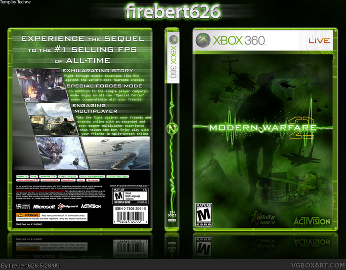
This is my first post here, hope you guys like it. I made everything except for the iw, activition, xbox, and M icons. Any tips or suggested additions, just comment.
Thanks!
Looks ok but heres what you need to change. Usuly the esrb is on the left side, and the logos and the esrb need to be alot bigger. For a first its a good place to start. Oh, and welcome to the site :)
I really like the subtle bits that you added to the logo. The clouds in the bg should be changed a little because its a little obvious that its just a filter.......try playing around with brightness and contrast to see what you can do. Also try giving it a little more texture that just clouds and all the said above about logos and stuff is true. For a first its nice.
seriously this box is extreamly underated, cmon, only 1 fav. it's pretty hard to get a decent result out of such an effort on this site.
everything is perfect, but you could have added a soldier on the front cover, but its still great. 4.5/5
Very nice I like how you left it plain and simple, I also like how you used the modern warfare 2 logo and the starting point for the text background very nice and plain and nice looking background for the back part of the box also. 10/10
 Call of Duty: Modern Warfare 2 Box Cover Comments
This is my first post here, hope you guys like it. I made everything except for the iw, activition, xbox, and M icons. Any tips or suggested additions, just comment.
Thanks!
[ Reply ]
Not bad considering the art available.
It's very clean.
Edited at 1 decade ago
[ Reply ]
Looks ok but heres what you need to change. Usuly the esrb is on the left side, and the logos and the esrb need to be alot bigger. For a first its a good place to start. Oh, and welcome to the site :)
[ Reply ]
This looks good, just the fact that its very plain, but that not your fault considering the lack in art. Nice and clean though.
[ Reply ]
#3 Thanks I'll change that soon
[ Reply ]
I really like the subtle bits that you added to the logo. The clouds in the bg should be changed a little because its a little obvious that its just a filter.......try playing around with brightness and contrast to see what you can do. Also try giving it a little more texture that just clouds and all the said above about logos and stuff is true. For a first its nice.
Welcome to the site.
[ Reply ]
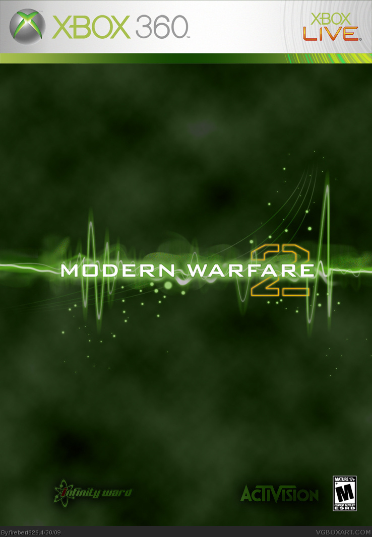
its to simple
when the screenshots come out then make a box
[ Reply ]
my way of life: Simplicity 4 life!
[ Reply ]
Thanks everyone! I changed the logos and they should be pretty accurate now. And I added a lighting effect to the bottom.
[ Reply ]
here it is with a back now
[ Reply ]
seriously this box is extreamly underated, cmon, only 1 fav. it's pretty hard to get a decent result out of such an effort on this site.
everything is perfect, but you could have added a soldier on the front cover, but its still great. 4.5/5
[ Reply ]
oh and also a Fav.
[ Reply ]
#11 thank you! check for an update after may 24 (when the new add airs on tv), ill probably put real screens on here
[ Reply ]
Very nice I like how you left it plain and simple, I also like how you used the modern warfare 2 logo and the starting point for the text background very nice and plain and nice looking background for the back part of the box also. 10/10
Edited at 1 decade ago
[ Reply ]
not bad. I think you should go easy with the motion blur though.
[ Reply ]
Thanks guys
[ Reply ]
Hey the update here has a modified front, new spine, screens on the back, and a 3d temp. Thanks!
[ Reply ]
how did i miss this, its awesome. faved
[ Reply ]
Thanks, haha because this is version 4, the others were pretty bad/boring.
[ Reply ]
#19, o never the less this looks great
[ Reply ]
#20, Why thank you Sir!
[ Reply ]